# New Banner for The Public Happiness Movement
**URL:** https://publichappinessmovement.com/t/topic/1542
**Category:** UI and Design
**Tags:** logo, ui-and-design, ux-design, done
**Created:** [22 August 2019 12:22 UTC](https://publichappinessmovement.com/t/topic/1542 "2019-08-22T12:22:14Z")
**Posts on this page:** 20
**Page:** 9
### Author:  [@bob](https://publichappinessmovement.com/u/bob)
#### Post date: [26 February 2020 08:05 UTC](https://publichappinessmovement.com/t/topic/1542/163 "2020-02-26T08:05:56Z")
Are any of these logos going to have text with it? Otherwise I’ll have to add it myself but then the font won’t match whatever you use later if there is text.
---
### Author:  [@AndyatFocallocal](https://publichappinessmovement.com/u/AndyatFocallocal)
#### Post date: [26 February 2020 14:45 UTC](https://publichappinessmovement.com/t/topic/1542/164 "2020-02-26T14:45:45Z")
We haven’t worked on text yet. I suggest just going ahead with it yourself, do you agree @isaiahgirard, or have you got something in the pipeline?
---
### Author:  [@isaiahgirard](https://publichappinessmovement.com/u/isaiahgirard)
#### Post date: [27 February 2020 01:21 UTC](https://publichappinessmovement.com/t/topic/1542/165 "2020-02-27T01:21:35Z")
i never looked into fonts, but that’s largely a personal preference sort of thing. i just recommend an easy to read font
---
### Author:  [@AndyatFocallocal](https://publichappinessmovement.com/u/AndyatFocallocal)
#### Post date: [27 February 2020 13:32 UTC](https://publichappinessmovement.com/t/topic/1542/166 "2020-02-27T13:32:34Z")
On the site we use Roboto. Perhaps an extension of that?
---
### Author:  [@isaiahgirard](https://publichappinessmovement.com/u/isaiahgirard)
#### Post date: [28 February 2020 07:03 UTC](https://publichappinessmovement.com/t/topic/1542/167 "2020-02-28T07:03:20Z")
it’s up to you, but i’d go for a more friendly looking font. maybe a serif font. [dafont.com](http://dafont.com) has a lot of free fonts and you can choose categories to filter by, and enter text to see it in each font
---
### Author:  [@AndyatFocallocal](https://publichappinessmovement.com/u/AndyatFocallocal)
#### Post date: [29 February 2020 11:13 UTC](https://publichappinessmovement.com/t/topic/1542/168 "2020-02-29T11:13:00Z")
@isaiahgirard what do you think about Mermaid Serif font?
---
### Author:  [@isaiahgirard](https://publichappinessmovement.com/u/isaiahgirard)
#### Post date: [1 March 2020 05:49 UTC](https://publichappinessmovement.com/t/topic/1542/169 "2020-03-01T05:49:35Z")
> [@AndyatFocallocal](#):
>
> Mermaid Serif font
i’m not really a fan, but it’s hard to tell since i’m on a 55" TV at the moment. not sure how it would look on a monitor. you could easily take a screenshot of the website, take a screenshot of the font, and put them together in ms paint to see how it would be in use. hold Windows + Shift + S to screenshot a small area on your screen. that actually gets copies to your clipboard so you can paste it in programs like paint or even in messages like this

---
### Author:  [@Mateo](https://publichappinessmovement.com/u/Mateo)
#### Post date: [2 March 2020 23:30 UTC](https://publichappinessmovement.com/t/topic/1542/170 "2020-03-02T23:30:25Z")
Hello,
If you’re still doubting on where to go with the font, I would say let’s use the Roboto one so it’s easier to read (sans serif font are easier to read on a screen, specially on tiny ones).
We could also go for a Verdana bold one, or maybe the Luciole (bold or regular) one, available here: [Luciole – Typeface](http://luciole-vision.com/luciole-en.html) but I’m not sure this one has every letters for each alphabet. Both of these fonts are good for people with reading difficulties or bad sight, so it could be great for accessibility.
I’ll add some examples here of Verdana, Roboto and Luciole:
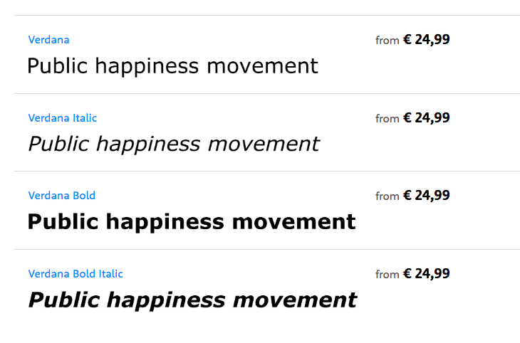 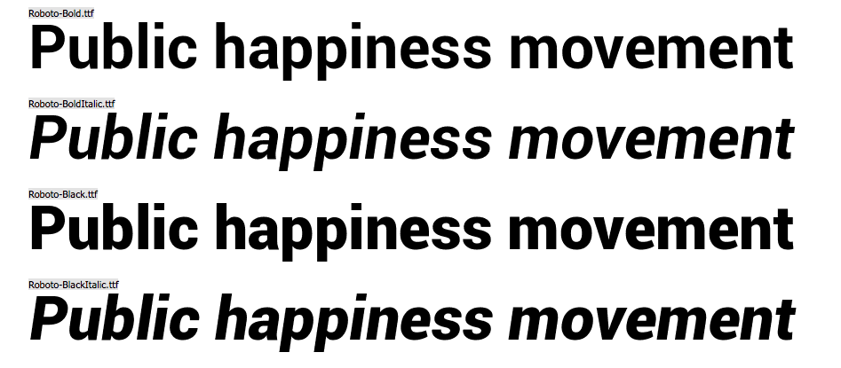 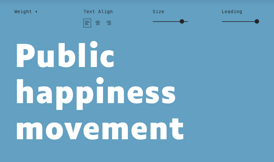
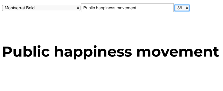
Or we could go with the Montserrat one, a favorite of many designer nowadays, a sure one but not very original:
Regards,
Mateo
---
### Author:  [@AndyatFocallocal](https://publichappinessmovement.com/u/AndyatFocallocal)
#### Post date: [3 March 2020 00:36 UTC](https://publichappinessmovement.com/t/topic/1542/171 "2020-03-03T00:36:11Z")
Thanks for that, I was really struggling with whether I should be the one making a decision here as it’s not a strong point of mine at all. @isaiahgirard if you agree with Mateo’s reasoning, could you take one of these suggestions and find a sexy and fun variation on it, which maintains the readability on a small screen?
---
### Author:  [@isaiahgirard](https://publichappinessmovement.com/u/isaiahgirard)
#### Post date: [3 March 2020 08:16 UTC](https://publichappinessmovement.com/t/topic/1542/172 "2020-03-03T08:16:48Z")
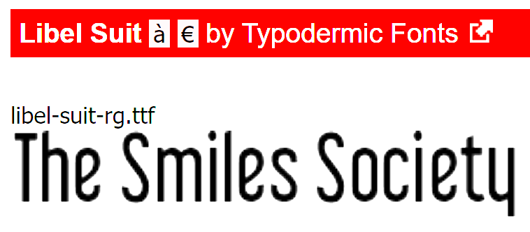
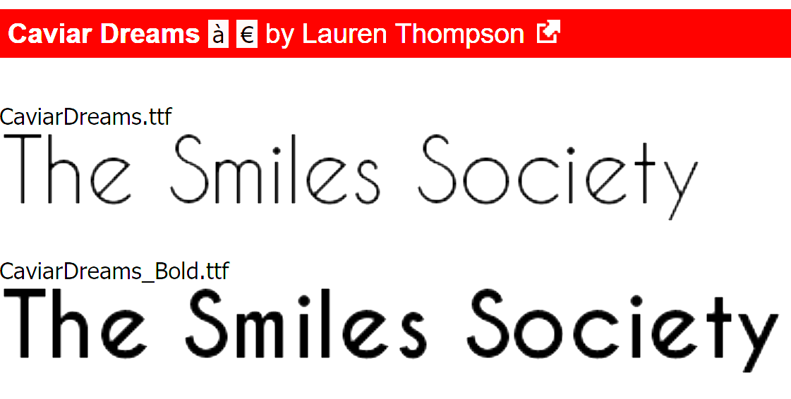
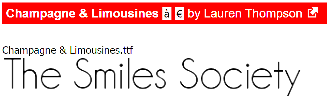
i kind of like the Montseratt font, but all the fonts have no character to them. i really don’t think that serif fonts are significantly less easy to read. if you want a sans serif font though, here are some options i like:
---
### Author:  [@Mateo](https://publichappinessmovement.com/u/Mateo)
#### Post date: [3 March 2020 14:58 UTC](https://publichappinessmovement.com/t/topic/1542/173 "2020-03-03T14:58:37Z")
Another question we should ask ourselves is if we want to write the full “Public happiness movement” name?
I think it would be great to make it tinier, I don’t know if something like “PHM” or “Phm.” or similar could work, what do you think @AndyatFocallocal ? Or maybe only keep a part of it, even if we use the full name on other places, calling it “The movement” or “Happiness” could have a bigger impact and make it easier for people to remember.
Or… Maybe we should just not use the name in the header but keep it for other purposes, like banners, roll-up, etc.?
Best,
Mateo
---
### Author:  [@Mateo](https://publichappinessmovement.com/u/Mateo)
#### Post date: [3 March 2020 15:05 UTC](https://publichappinessmovement.com/t/topic/1542/174 "2020-03-03T15:05:45Z")
I prefer the second one, “Caviar Dreams”, but we may need to work on the kerning as it doesn’t look that good on the image. (Particularly between the “S” and “o” of “Society”)
I would go for the bold one to represent something powerful and confident.
---
### Author:  [@AndyatFocallocal](https://publichappinessmovement.com/u/AndyatFocallocal)
#### Post date: [3 March 2020 16:06 UTC](https://publichappinessmovement.com/t/topic/1542/175 "2020-03-03T16:06:21Z")
Bold is good, I can see what you’re saying with the kerning though, strange that it’s only on that one.
The current plan is to have Public Happiness …
- Movement
- Token
- Summit
- Hub
- Etc, etc
It’s not particularly exciting, but it does help tell people what the project is, where Focallocal didn’t and that was an issue we faced for years.
If we’re shortening it then perhaps the PH needs to be iconic as that will be the part which stays the same. So PH Movement PH Summit, maybe.
The colours from this one which one of our members created are awesome and unique. What do you think about recreating that colour scheme inside the text
> **[Google Drive: Sign-in](https://accounts.google.com/v3/signin/identifier?continue=https%3A%2F%2Fdrive.google.com%2Ffile%2Fd%2F0BwLUtixxA6u_R3ktZTBqUzZ3bHc%2Fview%3Fusp%3Ddrivesdk&followup=https%3A%2F%2Fdrive.google.com%2Ffile%2Fd%2F0BwLUtixxA6u_R3ktZTBqUzZ3bHc%2Fview%3Fusp%3Ddrivesdk&ifkv=AXo7B7W3CiEfqkNgNq6p9ApDXZAUpxJzHcd-kL7Y2C4RimL8UseWMgBbB-SXm0qot3zydutBA8toAg&osid=1&passive=1209600&service=wise&flowName=GlifWebSignIn&flowEntry=ServiceLogin&dsh=S-1727790537%3A1693341276510273)**
>
> Access Google Drive with a Google account (for personal use) or Google Workspace account (for business use).
It’ll be nice to have the text. We wouldn’t use it unless the screen is large
---
### Author:  [@AndyatFocallocal](https://publichappinessmovement.com/u/AndyatFocallocal)
#### Post date: [3 March 2020 16:09 UTC](https://publichappinessmovement.com/t/topic/1542/176 "2020-03-03T16:09:04Z")
Was planning to call the token P.HAP… though I’m aware that does open us up to jokes. We could ride that to our advantage, or avoid it with a different four letter version
---
### Author:  [@isaiahgirard](https://publichappinessmovement.com/u/isaiahgirard)
#### Post date: [4 March 2020 01:09 UTC](https://publichappinessmovement.com/t/topic/1542/177 "2020-03-04T01:09:22Z")
i accidentally input a different charities name that i made a logo for before xD
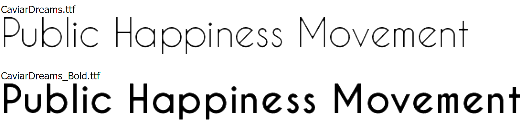
my opinion is that if there’s room then you may as well spell out the full name, and if not then PHM with the logo should be identifiable enough.
i like the watercolor gradient, and i can recreate something like that if you want
---
### Author:  [@AndyatFocallocal](https://publichappinessmovement.com/u/AndyatFocallocal)
#### Post date: [4 March 2020 02:05 UTC](https://publichappinessmovement.com/t/topic/1542/178 "2020-03-04T02:05:45Z")
Ok, sounds like we’re edging towards a final plan. If we’re colouring it like water colour paints then we’d want to go with the bottom version but make it bolder so the colours show up. Maybe double or triple width
---
### Author:  [@AndyatFocallocal](https://publichappinessmovement.com/u/AndyatFocallocal)
#### Post date: [4 March 2020 02:08 UTC](https://publichappinessmovement.com/t/topic/1542/179 "2020-03-04T02:08:20Z")
Oh PHAT. That’s cooler, if it’s not already taken
---
### Author:  [@isaiahgirard](https://publichappinessmovement.com/u/isaiahgirard)
#### Post date: [4 March 2020 02:28 UTC](https://publichappinessmovement.com/t/topic/1542/180 "2020-03-04T02:28:27Z")
PHAT means pretty hot and tempting lol
---
### Author:  [@Mateo](https://publichappinessmovement.com/u/Mateo)
#### Post date: [4 March 2020 08:32 UTC](https://publichappinessmovement.com/t/topic/1542/181 "2020-03-04T08:32:01Z")
I’d keep the colors for the hero text, and only put black or one color on the logotype.
What about a simple “PHT”?
---
### Author:  [@AndyatFocallocal](https://publichappinessmovement.com/u/AndyatFocallocal)
#### Post date: [4 March 2020 10:50 UTC](https://publichappinessmovement.com/t/topic/1542/182 "2020-03-04T10:50:06Z")
Needs to be four letters now.
[Previous page](https://publichappinessmovement.com/t/topic/1542.md?page=8)
[Next page](https://publichappinessmovement.com/t/topic/1542.md?page=10)