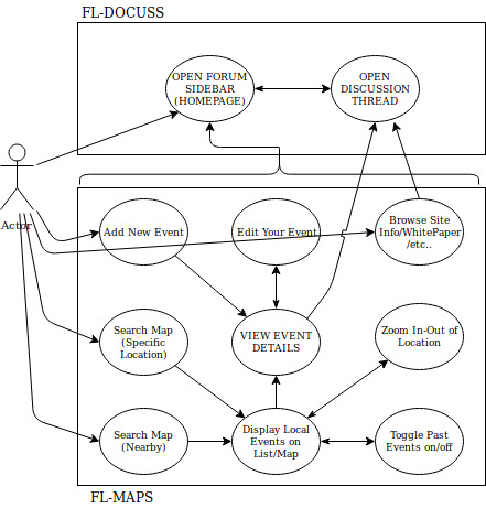
This section describes the fl-maps behaviour and structure from the users’ perspective. This is designed to illustrate how the site should work and draw attention to any customer pain points/area of improvements.
<complete description of how the application should behave from user’s perspective>
<should act as a framework/inspiration for the UI and software architecture>
1. SYNOPSIS
2. USE CASE DIAGRAM
The below diagram is a highly summarized view of the actions users might take on the site, and how these actions link up to one another as part of the user journey. note: the focus here is on fl-maps system (the lower box). While a very basic view of docuss - the forum system - is included (upper box) this is only here to illustrate how actions taken in fl-maps actions can spill over into docuss.
<TO-DO: add some form of colour-coding to improve readability>
<Expand on possible actions taken when creating event/build a separate flow chart for the event creation module?>
3. DESCRIPTION OF THE MAIN USER ACTIONS/FEATURES
<Text description of each feature from the user’s perspective>
