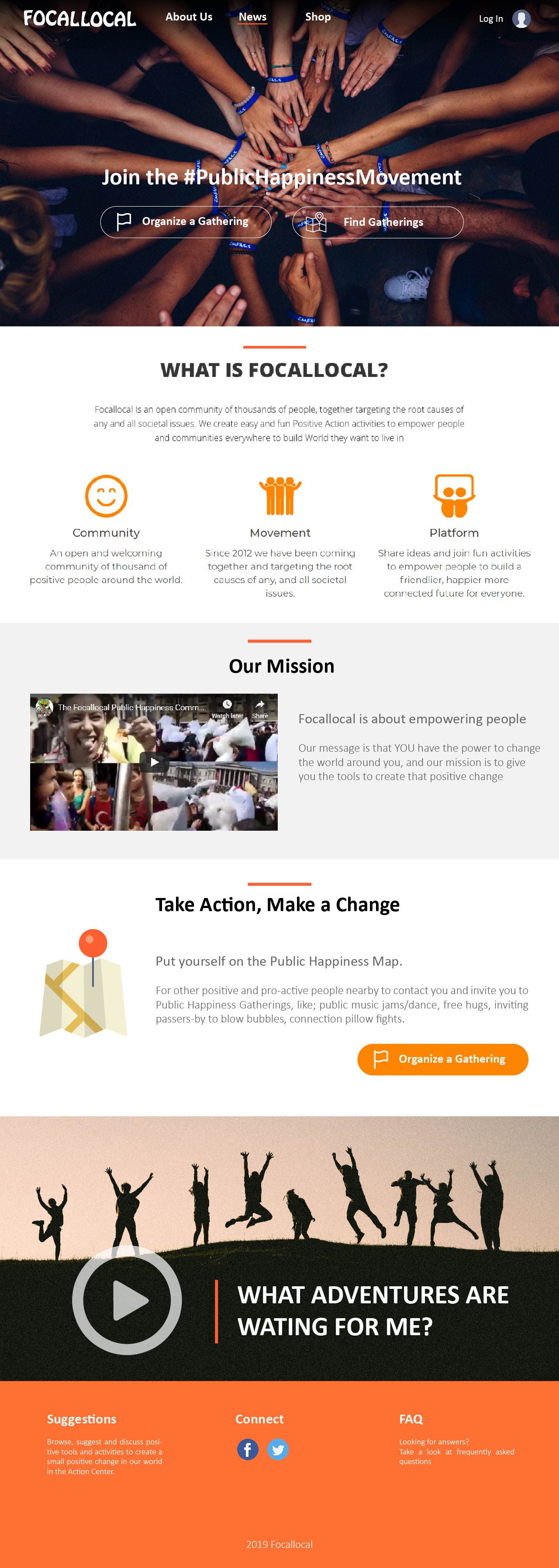
I have some ideas on how we can improve the look and feel of the focallocal home page to feel more fun and welcoming. I think the use of more visual cues such as videos and icons can tell more information at first glance rather than being too wordy, so my ideas are geared towards improving these aspects.
- I think the gray header image is dull, it can be changed to a brighter image. We can choose from other images available from members of the focallocal community.
- There’s already a location search field in the map so is there really a need for a search box on the home page? To access the map, a button titled something like ‘ Find Gatherings ’ can be used to open the map and by default the map can be zoomed to the user’s location or zoomed out so the user would be able to see all events.
- Maybe the ‘Gather’ button can be renamed to something like ‘ Create Gathering ’ or ‘ Organize a Gathering ’. The word “Gather” alone is not really clear to new visitors.
The header title can be renamed to "Join the #PublicHappinessMovement " or more general like “Join the Movement” along with the two buttons described above.
In addition, I think the flow of the page can be revised to something like this:
- telling people what is focallocal and why you’re doing what you’re doing.
- At this point, users probably will be asking, what can I do? how can I contribute? So tell the user how they can take action. I think the map icon hints to the users that they will be using a map based platform.
- lastly, the video can be used to show users what types of events they can organize or be a part of.
I provided a mockup of my ideas below. Let me know what you guys think.