wow! i cant wait to see them 
Yay @albert_kai - Cannot wait to see what you’ve come up with! So excited to see an awesome landing page, I can’t even tell you… Sure @Rula agrees!
I’m almost there @kirstystubbs! Hope you wont regret:)
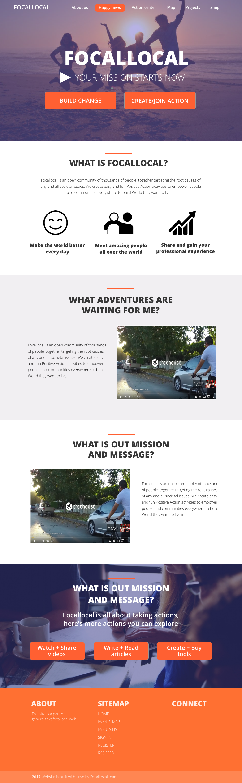
Hey guys, sorry for the delay, got ton of work. Here is the draft. Please tell me what to fix/enhance.
Another font is used for the logo on the picture. As far as I understand we also need to think about some cool logo right?
1 Like
thats really nice @albert_kai, i love it. let me see what the others think @Rula @kirstystubbs .
we can switch our cover photo in later if you give me dimensions. the only change it’d need now is that the main menu needs to be the same as the current one in gather.focallocal.org (plus the dropdown options others sent)
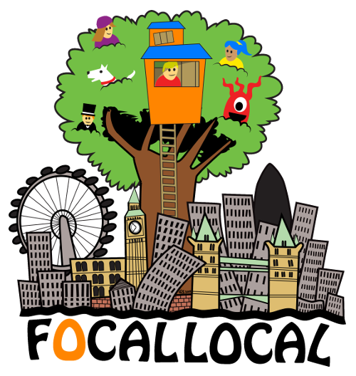
we have a well established logo. if you can include it that would be great
Q. should it include more videos at the bottom of the page?? or visual representations for the buttons at the bottom, something to make clicking them more appealing - like an image of whats going on there?
That looks really neat!
Great work @albert_kai!
Regarding videos/images, I don’t think you need to busy the page further Andy? Perhaps we could include a strip of collaged images somewhere, but I don’t think it’s entirely necessary.
My only Qs - How come both of the bottom two sections have the same title?
I wonder whether also, we can replicate the font from the logo in the initial ‘Focallocal’ bit? Do you know the font name Andy?
Is it possible to put a more Focallocally locally image underneath the initial 'Focallocal: Your mission starts now’
Content feedback - There’s a typo in the content holder paragraph (presumably staying as the first paragraph too)- It should read to build THE world they want… Also, there’s some questionable capital letters? Perhaps @AndyatFocallocal can explain?
My only slight dislike is how simple and spacey the orange sitemap section looks, but that’s really no biggy. Looks NEAT otherwise dude! Great work & Thanks!
P.P.S - Andy, WHY have we still got the two build vs create/join haha!? @Rula what was the final discussion on this?
Hey @albert_kai,
Beautiful work!!! Design wise, simple, clear and easy to follow. I even like the header image.
I find very powerful that the main point/action is sitting to clearly above the fold. I also like the badges and signposting. For me to comment further I’d need to understand where these link, where do they take u through? That’s really important and can make or break first impressions.
Regarding copy, i would need to understand the background/thought behind a few. Some seem like placeholders, right?
Personally, I find the ‘your mission starts now’ a bit aggressive and culty… but that’s me 
Anyway, I assume the first step is the layout not every single word, and on that i feel it’s pretty there. Re the nav bar, again not sure how much more it needs. This needs to be simple and backed with worthy content too.
@kirstystubbs, I think we agreed on 3 tabs in the end? can’t remember. Internally, I quite like the call to actions but not sure they are clear enough to people that are new to it all. We would need to test it.
Anyway, happy to have a little catch up over a coffee and a laptop to talk all this through. I find it very hard to write all my thoughts based on assumptions and questions.
Have a good night all
@rula agreed. ‘your mission starts here’ was a poor choice. @albert_kai lets drop it.
we went down to two buttons and added a splash window in the map so users instantly see where they are needed, without the need for a third main button on the home page.
lets coffee after the 26th.
@kirsty the font was hand drawn so we can’t use it i’m afraid.
@albert_kai can we remove the bottom title ‘mission and message", but leave the text underneath. oh and change’ taking actions’ to ‘taking action’
Can you also update the text to 'to build the
world they want
@AndyatFocallocal I get the feeling the text is just a placeholder so you can play around with it all you like, I suppose?
That’s a shame about that Font, I wonder if we could find something similar, to use going forward, because it seems silly to have the logo in one font and everything else in a different, particularly when ‘‘Focallocal’’ is so big on that landing page ?
Re two buttons - I think visually it looks neat, but we really do need to make sure the text on those buttons tells the right story, to lead people in the right directions, because I don’t think build, create, join etc are very discrete terms.
Up for a coffee after 26th, too.
Would be great if @albert_kai can also join - Not sure whether you’re based in London, but if not we could dial you in?
1 Like
@kirstystubbs @Rula guys @albert_kai is ready to put the homepage live. if you have time next week what days are you free for a meeting (both in person and online) to finalise any changes we want to make?
the site is going to be Alpha launching next week, and i’m going to be doing 1 month of Positive Action around the UK to draw people into it, so if you can make it next week that would be a huge boost
i’ve pulled all the points out from our discussion above. some for implementation, others for further discussion at the meeting
temp points for new homepage.doc (13.5 KB)
Heyy folks,
I could do tomorrow evening, 2nd May, but otherwise I’m not free for a couple of weeks as I have a big interview coming up I’ve got to prepare for and stuff in the diary every eve I’m afraid. Sorry!
1 Like
@kirstystubbs @AndyatFocallocal 2nd May works for me too! See you tomorrow then:)
I can meet anytime from 6.30pm - Where works for everyone? London Bridge, or if not somewhere along the northern line would be handy for me.
@Rula are you available? @AndyatFocallocal?