@kirstystubbs London Bridge would be fine for me
re. font. thats something i don’t feel comfortable in my skill set with. i’m not very design oriented. that said, not the one you found. it looks like Comic Sans  we can have a look at the meeting
@kirstystubbs London Bridge would be fine for me
re. font. thats something i don’t feel comfortable in my skill set with. i’m not very design oriented. that said, not the one you found. it looks like Comic Sans we can have a look at the meeting
@albert_kai is 18:30 BST ok for you?
@everone i was wondering. should we list all of our current members, events and proects created and cities we’ve been active in on the homepage?
it’d take me a while to work out, but would be enticing for visitors, right? 
Absolutely not @AndyatFocallocal - minimal KEY info is the key on a landing page; you want to feed people to places where they can find more.
Everyone, are we meeting?
got stuck on the train, going to be 10mins guys
@albert_kai click this link when you are online
lets try this: https://appear.in/focallocal
it uses webrtc, should be better
@albert_kai here’s the changes we discussed to the home page: https://docs.google.com/document/d/1xVUitFVFYHiQfpK-t59FPzeGStvRf5nGcoRJXb8yo1I/edit?usp=sharing
i’ll be meeting with Rula on Sunday to look at the text again and so it will have one more revision to the wording coming. once we have this up at the address http://focallocal.org then i’ll have a look at how we can edit the text and images and use it again for the Brighter Tomorrow map (the homelessness project). the continuity will look great!
if its possible to have a draft online for Sunday that would be a huge help. if not don’t worry i’ll talk her through the coming changes
Hey everyone, I only see posts until May 2017 so hopefully nothing is wrong on my loading end. I wanted to know what we are looking to integrate into the current design. I still don’t know how the main parts of the site works yet, so bear with me if you have to repeat yourself. Also I’ll be busy with a move until the 31st but I’ll be able to work steadily afterwards. (Please note I can help with front end development and can try to integrate our new frontend with the existing backend on a separate branch)
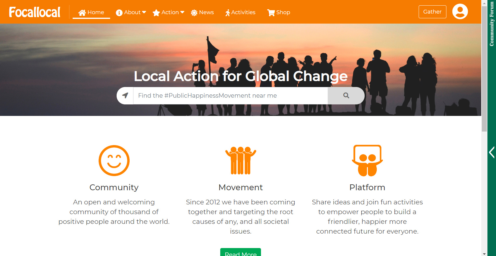
Nav Bar
Is the navbar connected with other apps and is there reliance on the current code for full functionality? if so in what way?
Logo
Is the logo set and cannot be redesigned? (main concern is the read at small sizes and the font)
Community Forum
I saw the trello card and to be honest didn’t think it was distracting if it could not open a new thread. However, for some reason it doesn’t always keep me logged in. I’ll be testing this more because it remembered me this time.
@WhisperPntr we’re just launching our platform. The main community has been in skeleton mode for close to 2 years as i found myself in the middle of everything and it became too much to manage without proper tools. Since then i let things cool and focused on just supporting the web team in building this platform, to create a space where a decentralised network could grow that would function whether i was around or not. With me just being one member of a wider community. We’re just about ready to begin bringing people back in! 
Navbar
The Navbar has been built identically in meteor, html, and on wordpress. It can be changed, but that requires re-coding all three - and we only have React/Meteor Devs on board right now. I manage the other areas, and the long term plan is to bring all other pages and platforms into our React/Meteor Platform. It can be changed if you think it urgently needs to be improved -that probably means me trying to recreate it in Wordpress and Html… which at my coding levels might require quite a lot of time. What issues do you see with the current one?
Logo
Actually now is a very interesting time to ask that question. The platform is being built for all groups working towards taking positive action in ways not currently recognised/rewarded under our GDP based societies. In that respect i think we should rebrand the website to ‘PublicHappinessMovement.com’ (Happiness is a broad term, Increasing Well-being and Peace would be more accurate, but ‘Happiness’ was chosen as it is universally recognised so good for a global movement). That would require a new logo, with Focallocal falling back to become just one of the communities active on our platform.
It would be helpful anyway if you can post a screen shot of the reading issue at small sizes. it should switch to a text version on mobile and smaller screen devices.
Community Forum
I’m not totally following, which Trello card was it?
Logging in is a known bug. We have Discourse SSO so once you sign into one you should also be signed in to all others (Wordpress, Discourse, Focallocal.org). It was working great but needs to be hooked up again as the security keys are incorrect now.
Hey everyone, I have also been working on some ideas I had for improvements starting wit the home page UI. Please find a snapshot below along with some notes:
These are my points:
Your ideas/suggestions are welcome!
Thanks,
Nikki
Hi Nikki
The major change was that the landing page should be sign up, and information only. Maybe keeping the location bar, maybe not? if we keep then it would redirect users who aren’t logged in to the sign up page. Then redirect them to the map if they have entered wanting to see their location.
After logging in users new homepage would become a profile page, where:
Part of that is already available in your personal stat pages, mine is here: https://discuss.focallocal.org/u/andyatfocallocal/summary
There is already some progression on the other major parts of this here
Most of these stats can already be pulled from here:
@AndyatFocallocal actually I was thinking the menu icons could be removed because some of the menu icons are not relevant and also removing the orange color and just use the links similar to what was proposed earlier by @albert_kai. Are you planning to keep the orange color as the main color of the site. It’s also being used in other projects right?
@nweat We can change the menu, but it would require changing it in React, Html and Wordpress. If you want to do that then it’s fine, i can give you access.
We quite invested with the colour scheme, the entire site on all platforms has been designed using a pallet derived from it to create a welcoming and warm feeling. It would help to have your specific criticisms of it, and suggestions to improve it, so we can discuss them.
The balloons issue is a know bug being worked on by Arty right now. We could also get more on there by asking all our developers to put themselves on the map.
@nweat i’m unsure how your heat map suggestion would work, can you make a quick mock-up?
right now the idea is that many users will be the 1st in their area, but when they zoom out they should see other active communities and so some users will take that as a challenge to get their friends involved, rather than a negative.
we haven’t begun advertising the map yet as it’s only recently become usable. that can happen now, so i’m going to try and find people to join our marketing team who will push for that.
@Andyatfocallocal
Sorry for the delay. still in the middle of a move which will be finalized on the 31st. Typing on my phone but I want to go over your points on computer. Thanks for clarifying.
@nweat I like the general layout of your design. Do you have the html, js and css ready to roll? And responsive? If not I’ve created similar layouts in the past so can help the technicalities and functionality of the menu.
If you can invest the time, one of us can design the other code so overlap is minimized. I think basic clean fast and functional supercedes fancy.
The right hand slider can be redesigned if need be as well but I like the way it works.
But imho having a uniform, functional, easy to maintain/modify look we all can agree on is the first general priority for a redesign.
Lastly the orange is fine. The logo can use a different font without detracting from the cheerful message and the menu can benefit from a restyle as well. But usually for my clients I try to work with what they want.
On that note… need to ask Andy about how react is also in play. Afaik WordPress is lamp stack only unless wp is blog portion only
@WhisperPntr The main build is in React. The long term plan is to move everything into React, although we have a few thousand pages and articles on wordpress which i expect will be difficult to import.
It’s not a great blog and fairly slow, but it works; it allows users to create their own articles, sync’s login with discourse and the react forum, and autoposts articles into the forum (great for users to subscribe to)
So functionally it does everything we need and i think there are higher priority tasks right now than rebuilding and importing it - unless someone comes onboard who really wants to do that task.
we also have a few html pages which overlay tools for project management, mostly trello and google drive for projects and storage
you can see these from the main menu by browsing
these should be easier to import, although Trello is going to be replaced with an internal system a bit later on, so it’s worth doing that 1st and then importing the other pages