they all would need to have the new menu built in their native code if we do it now, as that is the only way we create the impression to users that they are on the same site
we haven’t created an established process for approving new design suggestions here. previously we were just posting them in the meteor-maps thread and anyone online would discuss them, with me ultimately giving the go ahead, while recognising that most people in the thread were more skilled in their field than me.
we could continue with that for now, or you guys can suggest an alternative. ultimately i want to remove myself from the decision process, but think the community should be a bit more established 1st as we are rebuilding after being a skeleton crew for the past few years, until focallocal.org was ready to support a wider community
Summarising decisions and more discussions that i’m aware of:
- The menu can be changed. if you want to do that you need to ensure it’s changed at all three locations at the same time.
- my opinion is that the ‘gps icon’ is not universally recognised yet and less people would understand/click it. More discussion is welcome.
- move the title text, yes please.
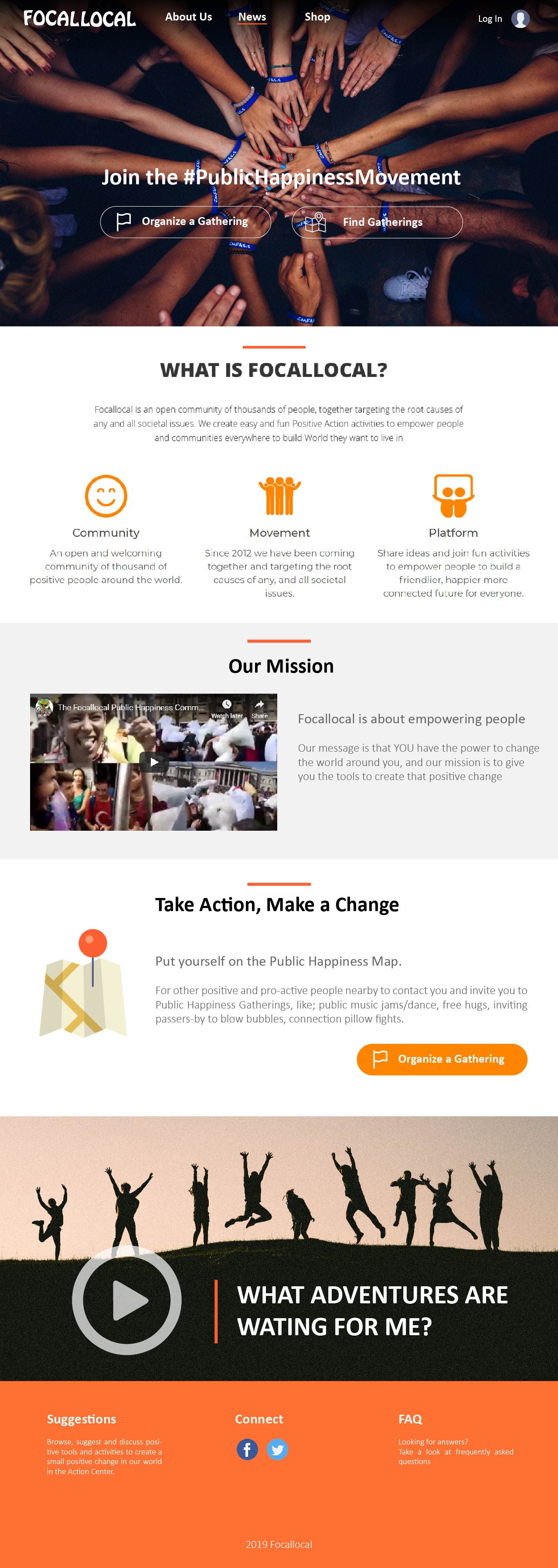
- new logo, yes although we need to design one from scratch ready for changing the site to The Public Happiness Movement, and making Focallocal just one of the communities on it
- Colour scheme change: i need more explanation of the need for it, or make a mock up and try to amaze the rest of the community with it.
- Heatmap: please expand Nikki
- ‘Gather Button’ - i think its a high value location, but i’m not convinced new users know what it does either. What could we do to change that? it is more self-explanatory on brightertomorrowmap.com.
One note is that we can’t use the word ‘event’ for legal reasons. Event’s signify to councils permission, approval, and other things that take months to collect. Gatherings are just people coming together around a pre-agreed idea… basically it’s the same, but legally it’s far safer for our members to call what they do a gathering. I have had constant police attention from things as silly as offering free hugs to passers-by. ‘where’s you council permission. who said you could do this, etc, etc’ - I’d love more discussion on the idea of making the homepage a signup and information page, then having users redirected to their profile page with all the tools, resources and stats they need. Maybe this would also require moving the search box to the second page.
We should also prioritise new missions based on immediate impact/time to change.
For example,
changing the header will probably have a lower impact/time ration for users than changing our dorky background image.
i’d love ideas on how to turn suggestions from here into a system for discussion > approval > impact/time assessment > action
You can see we’ve begun building documentation and systems of scaling only recently, so this is a white slate to work with 
1 Like
- I noticed the map issue was recently fixed with the event points on the map, so there’s no need for the heat map idea
- I noticed there’s already a location search field in the map so is there really a need for a search box on the home page? To access the map, a button titled something like ‘Find Gatherings Nearby’ can be used to open the map and by default the map can be zoomed to the user’s location or zoomed out so the user would be able to see all events.
- Maybe the ‘Gather’ button can be renamed to something like ‘Organize a Gathering’
These two buttons can be used as the highlights on top of the header image.
I created a quick mockup below. I pulled a lot from the design proposed 2 years ago. The general flow of the page is:
- telling people what is focallocal and why you’re doing what you’re doing.
- At this point, users probably will be asking, what can I do? how can I contribute? So tell the user how they can take action. I think the map icon hints to the users that they will be using a map based platform.
- lastly, the video can be used to show users what types of events they can organize or be a part of.
This idea can be used like the splash page for users who are not logged in as you had suggested which I think is a good idea.
@Andyatfocallocal I recently attended a web designer meet with a 15 year veteran. He said to always focus on content to drive design rather than the other way around.
So regarding your priorities, we should focus on a site map and content, what you’re trying to “sell”, and your product. You can just mentally spew the content and pages you have in mind, he said to use word. And together we organize the pages together.
No one knows your organization and mission better than you. We can help convey the message and project your ideas.
2 Likes
- We’re using discourse for sign up, right? Membership integration with the forum would streamline the site. I think from a ux standpoint registering from the home page shouldn’t change the home page too much. Only two sections should change, a sign up section and a notification bar up top
I’ll wire frame what I’m talking about in basalmiq.
Also I strongly suggest that we have the notification section above the menu like in this WordPress template.
Ignore the content.
However this site design I think approximates what you were thinking with in regards to using.color
Ok, i’ve had a go at creating documentation on a design suggestion and implementation process to smooth the process. It might seem long-winded, but i think it’ll actually be far quicker once we’ve done it once or twice.
I’ve just begun learning systems thinking and documentation, so i welcome your suggestions - especially if you’ve worked in similar systems before. I’ve also included @Pauiamor as switching to a splash page was his idea - which i believe you’ve all agreed was a good idea.
The ideas we have so far are still in the discussion phase. Lets all give feedback on each others designs, and then break your idea up into it’s components and post each feature for voting.
- Heat Map: Yes! i’ve been desperate for that fix for ages. Arty did a great job.
- Location entry Box: Some users don’t like sharing their location details. Especially as our users are people with a higher than normal instance of mental health issues. One of our core design parameters is that users should land as quickly as possible on a page which makes them feel connected to a positive local community who want to support them, which we designed as a list full of happy faces and a map to show they are local people.
If we switch to a signup and info page, then i agree. we don’t need the location entry field and should move that to a users new homepage. We already plan to create a ‘users recently online near you’ feature, and that can be on their homepage to meet the design parameter i mentioned before.
- I love the idea. If this is now a splash page we’re talking about, wouldn’t it need to be a single ‘Join the Movement’ or ‘Join the Community’ button, as either will redirect to the sign up/login page (also making the ‘login’ button redundant). The users homepage needs some serious planning as we need to include:
- Organise a Gathering
- Find Gatherings
- Put yourself on the Map
- Browse Gathering Suggestions
-
Flow of the page. Great. Users 1st thought is what’s in it for them so why don’t we begin with ‘what can they do’ 1st, then ‘who are we’ 2nd.
-
regarding the menu with no colour scheme. it looks great, but we have an issue here. on mobile, portrait view there won’t be a logo visible. We currently use different platforms with designs that aren’t instantly familiar. The nav bar serves to give users the impression they are on the same site. without that our platform appears broken. On boarding all of our external pages is expected to take around a year, and until then we need the Navbar to create that unbroken appearance.
Sure, we have reams and reams of content. I’m pretty committed to the rebranding of the site as ‘The Public Happiness Movement’, and downgrading Focallocal to just one of the communities on it. we’ve built an amazing tool, and Facebook has destroyed the great projects that sprang up 5 years ago using it to bring peace and well-being to the world. They all need a new home where they don’t have to pay to reach the communities they built. So i’ll need to re-write the homepage and about page too.
Focallocal has around 12,000 members. I can’t reach 1% of that anymore, unless i pay Facebook. Our email list is just as useless now too. The same for smaller charities, who were doing amazing work on their issues, and now can’t get exposure and following without paying for it (Brighter Tomorrow Map is also a home for all of those working on homelessness’. Social media’s near total switch for a ‘pay to play’ model is suffocating them all.
Can you explain the advantages of the notification section? I can’t think of what we’d put in it.
The idea of having a splash page sign-up/login seems pretty industry standard for community based projects. Like if you visit Facebook, or couchsurfing. 1st you sign up, then you land on a page with your interactions, tools and online persona. Our problem is that we have quite a lot of calls to action and positioning them is difficult.
@WhisperPntr @nweat. I missed one question.
Yes, we definitely need to make the ‘gather’ button more intuitive. Nikki’s suggestion '‘organise a gathering’ seem too word heavy, especially for mobile.
Maybe ‘+ Gathering’ or '‘post gathering’ … The 2nd is already getting a bit long
Also, lots of ideas flying around here and some are getting lost. I think we also need to add a system to track them through the process. Perhaps a Trello card. Any other ideas?
Actually, I think our current issue is trying to use just one thread. We should have a category and each new proposes design feature should be it’s own post
@Andyatfocallocal
Hey Andy read through the new thread on voting.
I think that’s great for features and tools that require significant man power to code, design doc and develop.
In specific for creatives I feel collaboration is key unless only one designer is needed. I don’t think competirive voting helps for creatives as we are a competitive lot and it’s already not in our nature to collaborate. Think upwork. So my suggestion is either one designer for ultimate design cohesion or a team of collaborative designers using trello for speed and fallbacks in case one designer is busy. Both have strengths and weaknesses.
Regarding notifications, the suggestion was more about sign up / sign in reflow. Will talk about that when it’s relevant.
@WhisperPntr the issue we have is that being a non-profit new people often come in with new ideas to improve the site and stable community members are hard to come by.
for example, most of the idea’s we’re discussing now are un-doing other UX/UI volunteers work from only a few months back. given that is a constant cycle in the nature of our project, there needs to be some way to automate that process and have it voted on by members of the community, with improvements explained by the person suggesting them. Otherwise the site becomes piecemeal and in constant state of flux.
One designer for cohesion would be great, but 6 months down the line, when a great new job comes up and requires all their time, will they still be active? In our current system most haven’t. Hopefully they will if we create a system where its easy to keep an eye on new changes in the project, even when busy.
Posting a reply to a new proposed change, and voting on it is easy and (i hope) will keep some consistency in our design as more people join in. we are also expecting the team to grow now the site is ready to begin hosting our community again.
@WhisperPntr @nweat can you please post all your suggested changes as individual topics in this category so that we can discuss them all rather than everything getting lumped together and us losing track here.
Please include a simple bullet point list of why you think the proposed change is an improvement over the current site.
I’ve also updated our documentation with a process which should be fairer and also capable of supporting a larger team while maintaining some consistency over time.
@WhisperPntr @nweat i’ve got an update about our main menu. The new version of our integration between discourse and our platforms switches from putting our forum in an iframe, to putting the rest of the website in an frame.
What that means from a design point of view is that the main header menu won’t be needed to create an unbroken effect between different platforms, so we can rebuild and redesign it and that only needs to be in one place - we will now be building the menu into the Discourse menu. There are plugins and also a CSS page in the admin section for us to do that.
I would like to stick with our primary colour scheme of bright colours and ideally orange, green or blue. vibrant yellow also matches the project, but we haven’t designed around yellow before so a lot of the rest of the site will clash
@WhisperPntr @nweat I didn’t heart anyone disagreeing with changing the home page to a login/create account, and info page. So I believe we agree on that, and just need to decide on a new design. Nikki’s idea is posted in the category and brinb discussed right now.
Before building that we need to decide what will be the page users land on after logging in, the lovedl in users homepage.
My thoughts are that it should be their profile page, with the main actions available to them and different components available that they can choose from to display - which will be open to Devs to code plugins for.
Perhaps we can use the Discourse plugin system here (imagine an early Facebook, before they began locking their users in to modify their behaviour).
Required features:
Focallocal/Brighter Tomorrow Map
- Profile. This will be our form, and users will put themselves into the map when they complete it.
- Create a Gathering/offer a resource
- See nearby, or search a location
- More
4.1) Create a community. This will be a modification of our current form
- recent users nearby to promote taking action together
- upcoming activities they’ve joined/community offers they’ve arranged