This is a test This is a test This is a test This is a test This is a test This is a test This is a test This is a test This is a test This is a test This is a test This is a test This is a test This is a test This is a test This is a test This is a test This is a test This is a test This is a test This is a test This is a test This is a test
I confirm. This is a test
@ArtyS I can reply to you, but not create my own posts as they need to have a category linked and don’t right now (I’m pretty sure you’re aware of that).
@ArtyS This is the category which should be linked to all posts here: https://publichappinessmovement.com/c/general-discussion/58-category
Probably two different Docus balloons, one for each section. The top graphics don’t really need one, but might as well keep it in. I’m curious where the number will appear and if that’ll look good as there isn’t much space on my phone.
Good work ![]()
@danyalamriben these are the 1st examples of how Docuss works. Arty is adding more tomorrow
I think the reason you couldn’t add a new post is because the auto-category that I assigned to the about page - “General” (1 word) - didn’t exist on discourse here.
If you change it to “The About Page Discussion” it should work.
I’ll change it now, so that we have the following for demo purposes:
about page --> “The About Page Discussion”
map pages --> “Hidden”
everything else --> “General Discussion” (temporary until we have the other categories created)
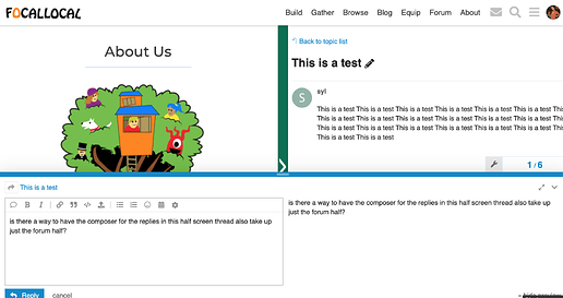
is there a way to have the composer for the replies in this half screen thread also take up just the forum half? as opposed to the entire bottom screen?
@syl the composer being full screen is new. What were the thoughts behind making it full screen? is it better for mobile, or you want users to be able to see the preview? or is it a setting we can edit?
@danyalamriben can you explain the reasons behind wanting it half screen from a UX perspective?
@syl the composer being full screen is new. What were the thoughts behind making it full screen? is it better for mobile, or you want users to be able to see the preview? or is it a setting we can edit?
@danyalamriben can you explain the reasons behind wanting it half screen from a UX perspective?
@AndyatFocallocal, I didn’t change anything: the composer has always been full-width discourse-wise. What has changed is that Disourse used to be displayed in an half-width iframe on the right, whereas now discourse is being displayed full-width. Hence the difference in user experience.
I definitely agree having the composer half-width would be better. I’ve already spent some time trying to style it this way, but I haven’t succeeded. If you got some CSS Guru, they can try. It’s not really Docuss-related, just standard discourse styling. Notice however that the composer is a painful beast.
(Replace this first paragraph
