Add into pages links similar in style to the photos, videos and stories on the template site here: http://www.docuss.org/docuss/lastev
into pages on this map: https://publichappinessmovement.com/docuss/m_gather
Add into pages links similar in style to the photos, videos and stories on the template site here: http://www.docuss.org/docuss/lastev
into pages on this map: https://publichappinessmovement.com/docuss/m_gather
This relates to each event individual event page, and would replace the V1 look and feel, where balloons were split into sections, with the moustachio style? (if so, I agree, it looks cleaner and doesn’t take up as much space)
yes, exactly. the balloons didn’t cut it. I’m sure the UX team will have their own opinions when they get there, but right now it’s clearly the correct solution.
They should retain the bubble which shows when there are posts and tells users how many posts there are.
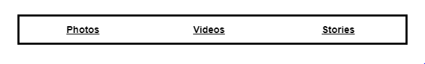
Created the buttons to look like the below. Same round topic counter as before. Will push onto live site tonight.
that’s cool, although they don’t appear to be more important than the ‘map’ link in that same image now. in the example site the box around them made it more prominent:
the header would need to change to something like:
‘Community Actions’
Danny can help with wording. @danyalamriben this is in pages on the map and we want users to engage with what’s happening on the page. right now that could be: and activity, user, or community.
obviously we need to break those into three different pages to allow customisation which is specific to each of the three
@ArtyS these buttons
They just make the links stand out much better
Community actions or event feed?
(I’m unclear on which it is)
Community activity. Comment icon with number of posts, camera icon, video icon, heart icons. Make it look as close as possible to the recognizable many other social community platforms so there’s no guessing.
The docus link stinks in my opinion. Share your experience makes me think I’m headed into a contact us comment card or something.
Can we have it labeled: “event activity feed” with an arrow that takes you to the expanded feed and posting options but most importantly contains a small thumbnail gallery of posts/images? And empty state can say “no one has shared any memories yet, help the team start their collection!” With a + icon?
We had icons before. I felt the ones in this example page were smoother when using the site. Not that its a firm decision, this is just me getting the new platform operational.
We had a different thread for photos, videos, a wall for discussion, and feedback from users
(the last one being because the pages currently serve for both users and activities posted on the map, and if someone was using the platform in the wrong way, there needs to be a feedback mechanism so its noticed. like Couchsurfing asks is users had a positive or negative experience after meeting someone)
why was it a different thread?
After an activity users will want to see each others photos and videos. If they post them in the main thread they’ll be cluttered in between chatter about the event, so there is no option to quickly scroll through pictures, or videos of the activity.
It also gives us the ability to explain to users that they have to post links to images and videos, not to upload them directly, which there’s no way we could afford to host.
It’s quite nice to have those options, and see in the notification bubble stats for how many have been posted too. I’d enjoy that as a user: ‘oh cool there are 47 photos here’