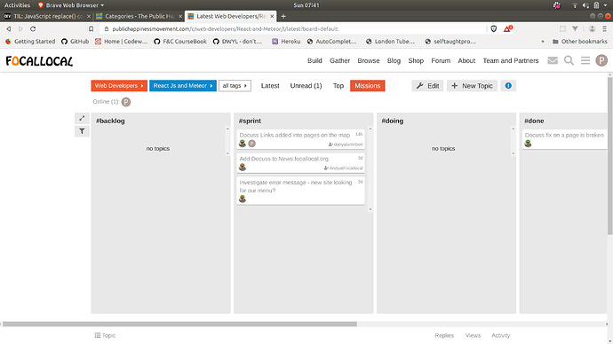
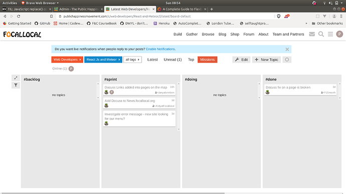
I think this is replicated from the margin when in normal mode which is there to center the forum box… will see if I can play around with the plugin CSS to remove it in Kanban mode.
I tweaked the kanban css slightly to (in my opinion) improve the alignment:
Here are the changes I made to the kanban css (keeping a record of it, as it’s something that will keep reverting every time you update the component if they release any updates):
.kanban-spacer{
		display:flex;
		flex-direction: column;
		align-items: flex-end;
// 		Min width changed and rest commented out by Arty to fix left hand margin:
		min-width: 100px;
// 		min-width: 50px;
// 		width: calc((100vw - #{$large-width})/2 - 4px);
// 		flex-shrink: 0;
		padding: 0;
		margin: 0;

		button{
			margin-bottom:4px;
		}
	}

.discourse-kanban-container{
    justify-content: flex-start!important; // <-- added by Arty to remove forced left margin
}
That looks much better @ArtyS, awesome ![]()
Want to add a line to that which hides the ‘unassigned’ column too?
Sorry, I mean ‘untagged’
Ok I’ve done it - and it does the trick for the moment - but we should keep in mind it’s very “fragile”. Problem is the author doesn’t assign any identifiable html class name or id to the cards on the page, so I kinda fudged it by selecting “the before-last div inside the container”; as the last div is just a blank spacer, this ends up hiding the Untagged card. If he/she changes the logic in the future we’ll need to update this too. (I wanted to select by innerText=“Untagged” but turns out css doesn’t support this yet apparently which is a bummer)
.discourse-kanban-container {
    div:nth-last-of-type(2) {
        &.discourse-kanban-list {
            display: none!important;
        }
    }
}
EDIT: as of latest version, this tweak is no longer necessary
if that will improve the plugin and your ability to customise it, add it to the ‘backlog’ section in the ‘missions’ section in this category (…or fix it)

