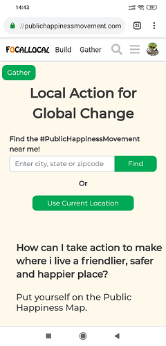
This button doesn’t make sense here anymore, and we don’t have any button on the map to post gatherings as this is in the hidden menu
It would be a good idea to ask the @UX team for advice on how to maximise its effectiveness.
This is the button users push to post a gathering onto the map for others to join.
Note the form has two purposes right now which need to be divided up and placed individually. Right now the form is also for:
- users posting themselves onto the map so others can contact them to suggest something public happiness related. (It’s suggested this will be the default action when users fill in their profile)
Can we make this one the number one priority please @arty a user contacted me today upset that they couldn’t create a gathering on our map
@AndyatFocallocal moved the button onto the map page only, now displaying on the top right - I don’t know if perhaps we should also change the button text as we also have the navbar “gather” button which is called the same but does something different.
Yes, I think we should. @danyalamriben, the issue is that the section and action of posting an activity are both called ‘gather’.
What do you think?
@ArtyS i’ll move this one into done as it is done, and @danyalamriben i’ll create a new issue for renaming that button in the UX thread. the text should be editable in i18n anyway so i’ll be able to update it myself once we agree on wording
this entire sentence confuses me…
- gather section
- gather action
is this correct?
Yes. The maps section is called gather. To post a new activity onto the map, the button is also called gather - which is obviously a bad idea
