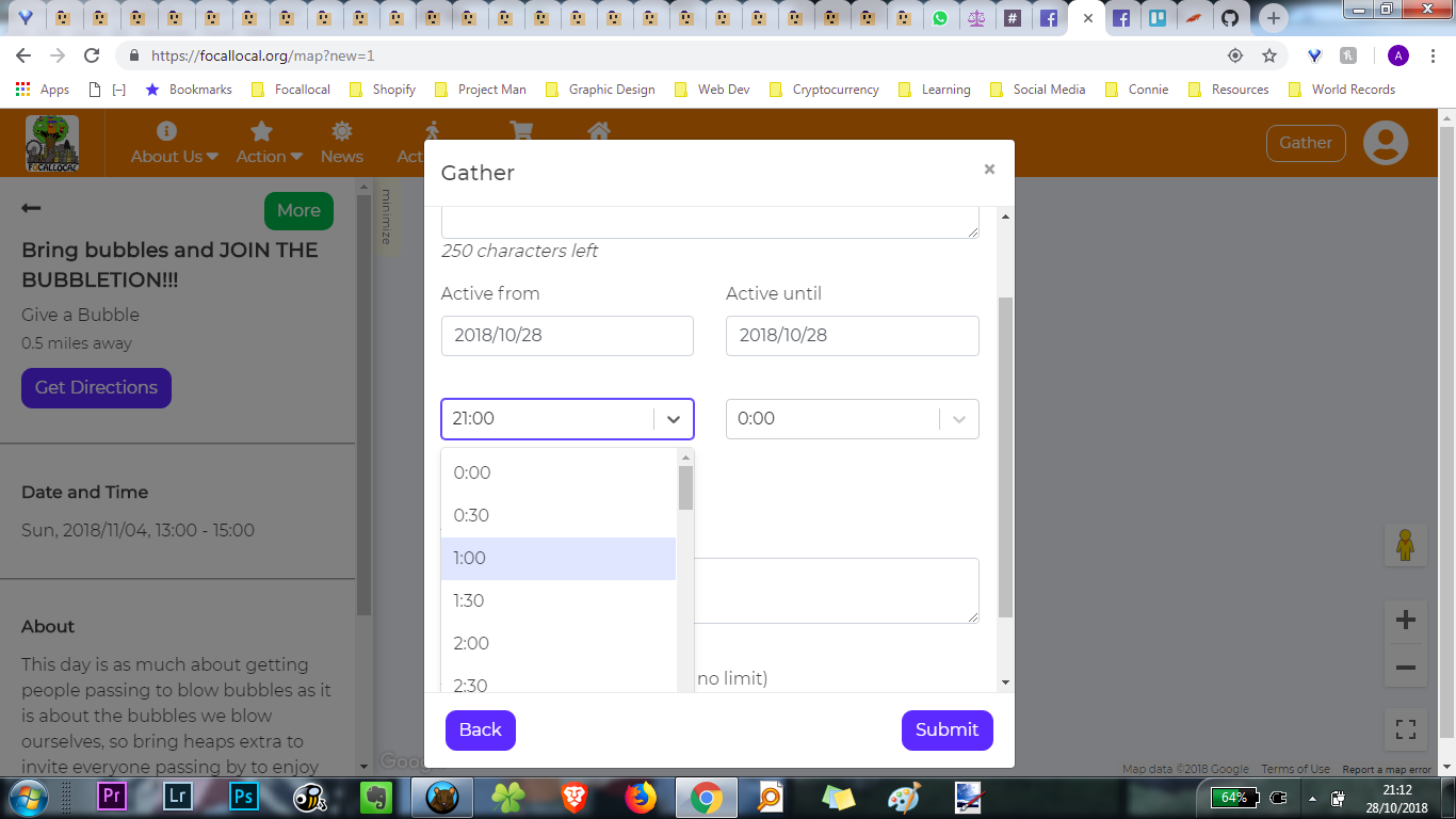
The hour picker is too long of a list, users are inconvenienced by having to scroll so far down
Hello Andy,
I would like to work on this one ![]()
1 Like
That’s a cool one. Go for it ![]()
Click ‘tasks’ and move it into the ‘doing’ queue
I will be looking for a component that can be used the way you expect ![]()
@AndyatFocallocal so, I can’t find a time picker that works the same way as you suggested. So I picked two options, which I will be linking here:
-
This one looks more like the layout we already have, it’s simpler and you won’t have as much scroll like the one we are already using.
-
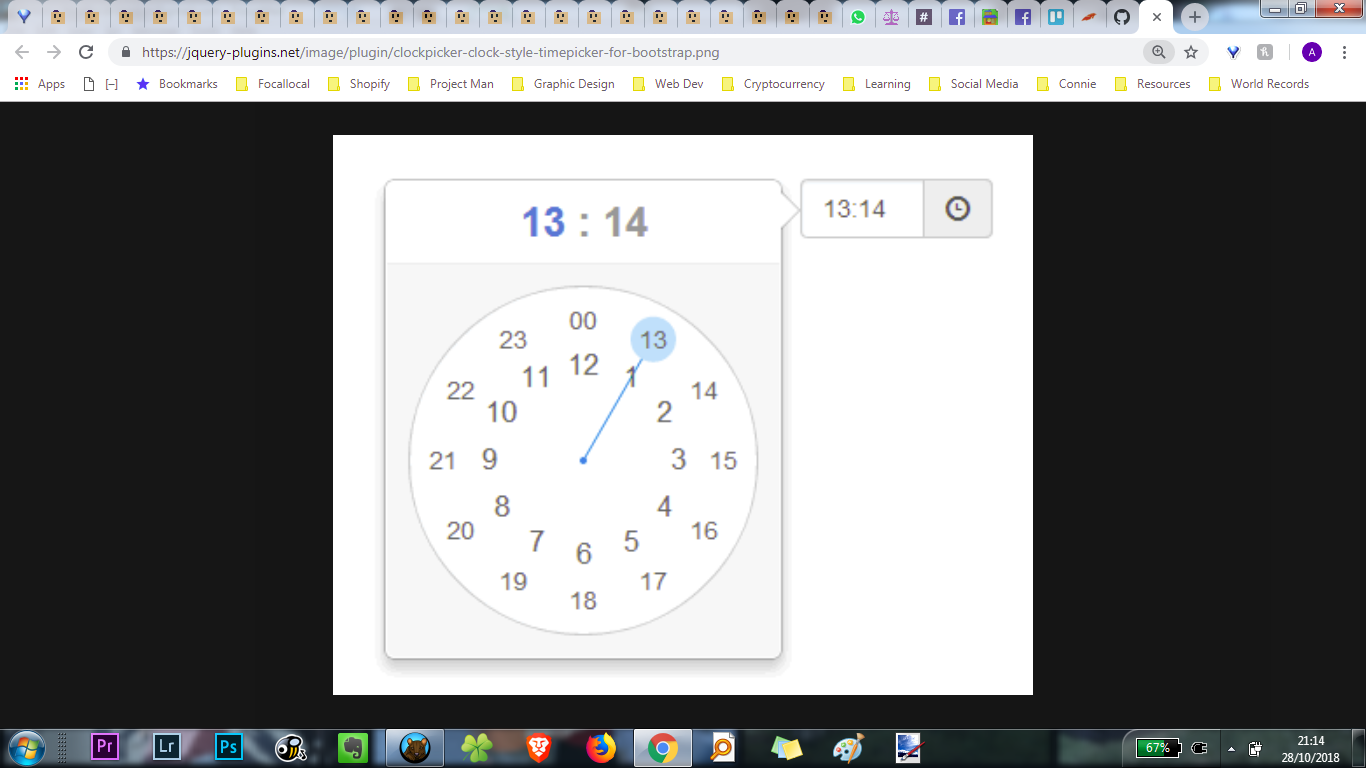
This one has a clock-like picker, but the problem is that it uses Material Design, which is not the current style we use in the platform.
I know it would be nice to have a clock-like one, but considering that the platform has its style, I believe the first one looks more cohesive. Please let me know your thoughts about it.
1 Like
I find the 2nd quicker and more enjoyable to use. Are there any technical issues created, or is it just a style change which is normally frowned upon?
@UXers what do you think between the two?
Yes, me too! I’m sorry to say that, but I confess I found this modal a little bit messy in the second part. Too much information, mainly when you select one of these two options:
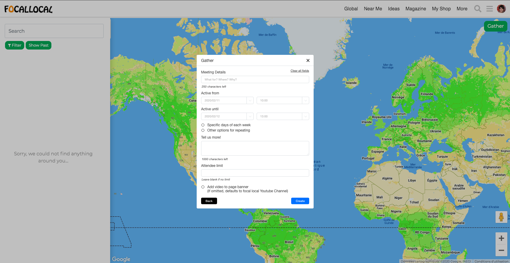
- Specific days of each week
- Other options for repeating
And, to be honest, I don’t think it’s a good idea do add an external component that looks totally different from the rest of the interface, just because it looks nice. It makes sense when you want to achieve good usability for the functionality itself, but it runs the whole. And I don’t think I could implement a clock-like picker from scratch right now.
I know that sometimes the functionality comes first, but it would be nice if someone could do a new UX flow for this part, too.
But, in my opinion, the first option would be enough for the shortcoming. If you want to have something fancier, I’d suggest a new UX flow for the gather modal.
1 Like
It would be good to have a new UX flow.
We have discussed separating that form into 3 forms which will reduce some of the options.
Phm/Btm
- Post an activity/post a free resource you’ve found
- Post yourself on the map/post something kind you can do you help
- Post your group onto the map/Post a charity who will help people who are homeless
I get it, that sounds great!
While we still don’t have this new UX flow, would it be okay to use the 1st date picker?
I suggest that, if we are going to work on a new form, we could try to use more about this Material Design library. The only downside is that we would have to change fields in some other parts of the platform too. But I personally think that it would enrich the product!
We did have material design on our main menu, I guess someone rebuilt that.
I’ll let you decide based on how much work is involved with each, given that the 1st one will probably be done again in the near future.
So if the 1st is a quick task then go with it. If it’ll take a while then it’s probably better to do the job just once
Great! So, the first one is quicker to implement than the second one.
So I will use the first one for now, and once the @UXers draw the new UX flow for the form, we can implement a new form taking advantage of the components from this lib https://react-md.mlaursen.com/
It’s late here and I am going to sleep. If I find some time during the week, I will try to finish this task.
Thank you, @AndyatFocallocal
1 Like
Awesome. Thanks for your efforts today ![]()
Hello!
I may be able to help here, I’m working on a new form for my company and I think I’ve studied all the research and academic literature there is about forms ![]()
Could you just tell me where I can see this functionality?
1 Like
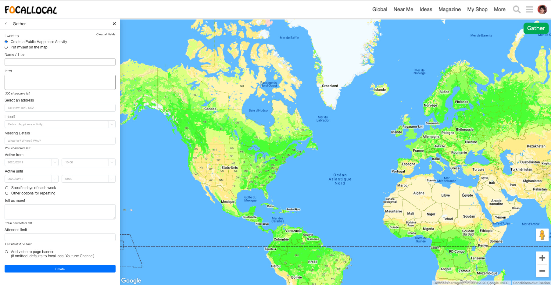
Great timing. The most recent version is in publichappinessmovement.com. click gather on the map to view it.
Given that you are possibly a leading expert on forms right now feel welcome to take over responsibility for Improving that area of the site
Perhaps you guys could bounce ideas off each other
So, I’m trying to use the first plugin here to handle the time picker. However, when I select a time, the form automatically refreshes the page. I tried to use events like stopPropagation() and preventDefault() but they just don’t work as I expected.
When I went deeper into the code, I found out that it is more complex to understand than I presumed. I don’t know if it should be this complex, or if I am only unskilled. But I just cannot understand how it works. The code was written two years ago, and probably those who wrote them have more experience with React than I do.
As you and @Mateo have been discussing about a new UX flow for the form, I wonder if this shouldn’t be the time to implement it. Because I think it would take me too much time to understand what they did with this form. I am sorry for not being helpful this time.
1 Like
You were helpful. You understand more about our code in that area than anyone actively coding now. @ArtyS has worked on them and is available to answer questions. (Not sure he’s got our app installed so might be a while before he sees this though).
Hello again,
I have questions ![]()
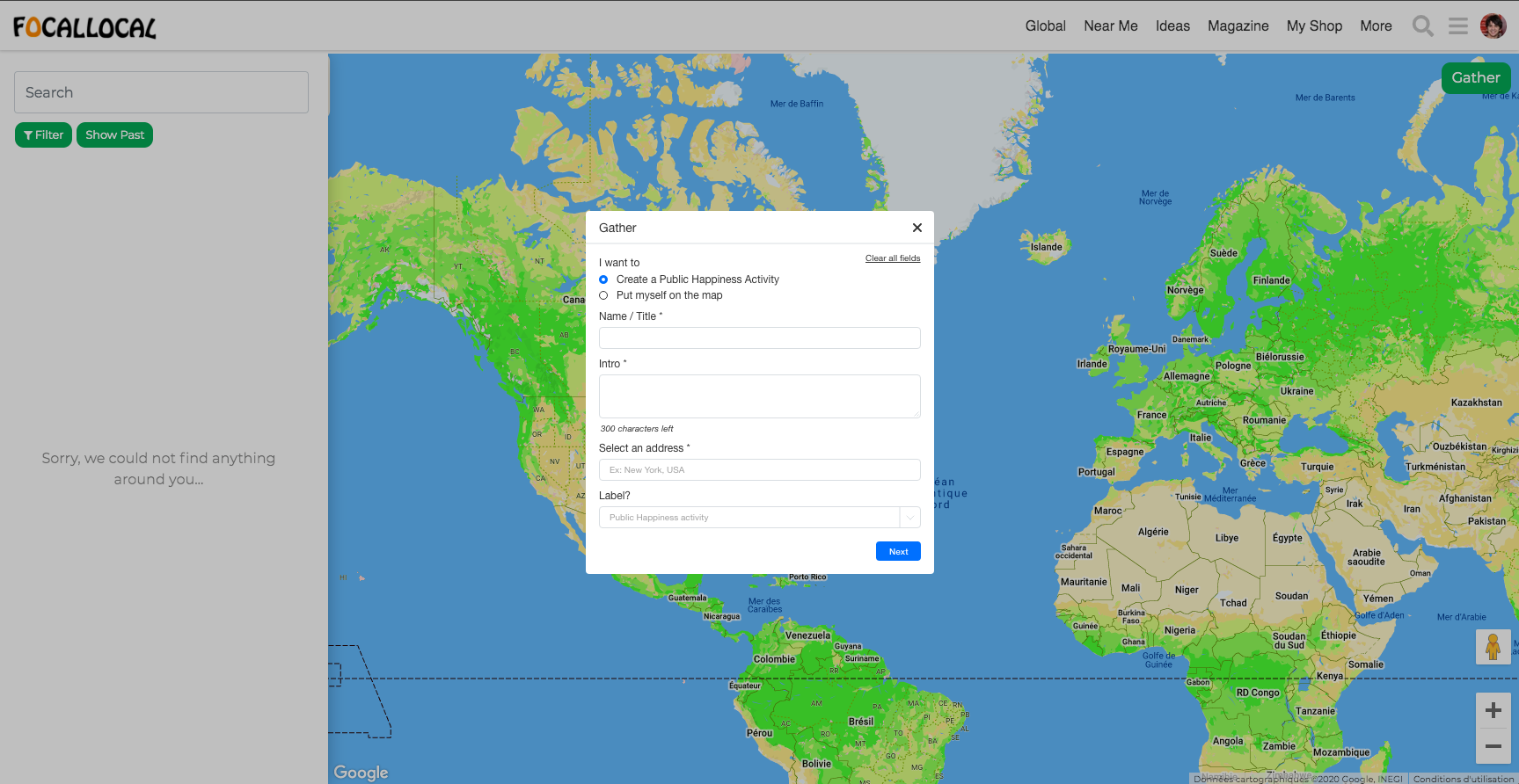
- Do you think we could make the “Gather” button more visible? I didn’t see it at first and it seems to be the second most important thing after “Joining an event”, no? Maybe all actions should be on the white column on the right.
- Could we have the whole form on the right side in the white column? (see example after)
- What is the purpose of the “Put myself on the map” functionality? Do you think we may separate those things as all the other fields don’t relate?
- What is the last field about in the first page of the form? There is no label.
- What is the size of the border radius on buttons and fields? (so my design is similar)
Things I added / modified
a. Made the “Clear all field” button more visible.
b. Added an asterisk to obligatory fields.
c. Took out the “magnifying glass” icon that doesn’t do anything.
d. Added a label for the last field of the first screen.
e. I’ll move the time of the event on the right side of the day, and then the end time and end hour on another line (so we read on a Z pattern)
f. Can make the “Until” fields
g. For the time thing, I would leave a blank field and it show different things depending on what the user inputs. If I enter a 1 for example, I see [10:00;10:15;10:30…] on the dropdown, If I add a 2, I see [12:00;12:15;12:30…].
To-do
I Design error states and clear messages
II Design dropdowns and auto-focus elements
III Design “Specific days of each week” and “other options for repeating” options
Here are the example with the pop-up and the column layouts
4 Likes
Wow, that’s some excellent work!
I’ve changed to numbers/letters/numerals to make replying easier
1 Like