Hello again,
I have questions ![]()
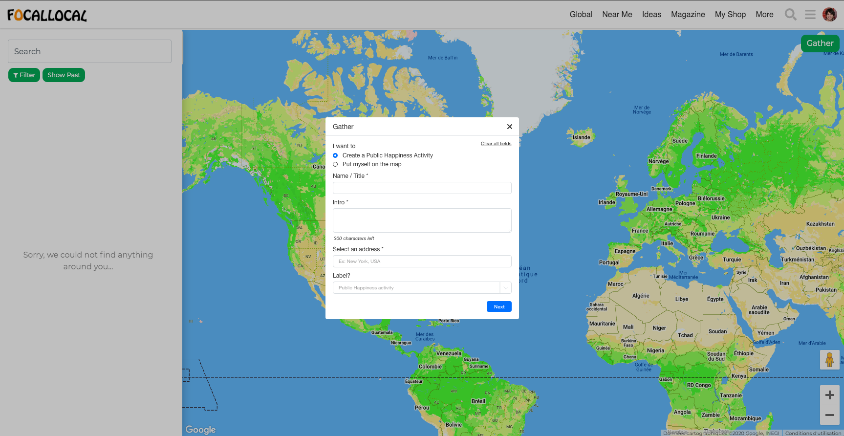
- Do you think we could make the “Gather” button more visible? I didn’t see it at first and it seems to be the second most important thing after “Joining an event”, no? Maybe all actions should be on the white column on the right.
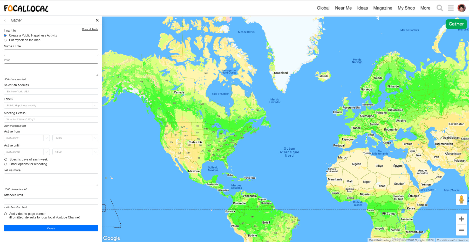
- Could we have the whole form on the right side in the white column? (see example after)
- What is the purpose of the “Put myself on the map” functionality? Do you think we may separate those things as all the other fields don’t relate?
- What is the last field about in the first page of the form? There is no label.
- What is the size of the border radius on buttons and fields? (so my design is similar)
Things I added / modified
a. Made the “Clear all field” button more visible.
b. Added an asterisk to obligatory fields.
c. Took out the “magnifying glass” icon that doesn’t do anything.
d. Added a label for the last field of the first screen.
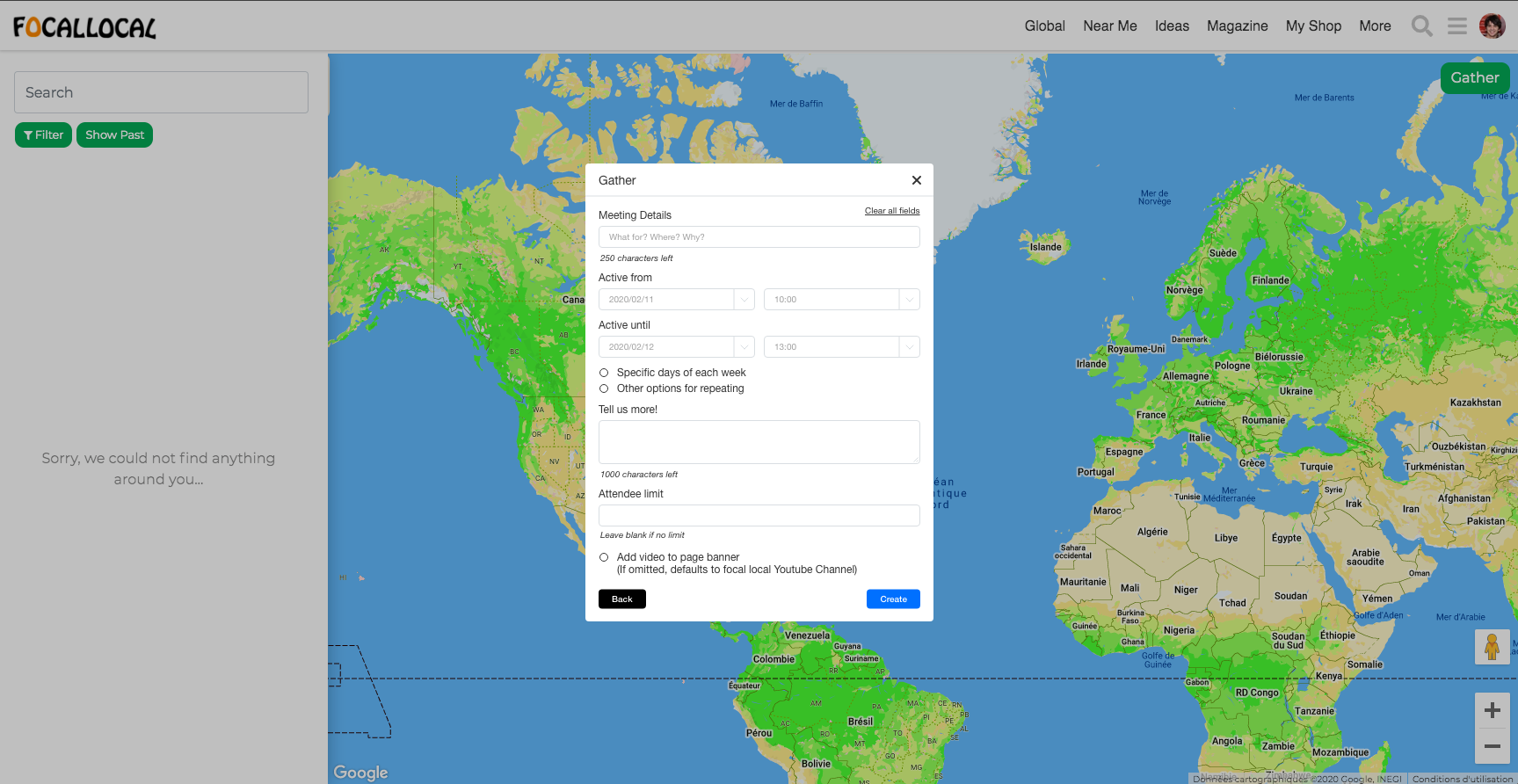
e. I’ll move the time of the event on the right side of the day, and then the end time and end hour on another line (so we read on a Z pattern)
f. Can make the “Until” fields
g. For the time thing, I would leave a blank field and it show different things depending on what the user inputs. If I enter a 1 for example, I see [10:00;10:15;10:30…] on the dropdown, If I add a 2, I see [12:00;12:15;12:30…].
To-do
I Design error states and clear messages
II Design dropdowns and auto-focus elements
III Design “Specific days of each week” and “other options for repeating” options
Here are the example with the pop-up and the column layouts