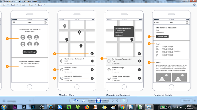
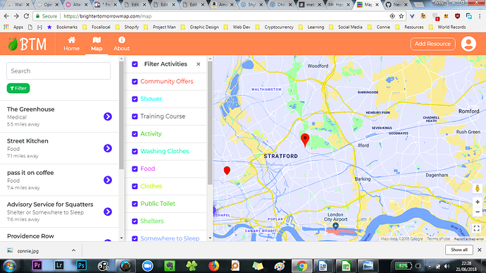
We’re adding stars next to all resources in the ‘community resource’ category to make them stand out as they are the the main thing we are doing to try and change homelessness.
you can see it in the two map view images in this image. I actually think the star should be in front of the name rather tan after it as that stands out more.
To explain to users what a star means please also add a star in front of the category itself in the filter list

