A modified replica of the planned forum (Global) pages, created as a splash landing page which shows users an active community building positive change.
Our culture is both:
- professional and serious about our mission and causes
- fun, colourful and cool
Fitting both of those into the homepage is a challenge. I suggest focusing mostly on (1) by presenting stats showing the current progress and activity, allowing photos videos, our logo and subtle details explain to the user that the platform is also (2)
The homepage is built in Reactjs. It copies the style of the other pages but requires slightly different operating parameters so a stand alone page is better. This also allows minor details to be added to display the fun aspect of our culture.
Note: You don’t have to code the header which is added automatically via our Discourse hookup.
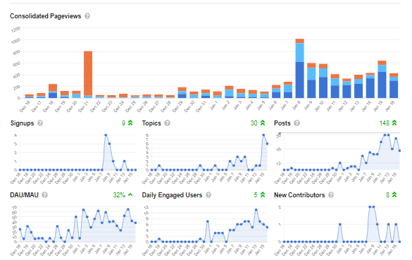
All stats/charts can be pulled from Discourse with a single api hook
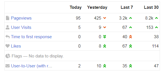
Basic forum stats:
These stats are in at /admin, in the general section and available via Discourse Api.
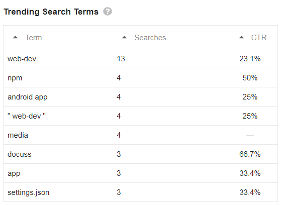
More stats to include
There would be no search bar in the banner of this page (as we have two different search functions, one for global and one for local)
The floating footer has three different options. ‘About’ ‘Join’ ‘Community Values’. The URL for these can be found in the burger menu, join being the create account page.
Note: logged in users will arrive at their profile page instead, so this page is for new visitors mostly. Logged in users can navigate here directly.


