I’m replying to your DM here @aeglobal so others can join in the discussion if they’d like. It would be great if you could copy the DM you sent me here.
The way everything moves looks very satisfying, i really enjoy watching it. I guess my question is what is the aim with the animation?
- Is it an intro to encourage people to join the Movement and download the app? If so its good, it would be nice to guide them around some areas of the site and give an idea of what they can do there. Like the more active tag-pages right now, then the near me and ideas sections. Possibly also i can give you admin access to show some stats as we plan to move those into the front so users can see them
- Is it aiming to show the platform as it is now? or the one we are building from the wireframe/mockup we made together. If so it should include the tag navigation search bar, the floating footer with action buttons for each page, and the stats i mentioned above
I would like it aimed as an intro to encourage people to join the Movement and download the app. I was planning to add more screens that would have either just have full text of what the animation will do before it starts each one or has the animation with the text. For example, the “Near Me” option. I can show different points on the map and have text to explain how people can meet up. I can conduct an A/B test with both to see what users would prefer when looking at the intro. I will go with the majority vote.
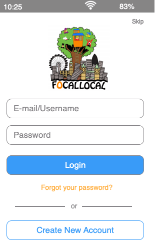
Here’s a preview of what it would look like. I still have more artboards to add and replace the one artboard that just had FocalLocal by itself. I just needed something to animate the page with so I could show the logout screen option. I couldn’t upload a whole video of it. So, I made two gifs of the login and creating new account. I will edit the post after I get the gifs from the other computer.
Login Option, Logout Screen, and Settings

Creating a New Account and Skip
1 Like
That honestly sounds amazing 
I would suggest adding in the features we are building like the stats, floating footer and tag navigation, as that would prevent it from being obsolete in a few months.
I think the wireframe is up to date but I’ll have a quick look and post some screenshots here of the key features we are bringing in
Oh, btw. The animation didn’t add to your comment properly
1 Like
Ok, thank you. I think the gifs have finally uploaded fully. So, I think the animations should work now.
1 Like
Apologies the site isn’t working great atm and you might meet an endless loading screen. From what i understand Discourse changed how their api’s were called without giving any warning to plugin developers, so some plugins are now broken. One of ours is and it just happens to prevent me accessing the plugins page so i can work out which one and turn it off. Tom’s on the case via the server. Right now using the search icon in the tool bar seems to be the most reliable way to navigate. If you want to see anything, like a kanban board or calendar, just ask and i’ll turn it back on. Hopefully it’ll all be back very soon 
@aeglobal The new-build overview is here: [Overview] New Forum Build
A visual mock-up is here, where there are small differences, for example, the text in a button, please favour the forum post ahead of the mockup as it has been updated more recently
Each step has an individual thread for it in the new-build tag.
My recommendation would be to animate these features which are not yet complete:
-
Tag-banners. This is easy, just use the category banners which already exist as they will be identical. Basically navigate using categories now, but so the viewer thinks they are seeing navigation via tags and tag-intersections.
-
Events plugin and Kanban boards. These are working on Categories already so just make the user think they are searching tags
-
Floating footer
-
Voting: Again this is already working on the categories so just show the user those and make it appear to be in the tag-pages. The explainer text probably should as briefly as possible reference ‘reputation weighted decentralised governance’, decide how your teams evolve and tackle tasks
-
User Stats. These stats exist already so this is easy
Public Happiness username /summary
-
Platform stats sidebar on the home page: These stats are currently in the admin section
-
Individual tag-page stats. These don’t exist yet, but can be seen in the mock up. I would suggest re-purposing some diagrams from the platform stats.
-
Probably the most important one for the animation, the tag-search bar. Sitting in the banner at the top of each forum page, under our menu. I expect this will be one of the 1st things you’ll want to show users.
They type in a skill, cause or topic they are interested in. A dropdown below the search bar then shows them the most commonly associated tags with the tag they entered (excluding backlog, doing, sprint and done), and a prompt invites users to type or click another tag to make the search more specific. For example: Homelessness + Social Media. Happiness + Documentation.
excluded: Central Tag Navigation boxes. This might be a big task to animate and is a big task to build. I suggest adding it into the animation later. I also want more UX feedback as i think it might be unnecessary, if the tag search bar is powerful enough.
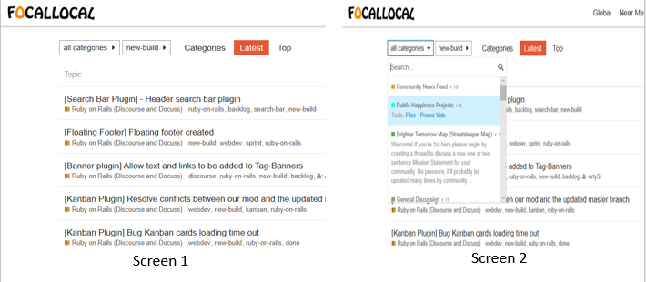
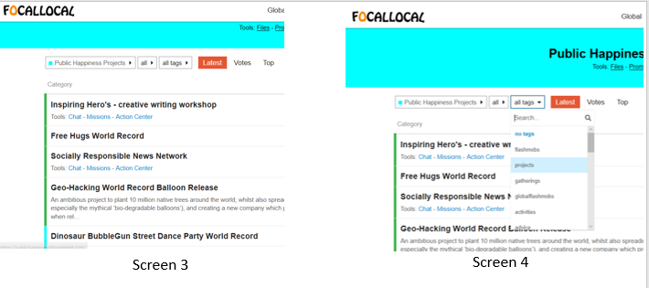
Would 1) be like the screenshot draft that I have below? I want to make sure I am on the right track before I start making the screens and animating them. I took screenshots while on my desktop. The mobile version will be different once I see what fits on the screen. There is going to be a screen 5 to show what happens after a user clicks on projects.
I’m not sure those four are showing off the features of our platform so effectively. I find it pretty easy when someone is with me to walk them through the platform and how to use it. Would it help if i do a screen capture of me doing that on my phone, and record an audio voice over?
Then you can animate that journey and any introduction text to explain to users whats going on.
1 Like
As a few of the key features like the search bar being in the banner and the floating footer won’t exist yet we can put a small banner at the top of the live platform informing users that the platform is still under construction.
I can turn on the components and record or screenshot them if that’ll help. the only one we don’t have operating (just not on tags) is the floating footer
Yes, I think that would be very helpful to screen capture. Sorry I’m just seeing this. I never got an email that you replied.