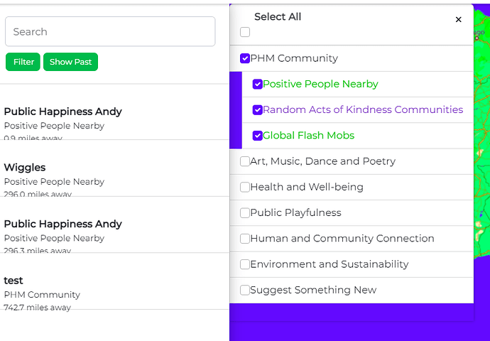
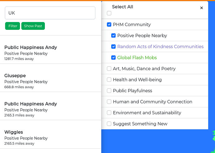
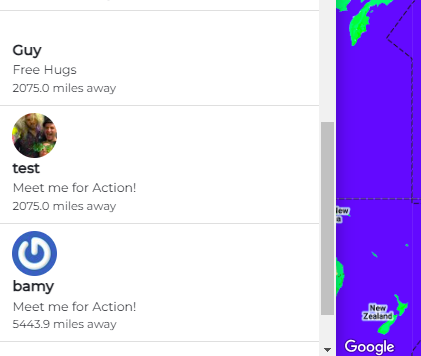
The text in the sidebar has become misaligned. Select All is also misaligned. Please fix them.
@targatonica great work. Its best to communicate on tasks in the task here so others can see its being worked on.
I’ll move this into the done column in anticipation of pushing this bug fix live.
Hi, okay so I will communicate next steps in here.
So the sidebar text alignment can be fixed by making change of:
.event-list-item {
border-left: 0;
border-radius: 0 !important;
border-right: 0;
max-height: 90px; → fit-content;
min-height: 90px;
position: relative;
}
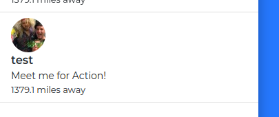
But I am not sure how the user foto should be displayed when the event is created, now it looks like this:
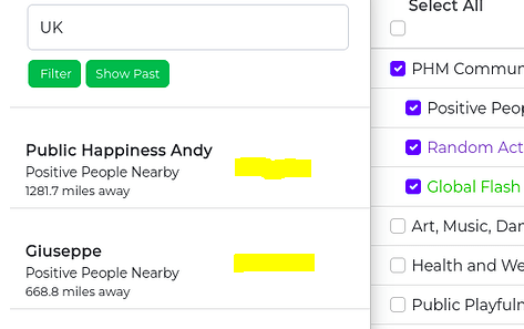
I also fixed filter elements alignment.
Is it okay like this?
Sorry @targatonica, not sure how i missed your reply.
Images should be here:
Can you make a PR with your edits please to our Git: GitHub - focallocal/fl-maps: The Public Happiness Movement: A platform bringing people and communities together to solve any and all societal issues. BTM branch is a project aiming to solve world involuntary homelessness. PHM brings communities together to create social initiatives for kindness and well-being.
Great work @targatonica. On my screen it looks like the spacing could still use a little teak so the text element is centred vertically between the lines. Perhaps that will fix itself when the users avatar is moved to the right of the text (or left if you prefer).
