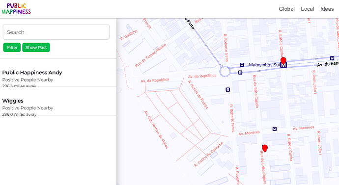
When i hover over a dot on the map it is supposed to show a popup with details of whats inside that dot, but it seems to be broken
Am i wrong in thinking it would actually be far cooler, and less redundant if instead hovering over an icon on the map added a highlight to which list item it is. For example in the image above the dot is ‘Wiggles’. If i hover over it maybe Wiggles in the list on the left can light up. If there are many posts in the list it would also need to scroll users to that list item.
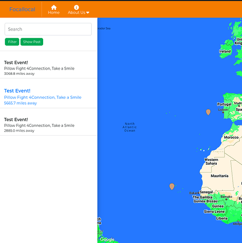
Hi, I implemented functionality when the dot is hovered the event block will light up like this:
And also when the event block is hovered it will change style(light up) and is also clickable.
1 Like
But right now it does not work with scrolling to event.
Now it’s working also with scroll to event when dot marker is hovered.
You mean the list on the right doesn’t scroll if there’s a lot in the list? If so i agree that would be good to include. Good progress on this task 
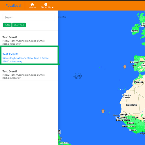
I think from a UX point of view we could make it even clearer if the outline of the list item also changed. Something like a Green outline to match the filter and show past buttons.
like this:
Although on second thoughts, i think the more standard method is to add slight shading and box shadow to make the edges appear to be pressed down so it looks 3D and shows its selected. Something like this but inverted: How to make a button looked like it's staying pressed down - DEV Community
Thanks 
Okay, I agree it will look better with slight shading, I will implement it.
And regarding the scroll if there’s a lot in the list - it’s fixed and now it works.
1 Like
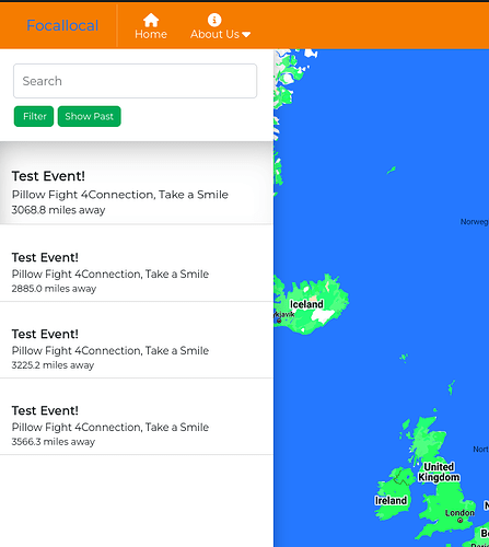
Now it look like this:
The font-size is little bit bigger and also ease transition is applied on shadow and font-size
2 Likes
Looks fabulous, well done
2 Likes


