Our hero image extends below the viewport on some screen sizes, which is bad UX.
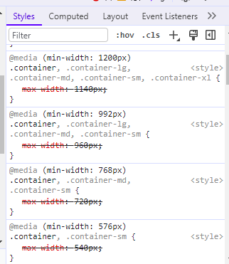
It appears to already have max-width CSS rules, but something is over-riding them. Please fix it so the image reduces its size (but stays centered) on some screen sizes so that the image never extends below the bottom of the screen.
Plain white, the page’s default colour, is fine to fill the now empty edges unless you have a better suggestion.
