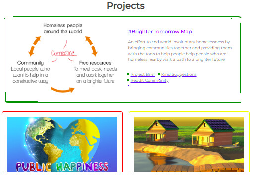
In the three sections on the homepage we’re going to make the 1st one an ‘About’ box and make it wider and shorter to break the page up a bit. The 1st box explains what each part of the site is and how to use it, which helps our UX.
Only the shape of the box and the positioning of the image and text needs to be changed. The text itself is already done.
It’ll look like this:
Hi, could I try to work on this?
1 Like
@targatonica That would be a great task to start with. You can assign the task to yourself with the ‘assign’ button at the bottom of the page. I’ll change the tag to ‘doing’ for you as drag and drop might not work for team members who’ve just joined.
Have you successfully got localhost running?
1 Like
@AndyatFocallocal Yes, I managed to get localhost running. Thanks 
1 Like
I just realised that we’re changing the width of the 1st box in each category so the about us information is different for the user. On mobile it’s already single row so there will be no change.
I’d like to add to this task a simple CSS change to fix that.
I suggest making the coloured border of each sections 1st box double it’s current width. If you’re skilled in UX and have a different preferred solution to make it stand out (for example maybe you think it’s better to slightly shade the background of the box… or doing both) you’re welcome to make it stand out a little more to the user using your own solution.