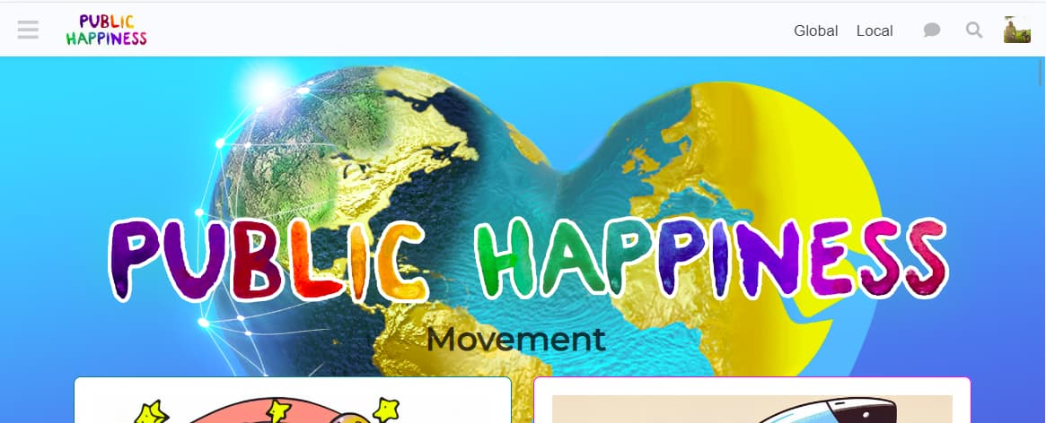
The card sections on the homepage and the hero banner do not align correctly on desktop devices.
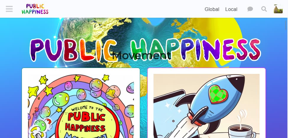
Please fix this. If you want to separate the earth background from the ‘public happiness’ text i can pull the layers apart in a .psd and send them separately
The desired final result should look have the two text elements and cards below them aligned like this on all non-mobile devices. The text Public Happiness should begin around halfway down the image, but it doesn’t matter if it moves up or down by 10-20% of the image as it adapts to different screen sizes.