Here’s current PHM homepage which we’ll be using as a base and redesigning with more focus on community.
You’ll see that all the text and links are called via i18n, so the code for both homepages can be the same but with different text, images and links.
-
fl-maps/imports/client/ui/pages/Home at master · focallocal/fl-maps · GitHub
Recently updated files are the active ones. Some others are code from the old page and will be removed and reorganised. -
fl-maps/imports/both/i18n/en/phm/home.json at master · focallocal/fl-maps · GitHub
There’s also a lot of old text that should be stripped out (commenting out doesn’t work in i18n) and doesn’t connect to anything any more.
You can read about how we use i18n in our Documentation section. The PHM and BTM homepage will be identical when complete except for the content added via i18n.
Here’s the redesigned one we made for the EU project, which is too formal but does have some improvements: https://www.figma.com/design/0KEEAt6XSI0gLrK4TpZGYu/DPP-wireframes?node-id=10-7&t=Ljpfam0RgXN2NWIK-1
My initial thoughts are that:
-
The Figma design has a much more compact ‘getting started’ section, since that’s not exciting and users who want to read it will click the links anyway so they don’t need to be enticing or exciting. I think we should tuck the current ‘Getting Started’ box on the PHM homepage at the top under the hero slider, and a little out of line to match the figma design, so it’s more visible and taking less real estate on the page. Its a bit dull so ours should be a bit smaller than the example as that was for a boring government website, we want users to know its there but not focus on it.
-
We have to think about what to put in the hero image slider for BTM. What would appeal to people who are homeless and also those who want to help them. I think between 3 and 5 slides showing activities that can be done on the platform to help people who are homeless nearby, with the title and subtitle explaining what and why they would want to do that activity.
-
Perhaps the square boxes of floating content are a bit boring. The figma design uses different sizes and shapes to be more interesting. We have the big space in between the boxes so users can see the background image as they scroll. That’s cool (for me anyway) and we have a fun background image already for BTM too. So the same design idea but with different sized and shaped boxes in each section. The Figma example has these sections underneath the getting started section:
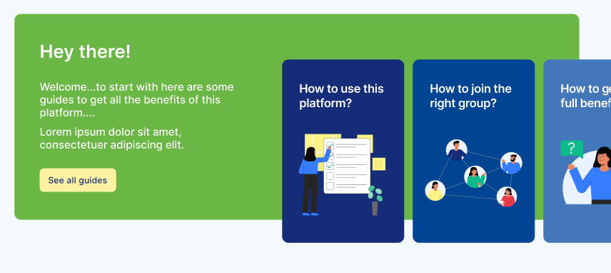
- Two wide boxes across both columns
- Two columns with 3 boxes each vertically inside making two sections
- Then 3 equal boxes in 3 columns, for most recent user stories
The design looks good and has plenty of space between boxes (cards) for our background image to be seen. We can change the number of boxes (cards) but we might not need to.
-
Each section has a link top right linking to where the content comes from ‘see all ….’. We should implement that as it’s more organised than our current links below.
-
The community feel should come from dynamically pulling content from the Discourse forum and Map, showing users articles and the resources they post to make them feel central to the platform. Maybe we could also embed a Discourse leaderboard for top users in recent activity (those are available in Discourse to embed on external sites). Most hearts received recently would be a good one, to show the users helping others in the community the most.
-
The PHM homepage uses some AI generated images. We do not want to go that way. It was cool and new at the time, but given our focus is on people and localism (local action for global change) some users will be put off by AI generated images. We’ll try to find or have some good images created for us.
-
‘Featured Open Calls’ would be a good place to put the current ‘missions’ which are activities we most want users to contribute to. For example on BTM this would be cities where someone has asked for help and we are collectively finding and posting free resources on the map.
-
The figma file’s colour scheme is a bit serious and dull for our use case. PHM’s colour scheme is pretty much on-brand. BTM used yellows and oranges in the past, though i’m not sure that’s the best colour palette. How about this:
