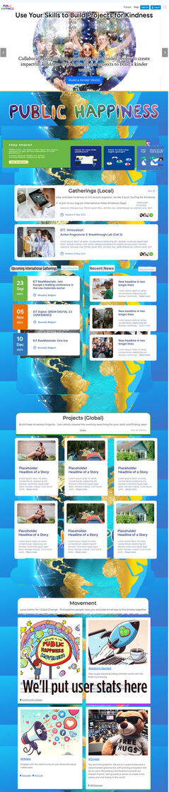
Not a perfect wireframe but i hope it conveys the concept well enough.
The key advantage of this change is that it allows us to prioritise information and pathways, where on the current page it all looks of equal importance to users. Also removing the links overload we currently have which was me ADHD’ing the design, but not what users are going to want.
@Marvelxy the only changes you need to do are:
- Change the shape and positioning of our existing homepage boxes to match. No need to change the style or any CSS elements. Just the shape
- Add the ‘see more’ button at the top right of each, and remove the links in our existing boxes. The see more button is now the only link in each card. I think the whole card should be clickable though?!
- Add the 'getting started section at the top. The new version is both more visible, and also easier for users to skip past and ignore if they aren’t looking for a getting started guide (don’t stress about the colours or text. I’ll update it later).
The coloured edges we have to elements looks good. Keep those as they are and add to any new elements created. The spacing of sections isn’t good in the mock-up, i think the current spacing between sections looks good so lets keep that.
The text and content of the boxes are things i’ll work on after. It’ll be good to see exactly how much space i have to work with.
Our current site looks great on mobile, so the only change needed for mobile version is adding the new getting started section at the top.