Designing the Home Page for Non-logged in users

Resources:
New User Profile Page Planning
New Splash/Landing Page Planning

  • Log in/Sign up
  • telling people what is The public happiness Movement and why you’re doing what you’re doing.
  • At this point, users probably will be asking, what can I do? how can I contribute? So tell the user how they can take action. I think the map icon hints to the users that they will be using a map based platform.
  • lastly, the video can be used to show users what types of events they can organize or be a part of.

Note: I changed the name as we are beginning work towards a rebrand, with Focallocal becoming just one community on the platform

Update: Right now users are accessing the site, but not creating accounts. How can we change this? Should we make the site inaccessible until an account has been created?

https://discuss.focallocal.org/t/topic/120/65?u=andyatfocallocal

To sum up where we are now:

  1. We’ve agreed on a splash page with a simple signup/login bar in on the header image.
  2. We’ve agreed to a menu redesign keeping with our current colour scheme
  3. We need to find a solution for the ‘gather’ button as it is not clear to users what it does. Currently the main suggestion is to move it into an ‘actions’ section on users new home/profile page. This leaves a high real estate value space where an important function for users site-wide should be placed. We haven’t agreed what that should be yet.
  4. We’re discussing having the logged in homepage as a users profile page and need to design this page.

Here’s a quick wireframe i created to begin discussions, using a plugin/modular design to increase users feeling of ownership of the site. We’d ideally find an existing library of plugins, and then develop a few custom ones to cover what we think should be the default modules/plugins for users

oh, and we agreed both header images are terribly cheesy and need changed :wink:

1 Like

I love the ambition! For the homepage, I would propose we step back a squish and take a look at some opportunities. For a home page, it’s important to think about that quick amount of time to capture or loose a prospect. There should be a few questions asked and answered:

“Where am I?” - Quick visual ques to let a user know they are visiting us and not our competitors.
“Who are you?” - this is where we let a visitor know who we are as an organization
“What do you do?” - Can be answered with a value proposition
“Why am I here?” - Our mission or brand should answer that. This answers why a visitor is visiting our site and not anyone else’s.
“What can I do?” -This is giving a visitor a reason to visit us.

and the last one which we can discuss further after the previous questions are answered

“Where can I start?” - This turns a visitor into a user. This gives a visitor an opening to explore the site.

I think your awesome ambition could be placed into looking into a starting point.
One opportunity is taking a look into crafting a brand with a visual language that can be used to answer some of the above questions.

Another opportunity can be looking into gathering user persona stuff. This can be used across all projects towards the goal. It can help everyone reference for a sense of scope and direction in solving audience facing problems.

One more chance to explore problems is figuring out how can we organize the site in a way that is intuitive and easy to navigate

3 Likes

Lazy signup can help a visior understand the value of the platform. I think taking a look at how other companies have solved this problem. Maybe reinforcing our mission or show deep examples of how this works? (visual ques).

1 Like

I completely agree on the need to establish clearer navigation of the site as a whole. I’m still figuring out what is happening here on focal local (there’s a lot happening!) and I’m considering just recording my click through of the website as I think out loud. N of 1!!

It might help us find some major areas of opportunity with regards to simplifying our content and user flow.

It could also help become a starting place for some usability tests I could run with a few participants.

@AndyatFocallocal what are some tasks that you want a brand new user to be able to effortlessly carry out when they first click a link that brings them to focallocal.org?

3 Likes

I’m just adding @danyalamriben slack message here so it makes sense when I answer all your questions. I love the enthusiasm guys :slightly_smiling_face:

Diana
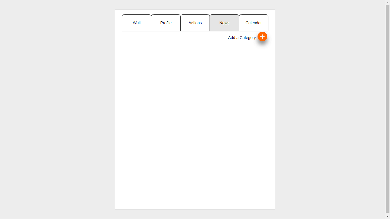
Is there a reason we are communicating through both slack and the community sidebar? Perhaps we could put a post redirecting people to “continue the discussion on our slack channel” and just link back to past threads on the old message board. I think it could confuse new folks as they hop back and forth and try to piece together a coherent understanding. Just a thought!

For the splash, I think before we mock up some design it might be valuable to clarify our users and goals for the site. @Alvin mentioned a visitor to the site… our goal is to convince them to sign up to the platform, right? Or am I misunderstanding the “gather” function?

I think with buttons, we should stick to a label that is clear, completely recognizable/follows average users’ mental models of what the button normally does (ex. I have no confusion about the “send” button in this slack message box. But if it said “tell,” I might not trust that it would do exactly what I want. Don’t trust, don’t click!) and does exactly what it says.

Understanding better what our goals for the site users are in high and ground levels should probably be a valuable tool to redesign the site flow and improve the experience for both new and experienced users.

I’ve been playing with the splash page.

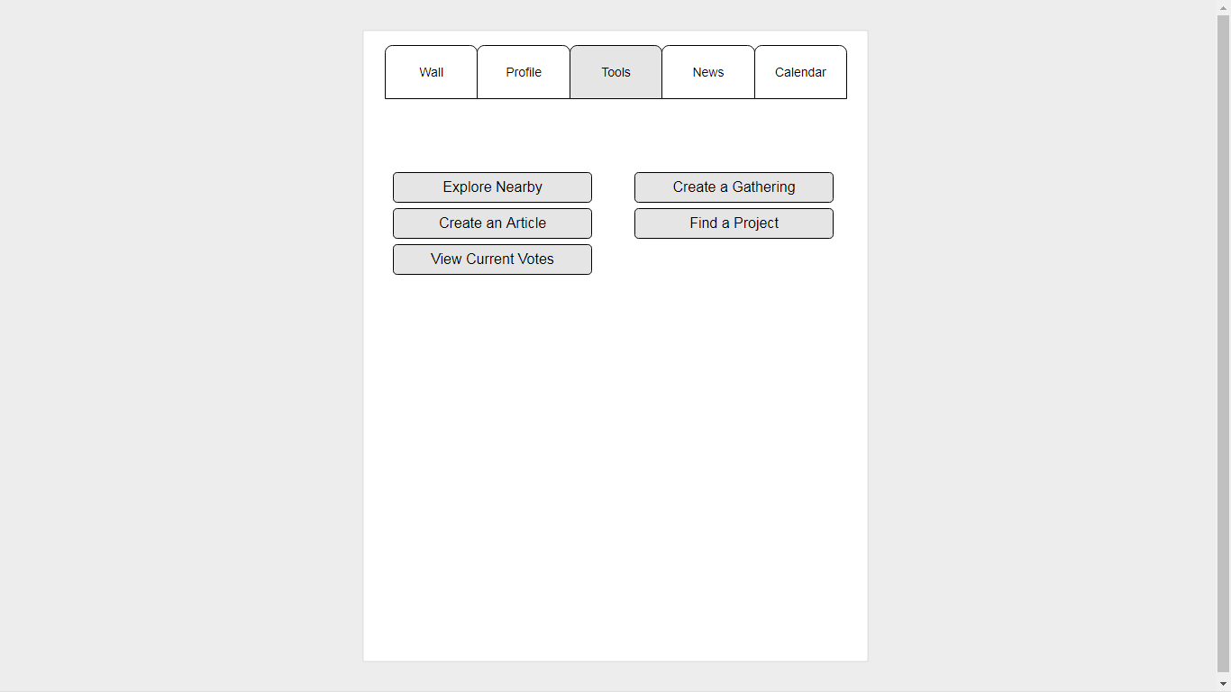
Right now, I’m resenting this gather button haha. It immediately asks for a large commitment- regardless of whether I am a new or existing user, it wants me to fill out a web form either organizing an event or crafting a personal profile/tag line as someone who wants to be placed on the map.

I’ve already logged in and filled out this form once, but it seems to not remember this.

Clicking the upper right profile silhouette only lets me “log out” :neutral_face:

…aha! Left hamburger menu! …maybe… actions? Maybe those will be less of a commitment than this “gather” aka “fill out your personal message and organize an event” button.

Action.focallocal.org… Wait, how many websites are there?

I think our splash page might be doing more harm than good. It can be the prettiest thing in the world, but without links and CTAs that gain trust in the site, I don’t think users will stay on the page for long. It’s a large investment for a user to take the time to learn how to get into the real website.

@andyatfocallocal do we have a hierarchy of pages for this site to understand better where we would be directing our users? As someone who is figuring this out from a perspective of both a helper and a “customer”/interested member of a cool community, I’m jonesing for a sitemap to help me understand how I can navigate this content.

1 Like

Great to see you diving in @danyalamriben, I’ll tackle your questions in order

  1. we are mid-switch to using our community forum as the primary communication method. Some of the web team are reluctant to leave Slack as they have it open all day at work, so they can participate and reply to questions as they come up, which adds value to the community.

We will shortly be syncing some threads here with the forum, so either can be used interchangeably. It’s not possible until we implement V2 of the sidebar though, which is likely to take a few more weeks. Sorry I know that’s confusing. I would prefer to use the community forum over Slack, as new site users will see an active community. Right now most of our communities energy is hidden from them.

  1. Desired actions from users when landing on the site. Plus site heirachy

We have different desired actions on each area of the site. We’ve been considering each sub domain as a separate site, while being part of a wider mission to bring more peace and well-being into the world.

  • Gather (our map). This is also currently our platforms primary page. We call them gatherings for legal reasons, and to promote the idea that everyone who comes is creating it, rather than just attending. This is the purpose for the ‘gather’ button, but it has never achieved its design purpose.

Main actions: to create or attend a public happiness activity nearby. Or to break that down further, to gather with other local users and create actions which increase well-being where they live

  • Action. A Microvolunteering suite where users can suggest, vote on and build larger projects. Project spaces are limited in number to focus energy on to completing a few, rather than starting many. The number of project spaces adapts to the number of users. This area is under heavy redevelopment. Note: It is Microvolunteering now, but will be rewarding users with points for each task in the future. Please consider this in designs

Proposed re-design thread

Main actions: Click the ‘Tasks’ tab in a tag-page on this forum > find a task they’d like to complete > move it into ‘doing’ > complete > move to ‘done’

  • Community News: A Wordpress site where users can create articles and tell their stories of positive social impact made through our community

Main actions: read, share and write

  • About a standard about page. This will probably be replaced by the new splash page

  • Shop: a Shopify store which sells apparel that carries our activities on passively. Like a shirt inviting people to share one minute of eye contact with them.

Main actions: purchase and post designs (right now I’ve repurposed it for an event, as it has no sales since we went skeleton to focus on the platform build anyway

  • Team: Members who achieve top ranking for their contributions to the eco-system (missions complete, activities created, likes in the forum, designs submitted to the shop, articles created, social media shares, and a few other things. to give a face to our communities leaders and something often used to support job applications. As the community is small during the rebuild is currently set to achieving 3 missions

Note. The resign requires having one set menu for all areas. Section specific functions should either be in a sub menu, or integrated into the page.

just saw this! adding my slack response:

-I should use the community forum (discuss.focallocal.org and/or selecting “community forum” sidebar from splash page) to communicate with you and teammates from here on out.

Is my understanding correct?

If so, I am wondering how you define the new user that you referred to in the design thread. Are you saying you want all new community members to see the development/site discussions that we are having?

I thought there was a distinction between users like you/I/other volunteers and our general user base of people that would participate in actions that promote positive social change. Are your target users all particularly computer/tech/web savvy?

I’d unfortunately agree with others sentiments towards slack just on account of my company servers blocking focallocal’s site, but that’s a personal problem that I can figure out, haha. It just will make the collaboration a bit more challenging but like I said I really am eager to work with this team, so it’s not a major issue!

I’d prefer here. All teams are open for anyone to join in. Although we designate channels for those lacking skills required to contribute. Like ‘site feedback’ instead of ‘user flow, UX ,ui’

We do have the other forum where we can sync the two ready to sync. Let me ask the guys implementing it if it’s possible now, or if we’d lose too much function on the site ( it’s heavily integrated into it and we need to recreate that on the new forum)

Thank you Andy! So I think it would be helpful to have an easy to understand, visual org of where we currently are. I would incorporate these large subdomains that you mention and their contained site maps and I would have this in the context of the whole ecosystem you have here.

If I begin to create a hierarchy of the project, would you be willing to help me by adding your feedback to help me have an accurate understanding of the current situation? It’s likely I will have incorrect understandings of the functions of a page or subdomain and I think a clear and correct view of the site will really help UI and UX designers assist!

1 Like

Yes, I would love to help you with that. I’ll be online/offline a bit today, but online most of tomorrow if I miss a reply

1 Like

We don’t have a full site map atm. I did create a basic one a while back. I’ll see if I can find it

1 Like
  1. the gather button sucks. It never worked correctly. I was thinking we should create a second form and make it a users profile. When users complete their profile the is an ‘add me to the map’ button below. This should increase users performing this task as it seems a default action.

Then the current form is just for creating activities on the map