Designing the Home Page for Non-logged in users

We need a new home page for logged in users. My thinking was that making it a profile page/wall (a bit like early FB had), would have these benefits:

  • Giving users a sense of ownership over the platform and their engagement with it
  • Giving stats to help gamify, track progress and stay engaged. for example their total contribution so far, local communities weekly public happiness creation level, the sites activity levels. We can then set challenges and contests around this.
  • Turning posting themselves onto the map into a default position by having them fill in their profile.
  • Opening up space for the community to create their own plugins/widgets, to allow individual creativity to flourish in addition to our collective user led decision making
  • Allowing users to customise their experience. Some users will want to be active mostly in building projects, others in the in-person gatherings. Some on specific skills teams (Design, web dev), others on learning courses like happiness, productivity, etc
1 Like

This in an invaluable contribution. UX isn’t just interaction design; we need to ask these questions first otherwise nothing else will make sense.

2 Likes

Any other questions I can answer that would benefit your understanding?

Hey @AndyatFocallocal, my apologies, I have been slammed lately. Just getting back to the thread. I don’t mean to bounce around too much but I do feel that this has all been important work in figuring out our information architecture to build a logical and intuitive navigation for the website. I’m still trying to wrap my head around who our users will be. I guess I am resisting just assuming that the main users will be only tech-oriented because I thought this was a vision that encompassed people from all walks of life, across the globe. If that is the case, however, I do think some of the content or strategy has many opportunities to be tweaked so that it is more accessible, and encourages people to stay the course and ultimately gather and volunteer in their communities.

What do you think??

Also, a little less abstract haha but do you have a list of links that are contained within the entire scope of this project? I tried xml mapping but that was fruitless, and so far I have:
-focallocal.org
-discuss.focallocal.org
-action.focallocal.org

  • trello (I know it’s not our site but for now, it’s worth keeping track of since it seems to be a large piece of our pie)

but I know there are more. I am also unsure of which links will continue to be live or if any are going to stop being used. I am concerned that the many urls will throw people off, I’m going to be the first to admit that I still find myself confused when tapping from site to site

thoughts off the top of my head re: wireframes (I am charging my dead ipad to be able to draft some changes to build off this… RIP!)

  • the wall is confusing to me and I think the “plugin modules” menu should be revealed to users when it is appropriate, meaning only more experienced users who are comfortable with the interface will know to access their settings or some discreet but findable button to customize their front page. OR we could build this customization process into the new user onboarding- like how if you set up a new site on squarespace it walks you through a few questions to customize what you see on your page. “What are you most interested in joining the platform for?” or something (obviously a better question than that but you get the gist! :slight_smile: )
  • I totally dont know what the heck that top left module is! what kind of graphic is it?
  • Can we embed trello missions? I think the fact that we have a separate source of info related to our project will definitely introduce room for confusion.

…I have to pause for now to return back from lunch break but I’ll continue after work today!

‘What do you think??’

Yes, it’s for for a wide range of users, not just tech folk. gathering and volunteering in communities is key. Also so is facilitating the forming communities (online and in the real world)

A map. We only have a top level map. I’ll attach it below. I’ve requested one a few times for SEO purposes, but it’s always been considered not a priority by Devs.

The URL issue will be fixed with the new Community Forum update soon. The links will remain the same, but they’ll be accessed through a portal on Discourse. This means the URL will always be PublicHappinessMovement.com/some code. And the menu will not change

I agree with the wall. My idea is to make it default for new users with the modules we think are most useful when they join. Then make them editable when they decide to explore.

The top left one is a graph showing a visual representation of recent action on the site (for example; activities created total. Activities created nearby. Activities created in your town ). To enable visual progress tracking, and gamify their interactions. This might be competing with a rival town to create more public Happiness than them, or just more than your town did last week

Embedding Trello missions is tough. We could do it via the modules on the new front page. Ultimately we will probably build our own system (or switch to Wekan), but for now Trello is ok, because it works - and that’s a big build

wide range of users: okay, awesome! this is key here, in my opinion.

As an outsider looking in, I get a really strong sense that this has been a project created by a very savvy team of developers. Which is awesome! A project like this needs all hands on deck! That is such a hard skill and absolutely a necessity.

However, there is a clear need for more attention to be paid to this wide range of users that we want to connect with, to the user’s experience.

Ultimately, they need to be at the center of every decision.

Why do we care about SEO? So they can find us! So it should be a priority!

Why do we care about a splash page, or a map, or the website at all? Well, to connect with the target user!

My point is that while it might not be a priority for our dev team, it should be an overall project priority because the level of engagement of our users can likely be one of our key indicators of success/a great platform/project.

We should let this guide our decisions with respect to the design of what information we present, and how. This is a very long-winded way of giving my critique on the forum’s indiscriminate visibility.

I think if this forum is going to be a major part of the project, which it already is, we really need to figure out how to present a less cluttered message. It isn’t a matter of being less transparent, but rather of ‘warning’ users who don’t care about the UX and just want to volunteer at a homeless shelter the option to not worry about a wireframe. People will not want to customize every category and topic that composes this project. They just want to filter into the right spot without having to think too hard. The people that want to work on the specifics will spend the time and energy finding this thread.

We can run tests, but my guess would be that one look at the main forum will scare many people off. Even though it presents previews, it simply is too much information right off the bat to a normal person. I watch my coworkers skim all the time and I promise, people don’t really read much of anything. Or they feel like they have to, and see it as a chore they’d rather avoid, so they give up on the task.

We have to remember, we are not our users. Lots of regular and smart people do not care to scan an entire screen of text to locate what information is important. It simply isn’t a worthwhile investment of time and energy, the world wide web is just an explosion of information and users protect their precious attention by only pursuing what seems likely to pay off.

We (site builders) only have a few seconds and text characters to capture and maintain someone’s attention, so we must prioritize what content a user sees.

This is why we need buttons with good “information scent”, basically, our navigation and breadcrumbs must signal to a user that they are getting closer to what they want. otherwise they have a bright red x to click, or a handy dandy back button!

If facebook/reddit/volunteermatch/xyz.site is easier to find and to use, most people will.

We need to pay close attention to how intuitively structured these sites are, and follow suit. I know from your generous explanations that there was a good reason for moving away from facebook as a platform, but I think that the value brought from such a familiar and usable platform needs to be maintained in this new forum that we are creating.

It’s generally not a smart idea from a UX perspective to build a site by reinventing the wheel (Gather button, for example) because people won’t visit our site with the purpose of being an expert user of our platform. They will because they want to be an excellent member of the public happiness movement, and it should be our job to make the platform so effortless for anyone to use that they don’t even notice the site design, but instead are completely consumed by the riveting content and interaction with others in the community online and in person!

I even experience this kind of “pain point” myself, and I feel like I’m not the slowest learner out there when it comes to tech… I compose all my replies in a bear note because of how slow it is to respond on discuss.focallocal.com. It’s not mobile friendly, it doesn’t make editing in markdown as easy as many other tools do. So I just use something else and then paste!

Sure, I know how to use the tool offered, but do I want to add additional resistance to my task? Nah, I want to focus on making the most thoughtful and valuable response to our conversation(my task at hand, so I leave the site and then return after I’ve completed my task. If it’s a poor experience for me, its worth considering improving.

@danyalamriben i agree the forum is far too crowded to be something users are presented with often, especially new users.

The way we have integrated the site is that users click on buttons or links around the website, and that opens the forum on a specific category or post. If you wanted to visit this thread via landing on our main site, you could:

  • open the forum and navigate or use the tag search function.
  • Or more likely you could visit the Action Center, find the UX/UI and Design team and then click the forum link there, which would open the category above this on the forum (currently there’s a direct forum link as we haven’t integrated the function into that page, but it will be ready in a few weeks - also i think UX/UI is grouped in with Web Dev at the moment)

the way the forum is integrated means its localised. essentially its a sitewide community communication and collaboration suite. any forum ling you click on will open an area specifically for discussion on the topic of the content surrounding that link.

we absolutely want users to be at the center of all the development we do to the site. our main issue has been that many designers have come and gone, each leaving a mark on one area. we have begun creating documentation to try and create a more unified consensus on doing things, which will include design choices - so others coming later have a framework to work within. (you guys are welcome to begin building guidelines for that)

(i just edited the 1st reply)

I gotcha. I do think this is still a bit much if we expect the communication in any form to take place through this platform, though. How do people know where they want to navigate to? I think the many forum topics/threads/ideas suggest to people too many choices. It seems like they can pick from a million ways to contribute, which will more likely stress them out and make them overthink it. I want to think about a way to avoid a tangled web of forum links that one has to navigate in order to participate in a relevant topic. This is part of our information architecture/sitemap, in my opinion because it is a key step in taking action.

this way of discussion doesn’t make me trust a system. I’m going to be questioning if it was this or that thread I wanted to return to and respond on. If there are a million ways to find something and it’s possible to find a duplicate something, it’s hard to feel like youve found what you were looking for. There doesnt seem to be an inherent way of keeping the threads on focus or organized in this setup either

Features

Users

  • Log in
  • learn about movement and understand where they fit in
    • learn, search
  • make informed choices about what action to take
    • learn
  • gather with others: organize a new event with others or find a new event
    • communicate, plan, execute, search
  • volunteer
    • find/locate, communicate, search, post, plan
  • create a new project
    • learn, communicate, post, plan
  • join and embark on a mission in Trello
    • communicate, post, execute, find
  • share with others and learn about current developments/news related to community
    • learn, search, communicate
  • buy and design merchandise
    • purchase, find, post
  • learn who contributes the most to the community, understand their impact
    • learn
  • communicate with team members to collaborate on a project
    • communicate, plan, execute, plan
      • Function of communicate: build a portfolio to communicate to community members

I started from the top of the thread and tried to distill from the user actions it seems we are mentioning most often. I tried to find some patterns in these and hopefully we can maybe recognize ways to eliminate redundancies in the navigation and sub-domains

1 Like

imagine the forum as a shadow underneath the main site (even though technically it will be in front).

the main website works as a traditional website. when you want to engage with something on it you click the nearest link and the forum opens up on the correct place for users to comment. you can navigate directly via the forum, but i think users will only choose to do that once they are highly familiar with the site as a shortcut.

(technically it will be in front, but users won’t see it until they engage with an element on the main site)

1 Like

that does make sense, and is an example of letting more experienced users have access to greater complexity. I wonder if there is a way to give a high level preview of some of these discussions to help give new users a direction towards what they would want to engage in.

1 Like

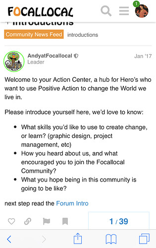
so is this the action center? I’m confused again :grimacing:

it would help to have a live example of how this can work. unfortunately we have one which would add a lot more information into the mix, and one which is broken.

here’s the broken one the text will be in drop downs under the title as its far too much words on there right now.

on this page we are using balloons. there would be a balloon on each of the FAQs and clicking it opens a new discussion thread in a category specifically created for that content. that thread is directly linked to the content on the main sites page, so someone commenting on that will always be in the same category, and posts can’t get lost.

the discussion we are having now will always be linked to the UX/UI and Design Team in the Action Center on the main site. Users wanting to participate will always end up in the category above this one when clicking to get involved or learn more in the Action Center