These sketches are my interpretation of the previous UX discussions with you and others, mixed with our tech situation and what is realistically achievable by the end of the month - as we really need a MVP.
I would love a UX review before we begin the build. The Global part of the platform shown here is a new project management theme built in Discourse, modifying existing plugins to keep costs down.
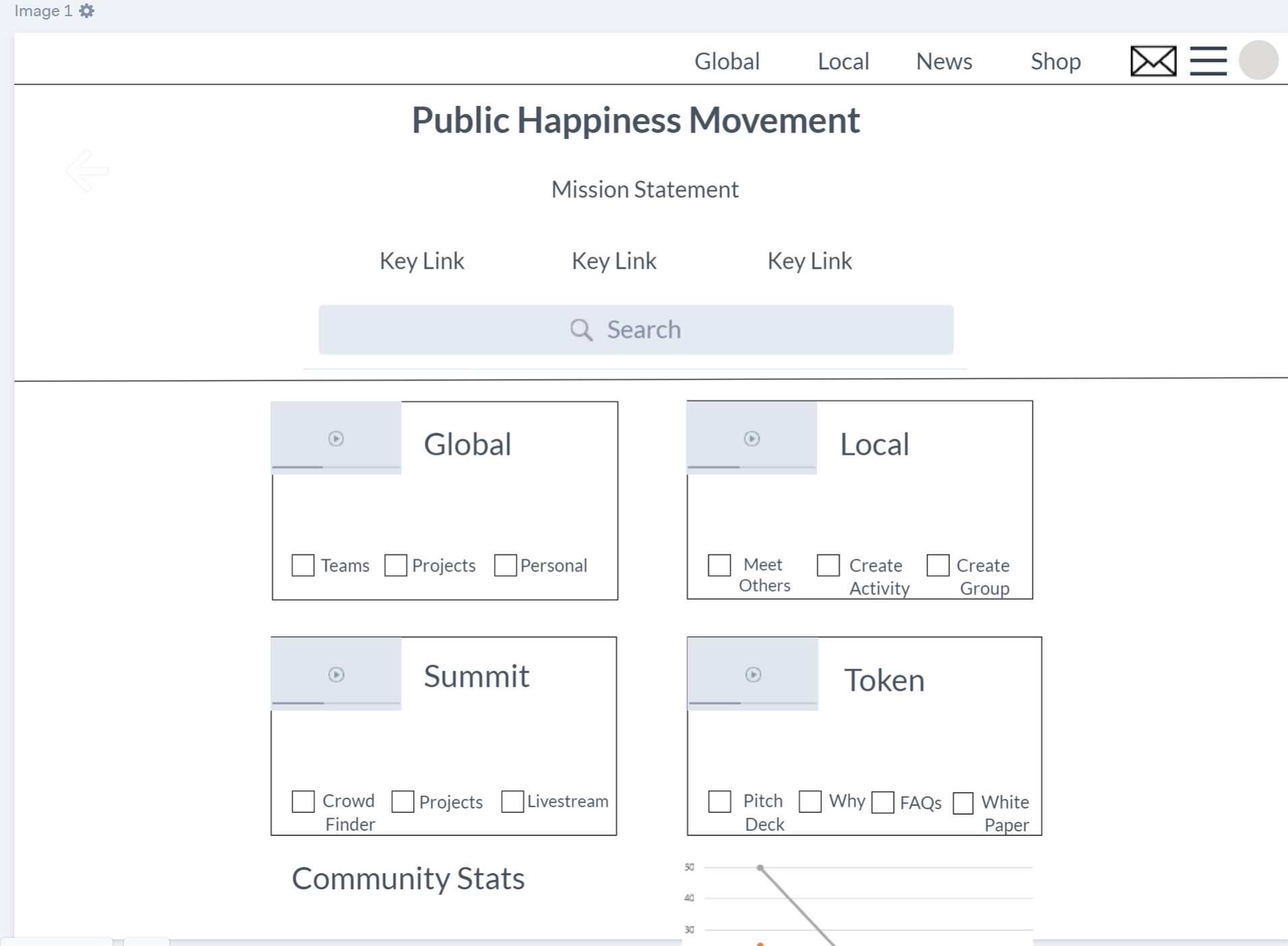
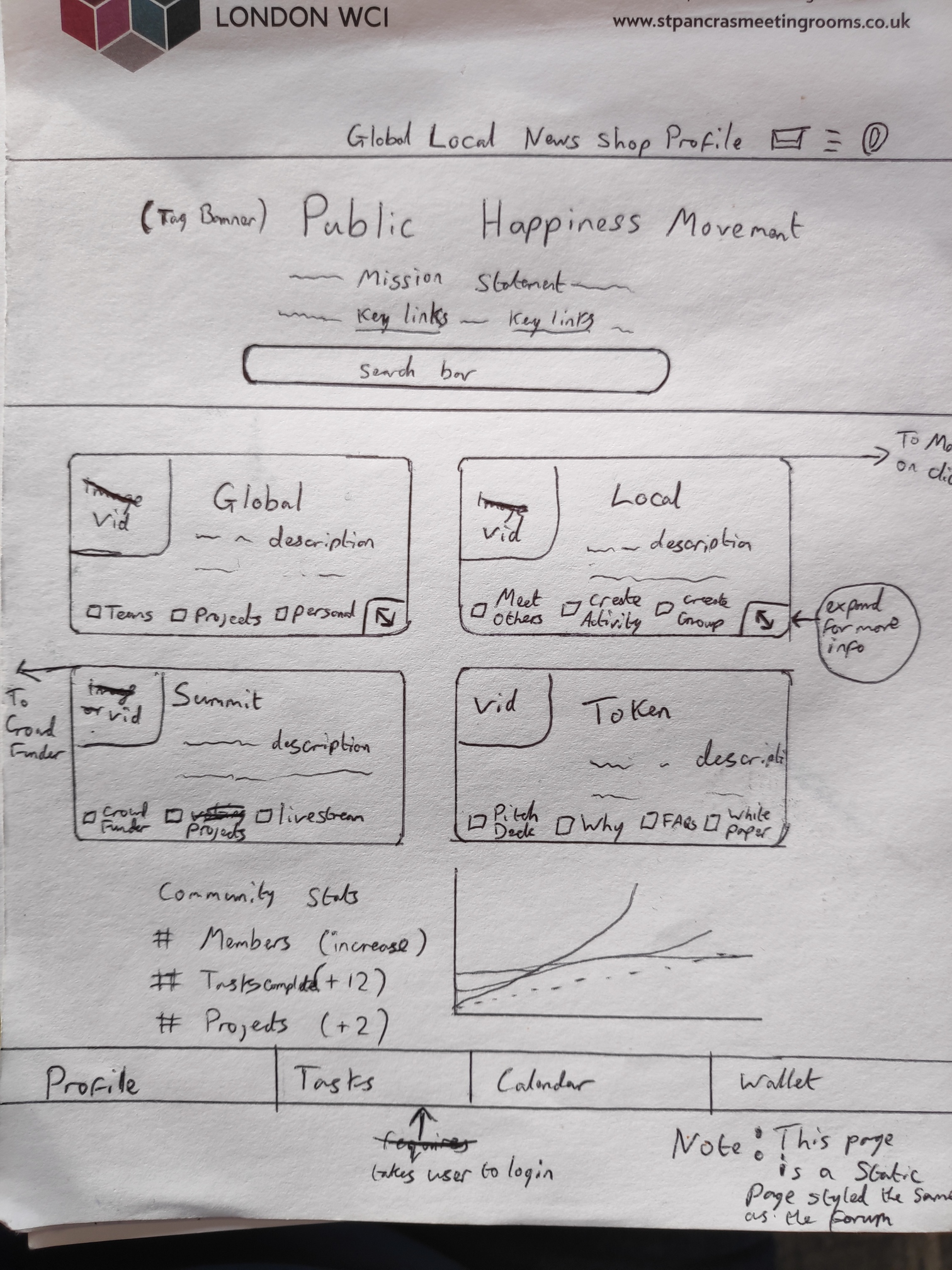
Page 1
- New site homepage. When users are logged in this changes to the ‘profile’ page where users see recent action in their groups and their stats (which also means we can probably remove ‘profile’ from the top menu
- There is no search bar here (i realised after the sketch). Instead there is just the Title and Mission Statement. Users need to choose a path before seeing the search bar as the global and local side have different search functions.
- Each section has its own Mission statement related to the homepage mission statement:
to bring more kindness, peace and well-being to the world
- This 1st page is not the same system as the other pages, it’s a splash page copying the style. Those boxes are fixed links, description, with sub-links so users gain an idea whats inside each and can navigate quicker.
- we should probably include 6 boxes in the main section here so we can also have ‘community values’ and ‘about’. Or is that now too many options and we should put those two somewhere else?
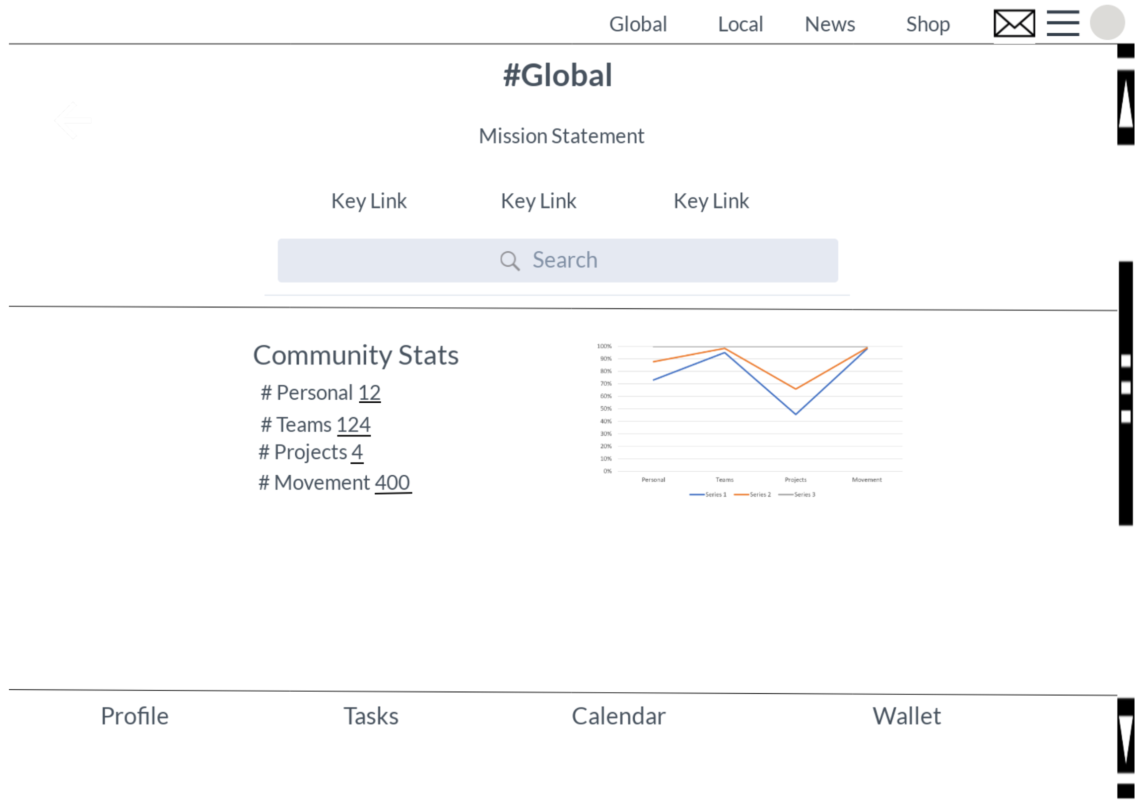
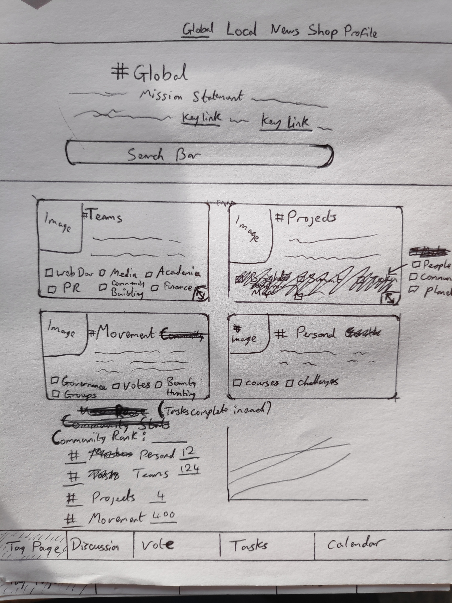
Page 2
- there should be tag specific stats in the default view, and user stats. Either side by side, or in an extra tab (‘all’ and ‘user’ stats).. maybe we already have enough tabs
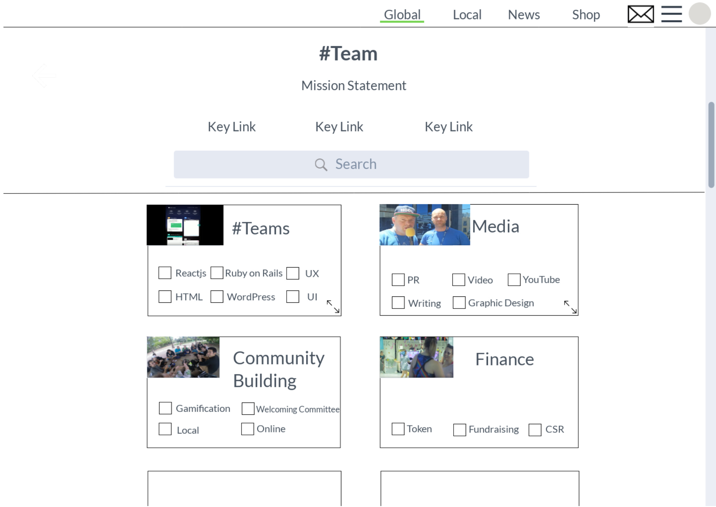
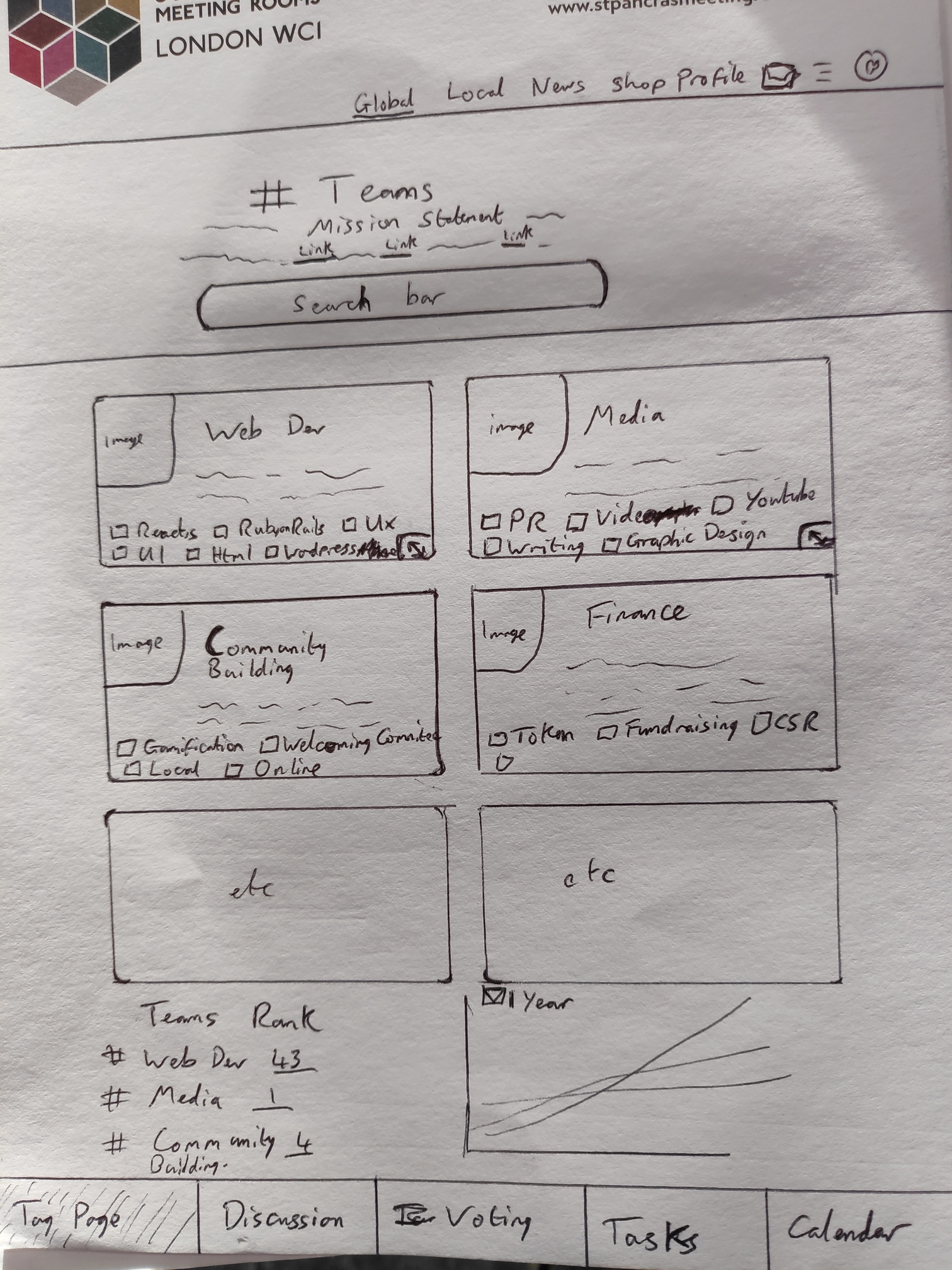
Page 3
- the path is still defined by admins at this point. The plugin allows set paths (hashtags) to be defined. If not defined it shows the most commonly linked hashtags - although mods can ignore one globally, for example ‘backlog, sprint, doing, done’ will all be hidden.
Page 4
- In tag-pages further down, where tags are not defined the system changes to show the most commonly linked tag with the tag-page shown. This means users can create their own paths and tag-pages, which appear all the tools attached. for example, i can create AndysFridayFun tag and have a project management space for everyone who joins in.
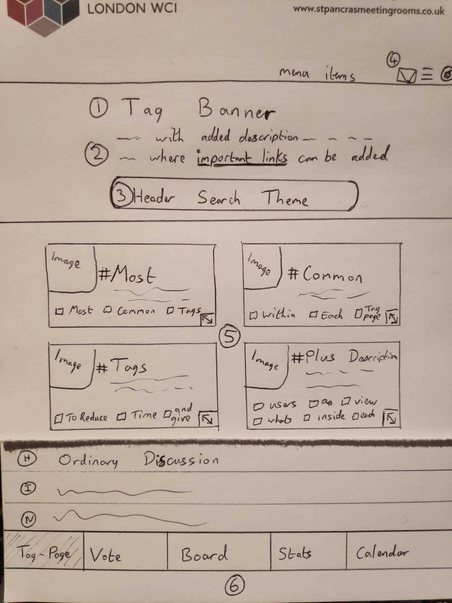
- ‘Board’ in the floating footer will actually read ‘tasks’. My thoughts on calling the 1st tab in the floating footer ‘tag-page’ is that it quickly teaches users that our site navigation is based on hash-tags
- I’m still unclear at what point we should require users to login in order to see what’s going on?
- cards in the task section will have a bounty attached in the top right corner. You can see an example of this system at thepavillion.io
- in the last image I switched to forum rather than stats in the default page to get feedback on whether the landing page for each tag should be stats or discussion
Tabs in Floating Menu
@UXers @RubyonRails what do you think?