Reviewing new Global section before we begin the build

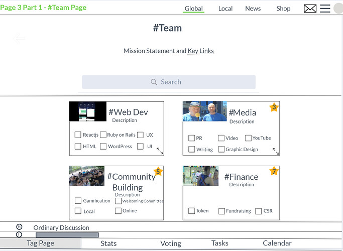
that’s fine with the photos. it’ll be fin for the teams to choose their own. can you put a hash-tag by all titles, to show that we are using hashtags to navigate.

i’d suggest having ‘Mission Statement and Key Links’ rather than having them separate as it looks ]like those are set apart, where in practice they’ll just appear inline in the mission statement like this. usually at the end of the sentence.

the 1st box is #WebDev

That makes sense. I think I just got confused with the lines. So, I thought it was a drop down menu.

1 Like

I’ll have to change it for all the screens. I will do that after I finish working on page 4.

1 Like

It is finished. Here’s the interactive prototype. It might be easier to view all the screens at once. So, you can see the screen names. You’ll need to use the right arrow after page 1 part 2. There’s no scroll bar link between page 1 part 2 to page 2. #Teams box in page 2 links to the page 3 teams page. There’s also no link between page 3 to 4. Page 4 has the scroll bar interaction to get to page 4 part 2. Each page has interactions for the “Global”, “Local”, and “Shop” tabs on the menu. Let me know if I should change anything else on the prototype. I have 13 screens. However, only 11 screens are relevant. The other two screens are just copies of two pages.

1 Like

good work :slight_smile:

i think the floating footer should be included, as its going to be a big part of the new systems design. it begins from page 2 on. with that there you could also pull a quick image of the ‘tasks’ ‘voting’ and ‘calendar’ sections to make the full functionality clear

1 Like

I made an edit to page 2. I added the floating footer. I also added a blue line beneath each name in the footer section for page 2. “Tasks” links to an image, which is on a new screen. The image takes up most of the screen. I didn’t add all the footers for the ones that are missing. I wanted you to see if you preferred the underline beneath the names or if I should leave it blank.

better without the blue line. everything seems to be there except for calendar, but i was a bit confused with the ordering and some of the pages. for example, i don’t understand what this page is: https://marvelapp.com/d5da1ih/screen/63957544

this page is close to correct: https://marvelapp.com/d5da1ih/screen/63957006

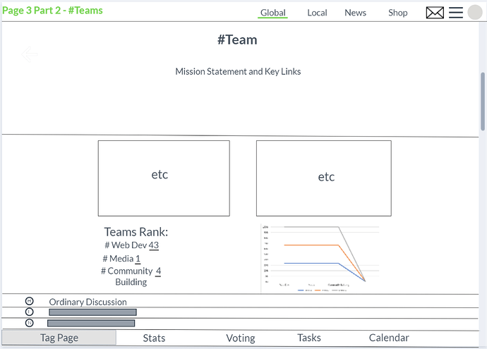
except there wouldn’t be a discussion option in the footer as discussion would be the default view under the tag-boxes. It would be nice to include stats at the bottom of that main page i think, or maybe we could include them on a tab where ‘discussion’ was before.

This page is correct:

‘Tasks’ is fine. You can grab a calendar page screenshot from the link to the plugin i added to the plan above. i can’t turn it on right now as it conflicts with other plugins (and isn’t that useful to us until it works with tags).

The footer for this one: https://marvelapp.com/d5da1ih/screen/63956355

would be correct on this page: https://marvelapp.com/d5da1ih/screen/63704046

you’d probably want to make the ‘join’ tab in the middle, and far wider (whitespace) so it’s clearly the main option. then have ‘about’ and ‘community values’ at either side.

That’s page 2 part 2 (Global page). Part 2 shows the graph and the four hashtags with the numbers from the graph. Any of the screens that have part 2 shows the last parts that couldn’t fit on the official first page. It is there to represent the user using the scroll bar to see the end of the page. I realized that I need to change it to rank instead of stats.

I’ll edit the prototype later this week.

1 Like

I made the changes. I also added the page names on the left hand side for each relevant screen. So, you won’t have to view all the screens.

2 Likes

Almost there, great effort. It’s a lot clearer to navigate now.

  1. This page: https://marvelapp.com/d5da1ih/screen/63704046
    could you center the header and text vertically to make sure the designer creates it correctly

  2. All pages can you underline ‘key links’ in the description

  3. Can you underline the tab users are currently on in the floating footers

  4. On all tag-pages except for the splash-page, underneath the boxes are discussion threads, so all the others would be like this example: https://marvelapp.com/d5da1ih/screen/63969456

  5. Stats we are putting in a different tab. Although i think from a UX point of view it would be really good to position some very small stats on the Tag-Pages like ‘weekly activity 230 (+21)’

  6. for the ‘calendar’ tab i meant to screen shot an example of the calendar itself. the page i linked has links to examples. i’ll try turning it on in our forum now.

  7. On the top left or right corner of some boxes is a ‘funding pot’. It’ll be a star with a number in it showing users how many tokens are available to earn if they join in. Its an optional setting, so ‘web dev’ wouldn’t have one as the next layer is more options rather than tasks. ‘brighter tomorrow map’ would have one as its a project, and that number would be divided among the tasks in the ‘tasks’ tab.

2 Likes

I’m going to try to edit the changes within the next few hours. If I can’t finish it by tonight, then you’ll be notified tomorrow. I have a few questions on certain tasks.

Task 3. Would almost all the floating footers have the “Tag Page” underlined? Also, what color would you want the underline to be?
Task 5. Does that mean that I will be deleting “Tasks” in all the floating footers? I can make a preview of the small stats.
Task 6. I took a screenshot of one of the examples. The one I selected has a few anime characters. However, most of the picture is the actual calendar.
Task 7. Below, I have added a sketch screenshot of what I thought task 7 would be like. I used the boxes in the “Global” tab as an example. Would it be something like that?

  1. The ones you’ve created, yes. Tag-page means boxes then discussion. The stats would be moved to its own page. Colour… not sure, I guess light grey is safe and easy.

  2. No, tasks is important. It means that there is a stats tab in the footer, but that one or two key stats would also be subtly on the tag-page (home page for that tag).

  3. I’m not sure. I’ll set up one on our site and send over a screen shot

  4. Perfect… well, a little more :star2: like :yum:

It is going to be hard to add the discussion threads for each one because I won’t be able to fit every line. Is having two lines ok for the discussion threads? Page 3 Part 1 shows what my current edit looks like. Or i might just take a screenshot and just make it look like Page 3 Part 2.

1 Like

Discussion threads instead of stats. Stats is its own tab, although I think placing a single line somewhere with one or two key stats would be good.

1 Like

@aeglobal can you please change the Mission Statement on the homepage to:

The Public Happiness Movement

to bring more kindness, peace and well-being to the world

@MarinaOhNo
We need a Ruby-on-Rails developer who is going to be modifying existing Open-Source Discourse plugins and creating a new Discourse theme from them.

Mission statement has been changed to the one you have requested.

2 Likes

Updated Build Brief

New Theme:

Discourse for Fluid Community Driven Project Management, Utilising Tag-Pages for Navigation and Structure

Overview of Work Needed:

  • Two existing opensource Discourse Plugins modified to work with Tag-pages.
  1. Tag Banner Title
  2. Events Plugin
  • One page (stats) modified to allow filter by Tag. It currently only works by Category.

We’ve already succeeded modifying Discourse Kanban boards to work with tag-pages and the code can be used as a base.

  • Debug plugins used so they work with each other (conflict resolution)

  • A new ‘Tag Navigation’ plugin created which puts tag pages at the center of the user experience. It can be based on the code in this excellent discourse Popular Tag Sidebar

  • A modified version of the normal pages created as a splash landing page (the options in the floating footer will be different, and some of the navigation boxes will be external links. Styling will be the same so its a quick task. either a static page, or a conditional rule to slightly change the 1st page)

  • A floating footer created or modified from this code. The footer buttons simply append the current url the user is on, like, x.com/thispage to x.com/thispage/calendar.

  • Two existing stats pulled into each page. They are available via Discourses API.

  • We also want an improved user homepage, but expect this will be a large task and is likely to built later on.

UX Wireframe Mockup
note: the ‘stats’ is incorrect here and needs updated.

What?

Creation of a powerful new theme which utilises Tag-Pages and existing theme-components to deliver a highly flexible and user adaptive environment for community growth.

Users can be guided down desired routes, but also where users have unprecedented flexibility to adapt and evolve their own environment. Including a floating nav bar with popular team management tools means a user can create a new tag and instantly have access to a powerful workspace with its own kanban board, calendar, stats, and voting area.

Why Drop Categories?

Categories are limited in depth and not suitable for a user led evolving environment. We could keep them and have the tag-plugin only function on the bottom layer of a category, but its probably easier to just switch entirely.

How The Theme Works and New Components needed

  1. Tag-page Navigation Boxes
    The Tag Pages Theme creates boxes just like category boxes, for an admin defined number of the most commonly used tags in each Tag-Page. Admins can exclude tags from appearing in this component either sitewide, or in relation to each tag-page in the admin section to create a defined path to guide new users and customise where needed.
    (for example ‘to-do’ is a functional tag for the Kanban plugin and would be excluded sitewide

  2. Other tags
    Underneath navigation boxes is a bar with links to the next most common tags for quick navigation. This bar is side scrolling and users can swipe to see more tags on each-tag page. It also adheres to the exclusion rules defined for the navigation boxes.

  3. Floating Footer
    To create the evolving and flowing workspace it will include a floating footer which navigates between popular project discourse management plugins/components by adding text to the url for each tag page.

for example:

Tag-Page: tags/reactjs
click ‘Board’
url appends to: /tags/reactjs/l/latest?board=default
Now the user is viewing the Kanban board and tasks to be done related to that Tag-Page.

The same appending url navigation will work for the calendar plugin. For the voting it will combine tags using the ‘Intersection’ feature.

an example of displaying multiple tags:

/tags/intersection/reactjs/vote

Dependency Plugins and Structure

Banner


Tag Banner Title
Tag Banners - theme-component - Discourse Meta

Search bar
Search Banner - theme-component - Discourse Meta

Tag description (if provided) also to add (‘pin’) important links
this functionality is in the category banner, but not the tag banner
Category Banners - theme-component - Discourse Meta

Main Page


Tag-page Navigation Boxes

[most common tag 1] [tag 2] [tag 3] [tag 4] [tag 5]

Other Related Tags Slider
Discourse Popular Tag Sidebar

Discourse posts

Floating Footer


5 theme component pages which link to the tag pages so users can switch between actions on the visible page

[Tag-Page] [Vote] [Stats] [Tasks] [Calendar]

  • Discuss: Standard Discourse threads
  • Tasks: Discourse Kanban for this tag page
  • Calendar: Events Plugin for this tag page
  • Vote: Discourse Voting Voting is enabled on all threads marked with the ‘vote’ tag, enabling governance and decision making to operate on any tag or intersection of tags sitewide.
  • Stats: A modification of the Discourse Meta page, to add Tags as a filter and open the tag currently being viewed by the user

Major advantages to utilising Tag Pages to navigate:

  • New users can be guided along a set path, while including the search bar for those who already know what they are looking for to skip directly to there.
  • Users can easily create their own tags making the platform highly adaptive and user-led
  • There is no depth limit. If Bob wants to make a ‘Bob’s Crazy Friday Group’, he can easily. If
  • Users also have the god-tier ability to combine tags, and the tools in the footer bar still work perfectly. Creating incredibly powerful methods for cross-team collaboration, simply by adding a tag in a post to drop it into their work flow and call attention to it

Recapping whats needed to create the theme

  1. Creation of Tag-Page boxes in the style of category boxes
  2. All dependency plugins working seamlessly together
  3. Tag-page support added to Voting and Calendar components/plugins
  4. Creation of a Floating Footer with Nav Links
  5. Text description added to Tag-Banners component
  6. Search component works with/embeds inside Tag-Banners
  7. Tag filters added to the existing Stats Page
  8. Improve kanban boards functionality
  9. Search bar works with tag page intersections
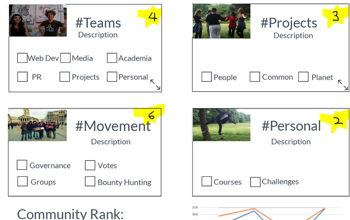
I will be fixing stats to the discussion now that I have finished my grad dissertation and other things. Also, @Rachel_Carton brought up some good points when she reviewed the prototype screens, especially the part about some of the title names in the filter section. Rachel’s idea was to change a few of the terms to be more recognizable to users, which I agree with her comment for the “Local” page. Also, she did mention the information architecture for page 1 part 2. I think the team should look into that.

I will also draw up a few sketches to show a few of my ideas for the ‘weekly activity 230 (+21)’ for the Tag-Pages.

3 Likes

Any updates @aeglobal?