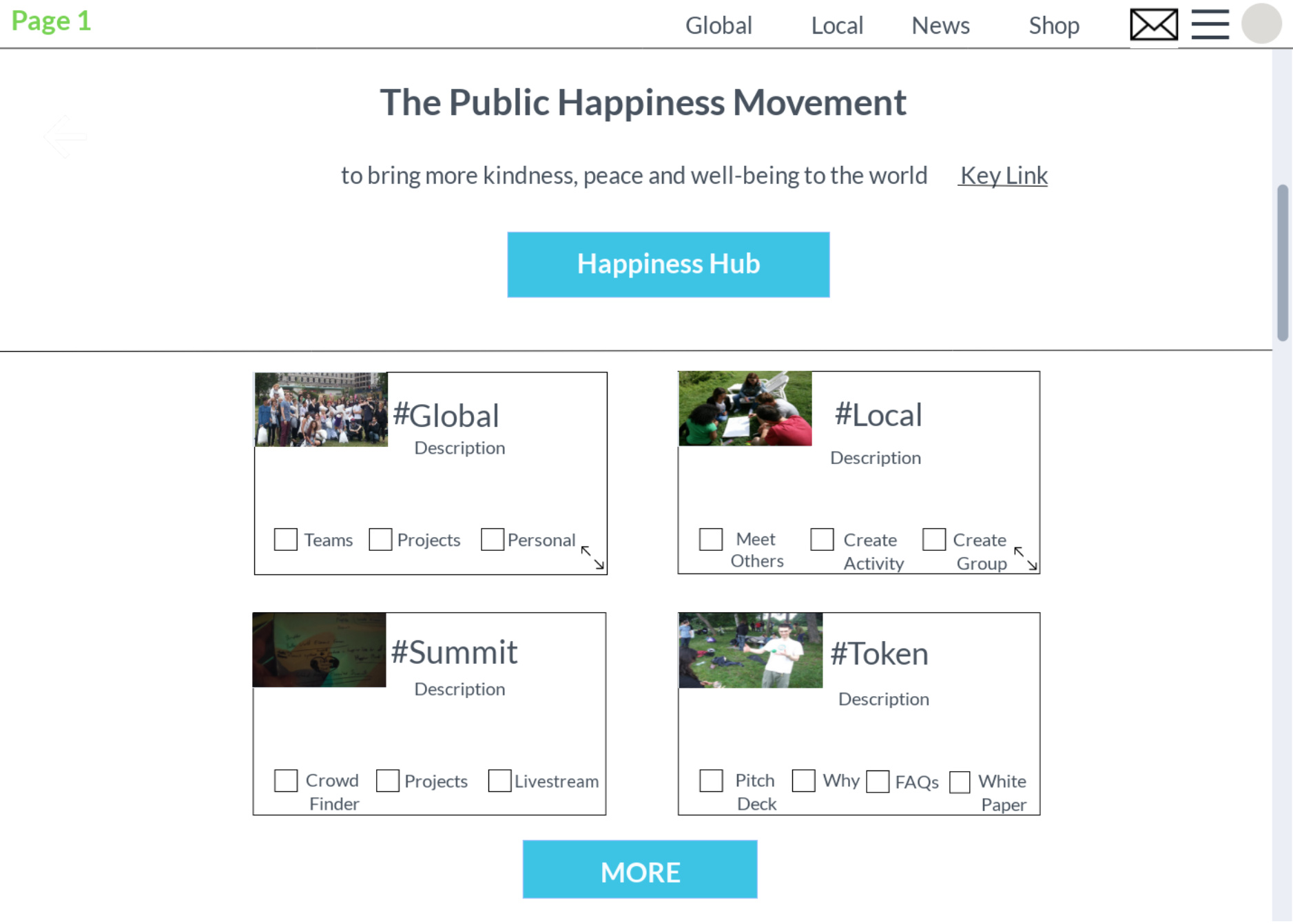
I added image icons to represent where the logo will be in the prototype. I also made the changes for the two names in the “Local” section. The sketches will be added within the next few days. I found a few design inspirations. However, I haven’t done any sketching yet.
1 Like
Nice. Can I request a small change. Just changing the Summit box on the homepage and putting ‘Happiness Hub’ instead.
Both are cool projects, I think the hub is more likely to be running 1st now.
Oh, and I had an idea that we should add a simple ‘more’ link/button under the 4 main boxes on each page. That way users can explore all the tags, but the main 4 are highlighted
I’ll make the requested changes. I’ll have it done by tomorrow.
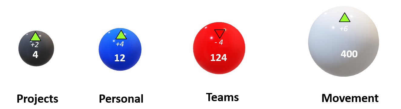
I have attached one page with four different visual options. The sketches are mostly data visualization based.
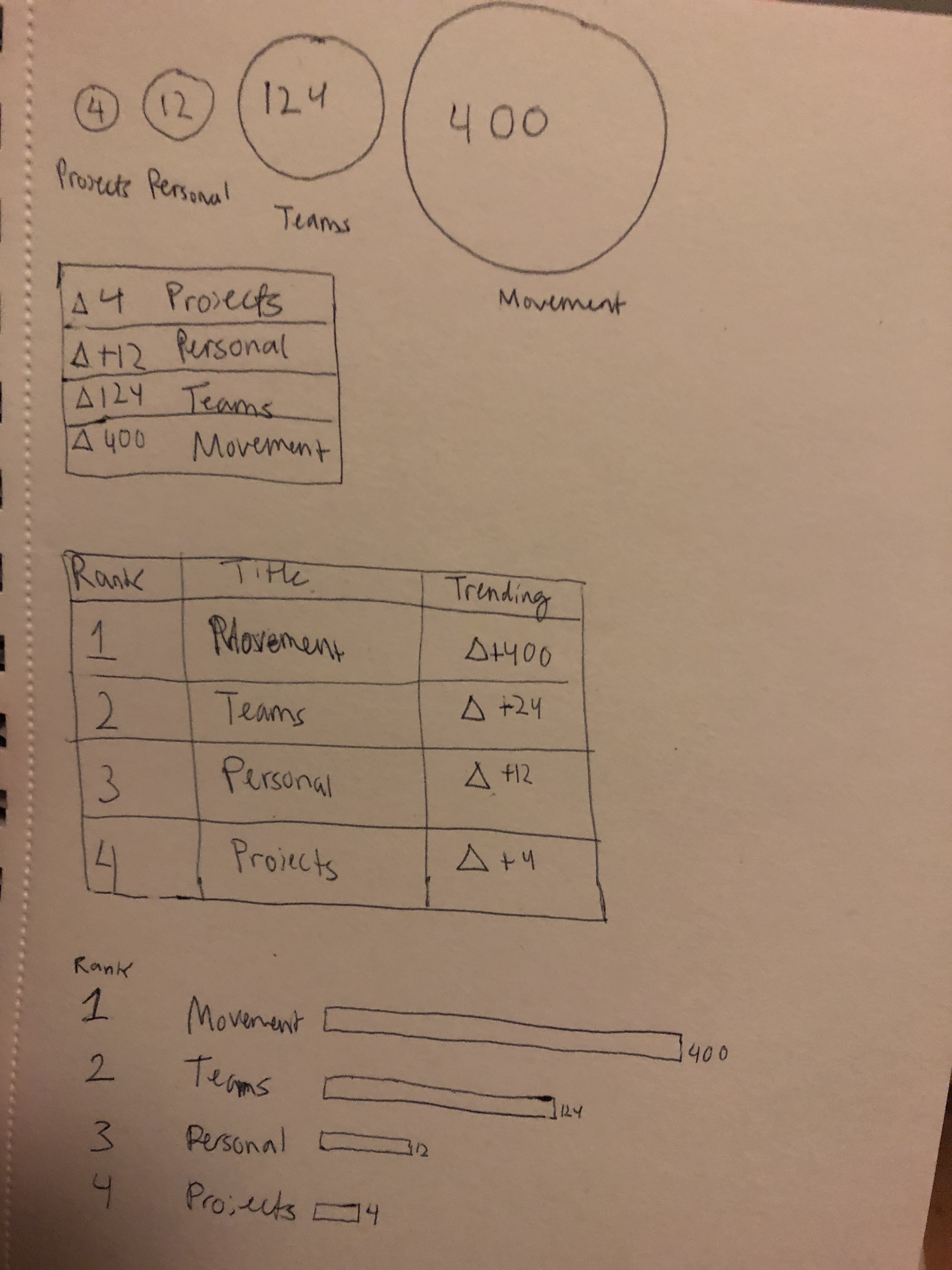
the circles look far smoother, although the up and down arrows suggest a sense of competition/achievement.
i think both are great features …what about circles with an up and down green or red triangle in their upper right or left corner to show growth/decline vs last week/month/year
‘More’ is correct. I think we missed each other on Happiness Hub. I meant to replace the #Summit box with a #Happiness-Hub box. Not to replace the search bar with it.
Ah, okay. My bad. I’m editing the prototype now.
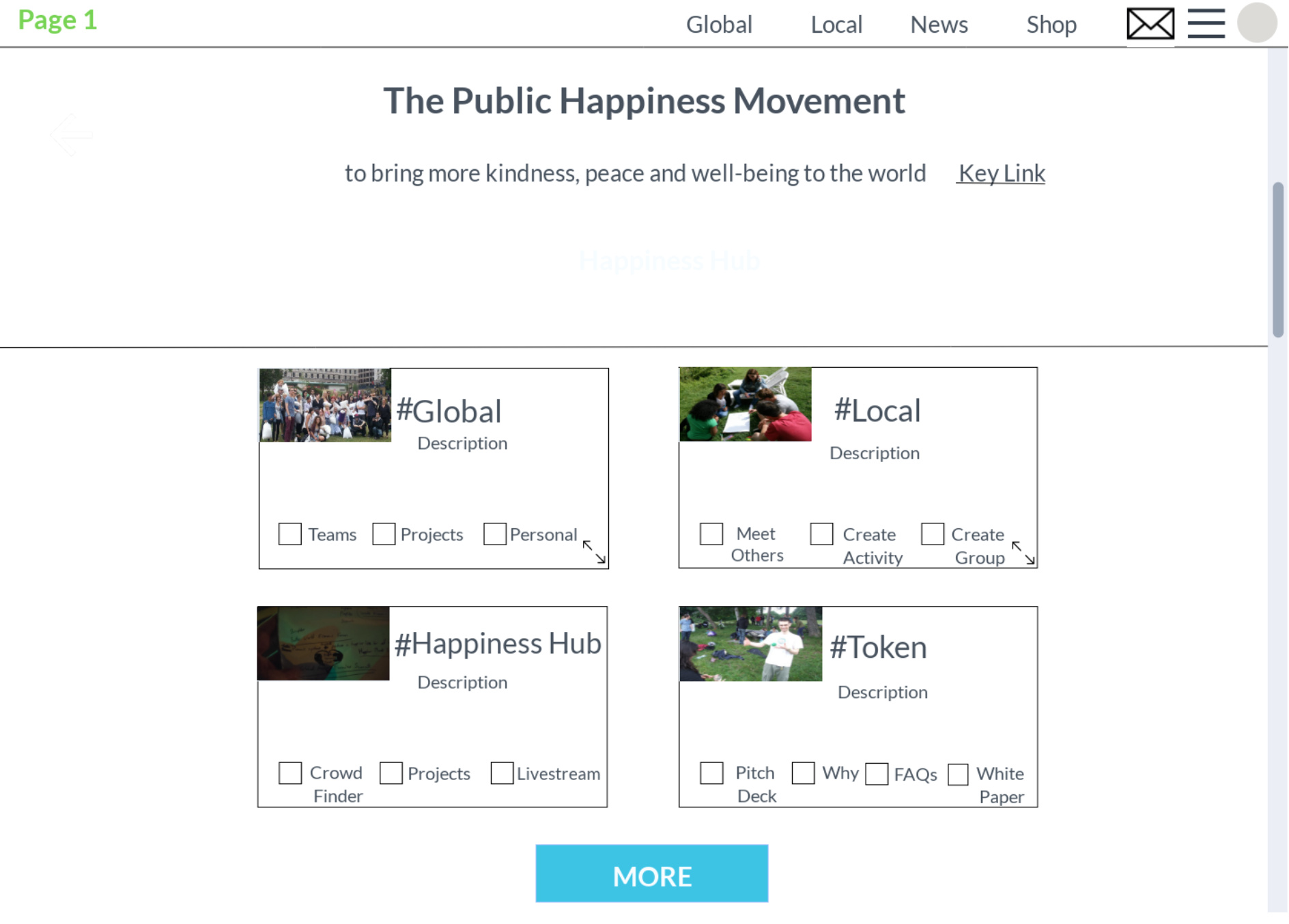
thats it. oh, and you were right not to add the search bar. my mistake it doesnt show on the 1st page
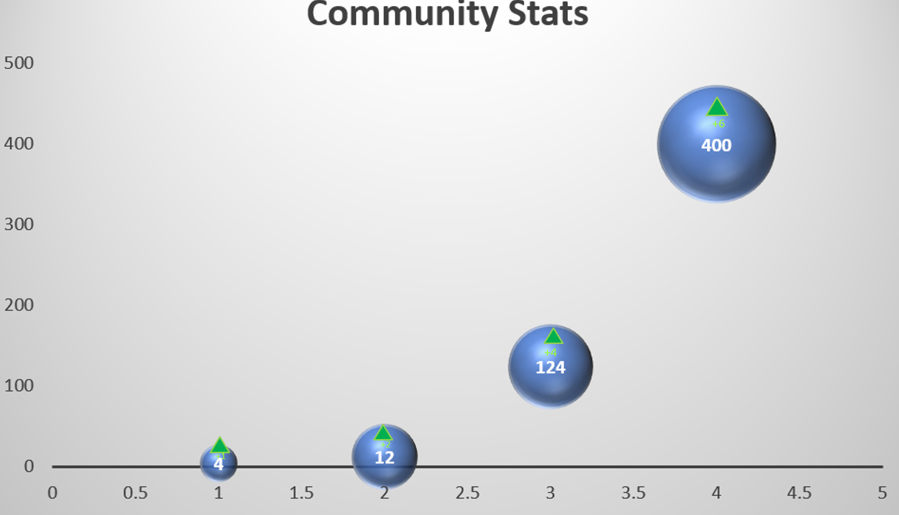
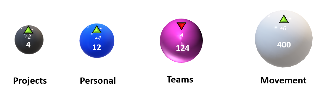
So, it is ok if I leave it like that? I’m going to be experimenting with the circle visualization and the up and down triangles. I’m going to have one with all the same colors and one with different colors for the four items.
1 Like
i suspect different will look much better, especially if we match it with the colours of the tag-banners. sure check both out though ![]()
1 Like
I’m going to try to finish the different sphere colors by this weekend. The one I previewed I had to make up some numbers in order to make the sizes like that. I’m going to try another program that won’t have the x and y axis. I will work on the smaller number colors for negative and positive.
1 Like
That looks beautiful

That one is fantastic (obv avoiding red as it’s the colour of the down arrow).
I changed it to the down arrow. I also added outlines to all four triangles since it was going to be hard to see the red arrow without the black outline.
What about making arrows 3d to help the differenciation. Or just avoid using red and green in the circles
Good idea. I’ll try with 3D arrows. I’ll also search to see if there are other colors. The program I used only had those four with a white background. I just learned how to make my own sphere in the program. So, I’ll be creating a different color to replace the red one.
1 Like
The 3D triangles definitely pop out more. Do the four different types have a color scheme? I can change the sphere colors in order for them to match with the theme for each one.
1 Like
Not yet, but we have been using a colour scheme in the design so maybe it should match
1 Like