It doesn’t seem to be tagged correctly. I’ll search the documentation tonight
Ok, thanks. I’ll make changes once the scheme is finalized.
1 Like
i’ve looked everywhere and simply can’t find it. it must have been on Slack, and we need a subscription to see those older messages. i recommend using colours that pop with Discourse (this forum), as that’ll be where there’ll live.
for inspiration look through the users here: https://publichappinessmovement.com/groups
the ones with the stock profile images, like yours, are using a pallet they’ve selected to work with this site.
I’ll take a look at the link. I’ll post samples once I look through the different groups.
1 Like
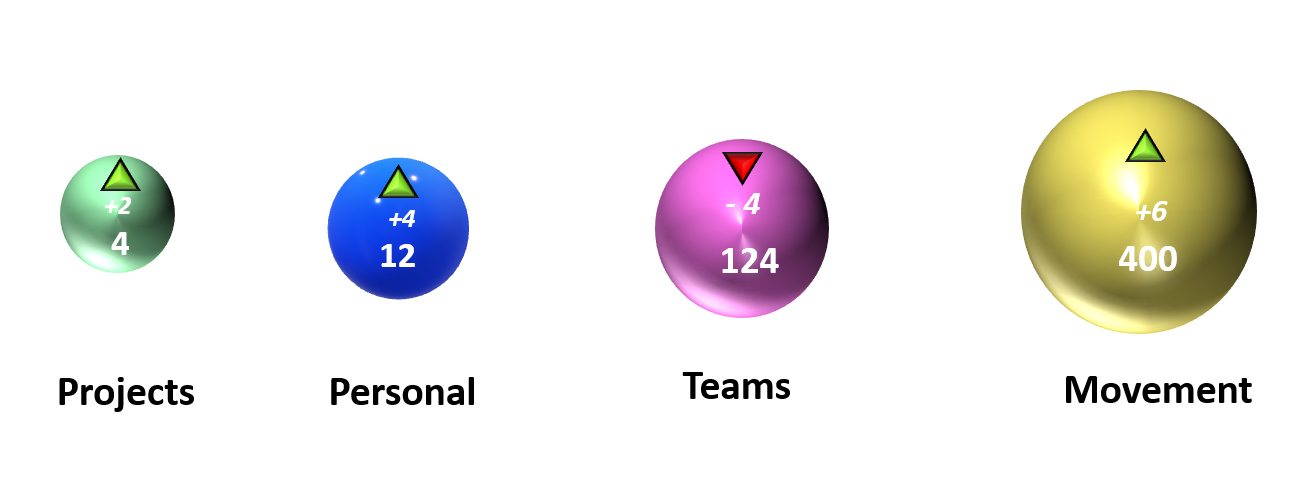
I changed three of them. This was based on a few colors that I saw from users in particular groups. So, I kind of went off of that. The third one was lightened a little bit. I might also consider changing the project color. I just didn’t see a group that was specifically around the personal one. I will work on the text once all four colors have been decided.
1 Like
Looks great to me ![]()
1 Like
Ok. I’ll work on the font. Then, I’ll add it to the prototype.
1 Like
@Mateo and what do you think about this colours? ![]()
Hello there,
I’m kind of lost with all the information, do you think we could have a quick Skype call and we explain things? (we don’t even have to share screen or anything), or maybe a chat where we define everything. I’m very sorry to ask so much things so late in the project and for not being able to participate before ![]()
I feel like with started with UI design without doing research here. I would start creating some user journey maps and experience maps, then maybe a site map with all the sections (and maybe we should start by having some user persona, although I don’t use/like them a lot).
Then we could start wireframing and create some low-fidelity designs and only then decide on the colors ![]()
I’m okay to work on all the research work, it will help us take decisions.
Thanks!
1 Like
Ok I’m reading more things in other threads, I have to update myself as there are a lot of documents ![]()
Regards
Sure we can have a video call. A lot of the documentation is from people who started then dropped out, so it’s a good guide but not necessarily something we need to keep to.
The UX team mapped out a simple MVP design for the site (not including the maps) which the ruby on rails team are building now. It didn’t have much UI input at all so you are welcome to begin improving that plan.
There’s a mock up in the overview here: [Overview] New Forum Build
The map side hasn’t had any UI input for quite a while
I have a quick question. Did previous designers design what one of the pages would look like after a user were to select one of the four box options and check one of the check boxes on the home screen? I want to come up with a few tasks to see if potential users know where to look for information.
It would look the same pretty much. clicking one box navigates users to that tag page. Clicking the box (it’s a filled in box rather than a check box and the text next to it is a link), also navigates to a tag page.
The filled in boxes (that looks like a check box), are showing the most common tags associated with the
tag page users will visit if they click the outer box.
The main purpose of this is to give a simple and powerful insight into what that tag page is about, in addition to the description. It doubles as a quicker way for users to browse and explore.
The design is heavily pulled together by me combining the key points from our previous discussions and creating a minimal version of them, (as the team went quiet and we had an offer to build it).
Sorry for the long winded answer. Getting to the point, no. That hasn’t been tested and it would be great to test it and make it better before it’s completed.
The platform being built now is a skeleton frame of the key functions the UX team identified. It’s ready for the future community to improve and make beautiful ![]()
![]()
I came up with five tasks. I know a site that will be able to do the test, but I will also make it on another site in order to get more participants. #4 I’m still kind of working on it because it needs to be somewhat detailed. However, not where it will give any like big clues. I’ll be drawing out happy paths for each one.

- We updated local to ‘near me’ which seems more explanatory
- This sounds a bit vague. I’m not sure anyone will come to the site looking for ‘community building’. I recommend unpacking this a bit, what is it specifically they are looking for in your question?
- I suggest adding ‘projects being built targeting issues you care about’
- This one won’t be applicable in the new design as most common tags will be what they see on every page. Might be better to put specific tags and see where they’d go to find them. #London #environment #marketing
- Edited to ‘near me’
- I was just trying to add something related to the team page. I’ll change it to #media option. I’m currently writing the new one. The scenario would be that they are new to the site and want to find PR and video information. I changed all the possible options to the current menu options. I was basing it off the one that was in the prototype. I’ll make changes to that later.
- I have made the changes after your suggestion
- I added #marketing and #enviornment
2 Likes
- Ah, I see. Maybe ‘join the community building team’?
1,3,4
Ok. I fixed 2. I will add the media option as a 5th task.
1 Like
14 people have responded to my survey so far. I waiting on a few more responses from the other site. I’ll share the results after I get all the responses.
1 Like