We do also have a new channel with no subscribers which syncs to parts of this platform. Maybe that would be easier to work with as it is cleaner and only has the better videos of ours, but we’d lose the subscribers… even though we don’t have many.
If you want to use the new one we can discuss it here.
I’m not sure how others cover different topics but i suspect it would be through 3 separate playlists. I guess ours are at least related as they all tie back to our movement and community.
@A-Team If anyone else would like to join Roy on this endeavour please message him, and me for access.
Alright! Will start working on the task, and will be back with with questions and thoughts requests whenever I finalize a part!
Would also like this thread to be an area where the whole team can join in with ideas and feedback!
Hello everyone!
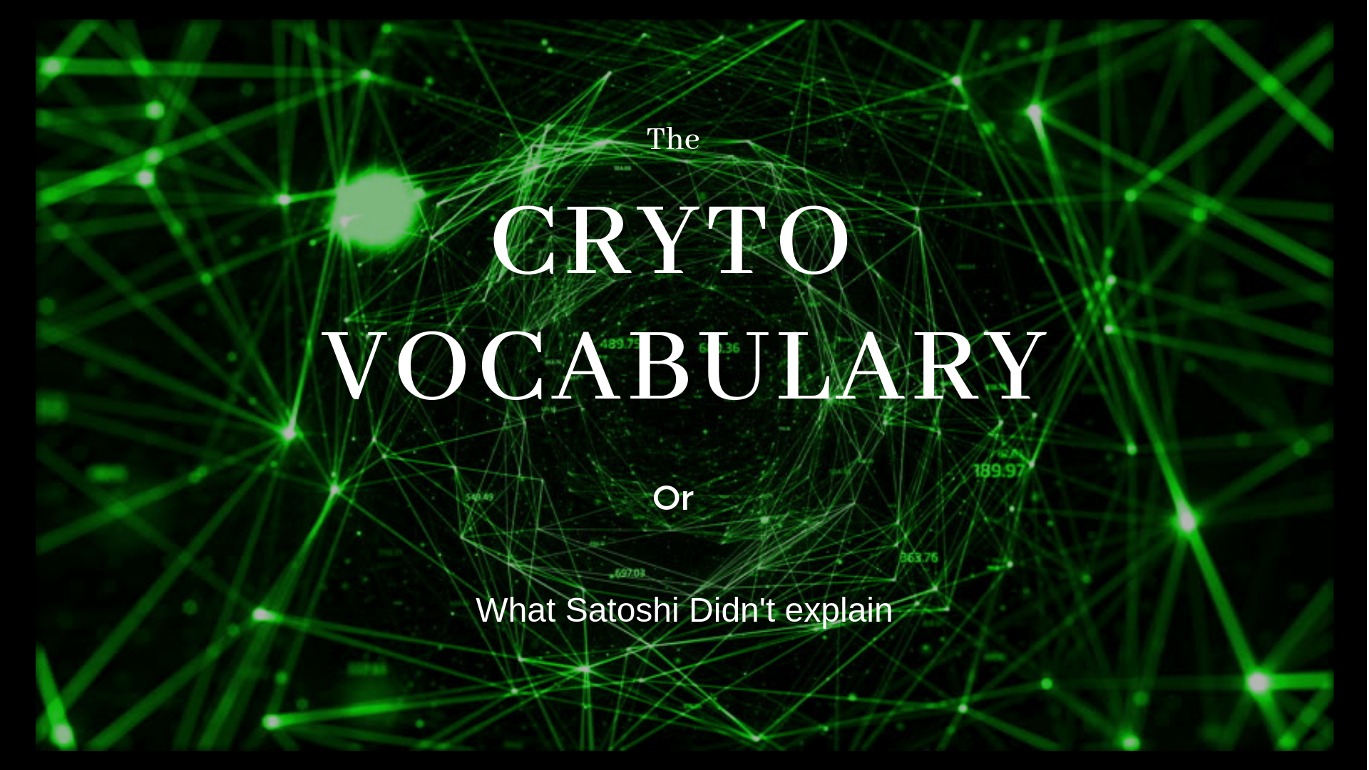
Excited to be sharing with you the first test Youtube channel banner! Would like to hear your thoughts on it and if you think anything can be improved!
I chose this color scheme since it represents the pupper! It also fits well with the humanitarian theme of the movement! Wanted to keep the banner straight to the point, giving a quick and general idea to new visitors as soon as they see it!
Yes, that looks nice and warm @Roybd. What do others think? How about the @GraphicDesign design team? and the @A-Team
I should have set out the design goals before you began that really, although we now have a good base to build from.
We want to create a design influenced by our past fun happy events and projects, and also by the financial and crypto world. A strange hybrid but i think it could be achieved by adding some small hints to each in your design.
One way we could achieve this would be to make the text, or the background fade from one style to the other, creating a meld between serious and fun which is something i’ve always wanted to… and struggled to explain to new users. Fun activities and community striving to tackle serious issues in the world and having a great time on the way.
We also have this cool globe logo which i believe would work great in your current design.
The biggest issue i see with stylising that banner is going to be that it uses strong colours. One vibrant and the other… i’m not sure what the words are. I guess sharp, florescent, highly contrasting. Making them work together is going to be a challenge.
As our team is quite light still why not also post the design brief and your ideas/drafts on sub-reddits, explaining that its a difficult task and you’d love their feedback and guidance. Subs like r/graphicdesign and r/UI-design.
Alright, so I guess the draft I submitted earlier today does not really comply with the design and style in question.
The heart globe graphic is extremely nice imo and I think it could be the center piece of any future design that’s gonna be created.
Any thoughts from the @GraphicDesign team ?
A 2nd way we could achieve it would be to have the vibrant, fun and colourful text and the globe logo, standing out from/floating above the high tech style background. I think that would be the clearest and most captivating design - visitors would understand that we absolutely mean what the background says.
Actually, to make it easier. I always loved that paint title (the colourful text from the 1st banner).
If you could:
find a way to recreate that but as ‘Public Happiness Movement’
I love the smaller text you added underneath
I love the heart earth logo and the idea of having it in the banner you created
Find a cool fin-tech/crypto style background (we are allowed to use) to go behind those two. Making them really contrast, so probably dark with fluorescent lights on it
I think the colorful text from the first banner is great too as it catches attention and really drives home our name Public Happiness Movement.
@AndyatFocallocal Do we have the SVG/AI file for the globe logo? I’d like to play around with it a bit, maybe put “Public Happiness Movement” around it.

