This size is perfect https://publichappinessmovement.com/uploads/default/original/1X/09926ac607ebab93a09146166d3d3e43ae5d49f0.png
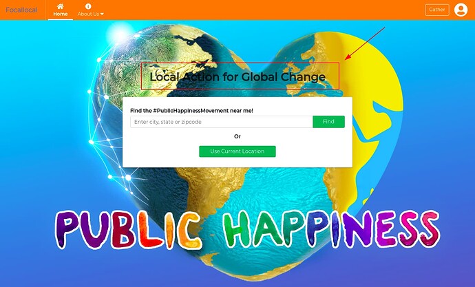
As the orange tool bar is hidden on the live site. The current toolbar you see now comes from Discourse and floats above the orange one, hiding it.
I see. So, no need to work on it then
No it’ll be there once you put the new homepage on the live site 
what about this? Won’t the orange menu be hidden at the end?
the toolbar you’re working on is orange. it’ll be hidden by the discourse instance we load our app inside
so you can leave it as it is and not worry about it
Exactly. Since it’ll be hidden, no need to work on it, right? Or am I missing something 
yes, exactly. no need to work on it 
Alright ![]()
Gone! Its not needed
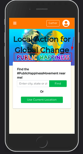
Do you mean the “Local Action for Global Change”, or the “Public happiness movement” text on the banner?
Local Action for Global Change. That’s not in the new UX design.
Okay, great. More space for us 
For the mobile design, I will try not to cover the “Public happiness” text.
I will need some help with the search.
I forgot. The one we have on the site at the moment, is it the global search or local search?
It might fit and look good, or it might need to be cut in half and moved onto two lines.
In the mockup its at the top of the page, and below the image is the text ‘Movement’
The one onsite is the Local search. It searches the map.
The Global one is pulled from Discourse (its the magnifying glass icon at the top of this page). The task i created in the Kanban boards has a pretty good write up with links to how to find the api needed.
I’m here to help with anything you need 
(will be here quicker when i can work out this notifications issue  )
)

