All images the same dimensions as with Liberators bubble
Update wireframe
Separate text and image on heart logo
Add links to the forum and map in the header via Discourse
Remove some links from boxes on homepage so it doesn’t distract users too much
Re-order the boxes on the bottom
Improve About Page
Update ‘Getting Started’ guides phase 1
Find a way to hide the burger menu on the homepage since it doesn’t work
Add target-top to login/sign up link
Re-do setup with sidebar navigation section on Discourse and colours to match homepage. Hopefully nested category/subcategories are now supported (as UX sucks without it).
Top level categories on forms shouldn’t be selectable. Put myself on the map also shouldn’t be
Mousewheel capture in forms fixed
When closing the congrats modal window too fast the page it tries to navigate too hasn’t been created yet.could be a delay though watching for the page would be faster, more reliable and smoother.
Add an informational footer, should be easy via Discourse
Add a CTA under all activity guides with a fixed url once we have a link for the forms so users don’t have to navigate back to the map and click on it themselves
Reduce PHM notifications default to only those that directly interest user, as it pisses me off so much on new reddit
Add Hashtags to all How-To articles, so users will be promoting us when they post on other social media sites.
Neither are particularly exciting so these choices should be reviewed later.
Slide 1
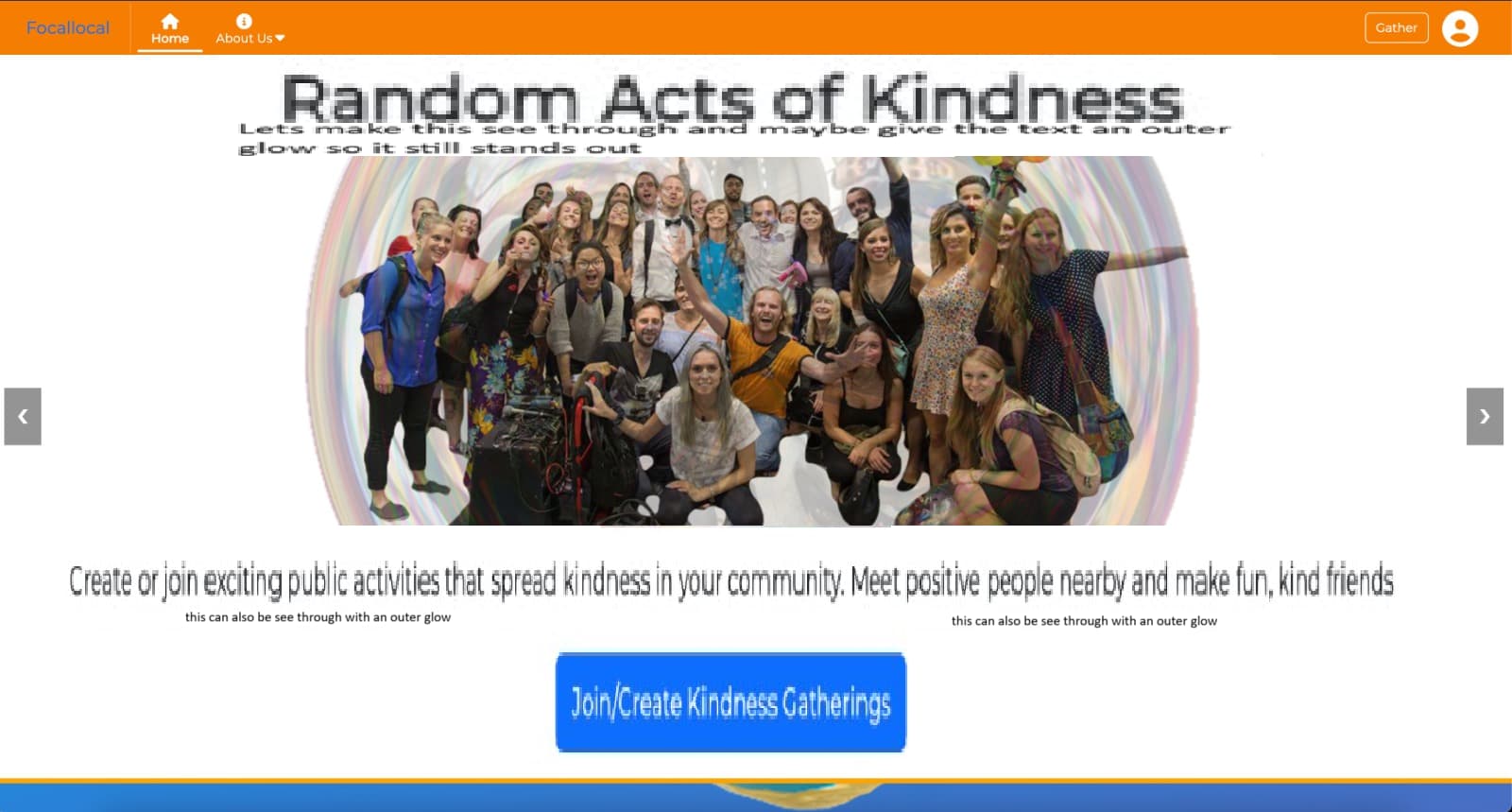
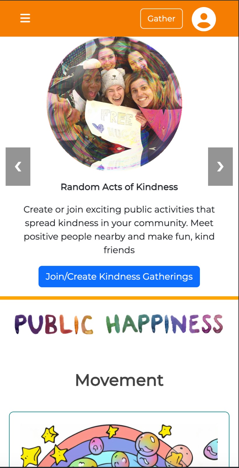
Header: Random Acts of Kindness
Sub-Header: Create or join exciting public activities that spread kindness in your community. Meet positive people nearby and make fun, kind friends
CTA Button: Join/Create Kindness Gatherings
Slide 2
International Mass Kindness Days
Subheader: Join global celebrations of kindness! Be part of fun, inspiring internationally coordinated events near you designed to shape a friendlier, happier world.
CTA Button: “Join In”
I’ve spent some time improving the Header CTA and subheaders. Here’s the updated copy:
New version:
Slide 1:
A. Random Acts of Kindness
Host or join fun, public kindness activities—and connect with amazing people while making your community a friendlier, happier place. Create unforgettable memories, make amazing new friends, and spread more kindness where you live. CTA:“Find or Start a Kindness Activity”
B. Spread Kindness in Your Community
Join or create fun, meaningful activities that bring people together and spread kindness where you live." CTA: “Start Spreading Kindness Now!”
Slide 2: International Mass Kindness Days
Join a global wave of kindness! Take part in fun, globally coordinated activities with thousands of positive people - spreading joy and making a friendlier, happier world for all. Be there… or wish you had been! CTA:“I Want to Be There!”
Slide 3: Build Kindness Projects with Your Skills
Collaborate globally with passionate, like-minded professionals to create impactful, kindness-driven, locally led projects that build a kindner world with more peace, well-being and happiness. Local Action for Global Change!", CTA Button: : "Build a Kinder World
Slide 4: Kindness that isn’t only feel-good - it’s proven
Our projects are powered by the latest research on happiness and well-being, to make sure we have a real impact, as well as having loads of fun! CTA: “Explore the Science Behind Kindness”
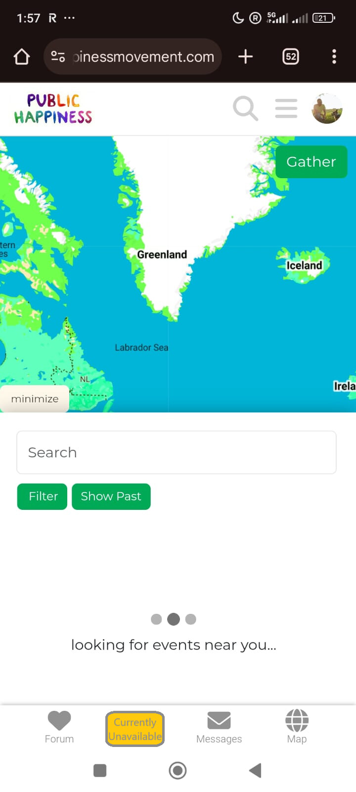
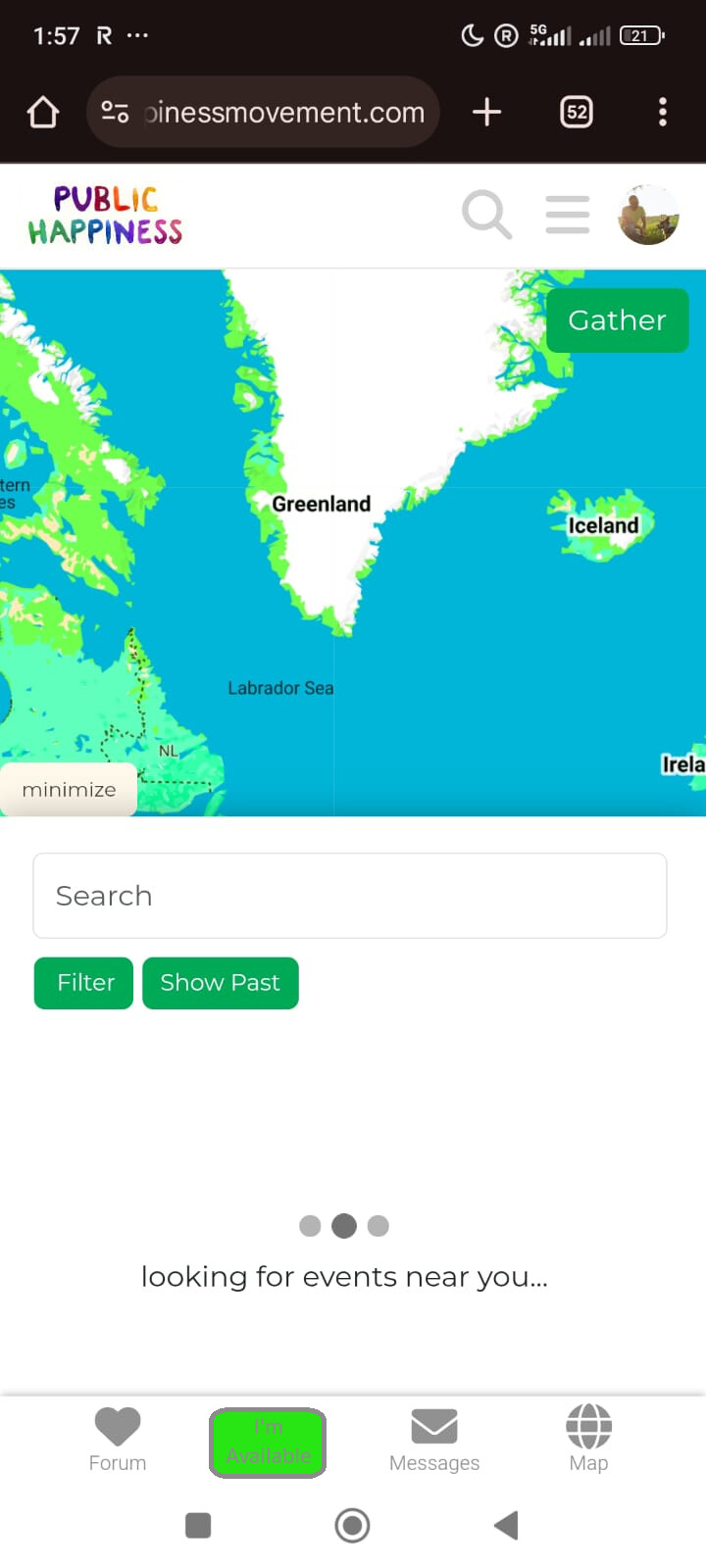
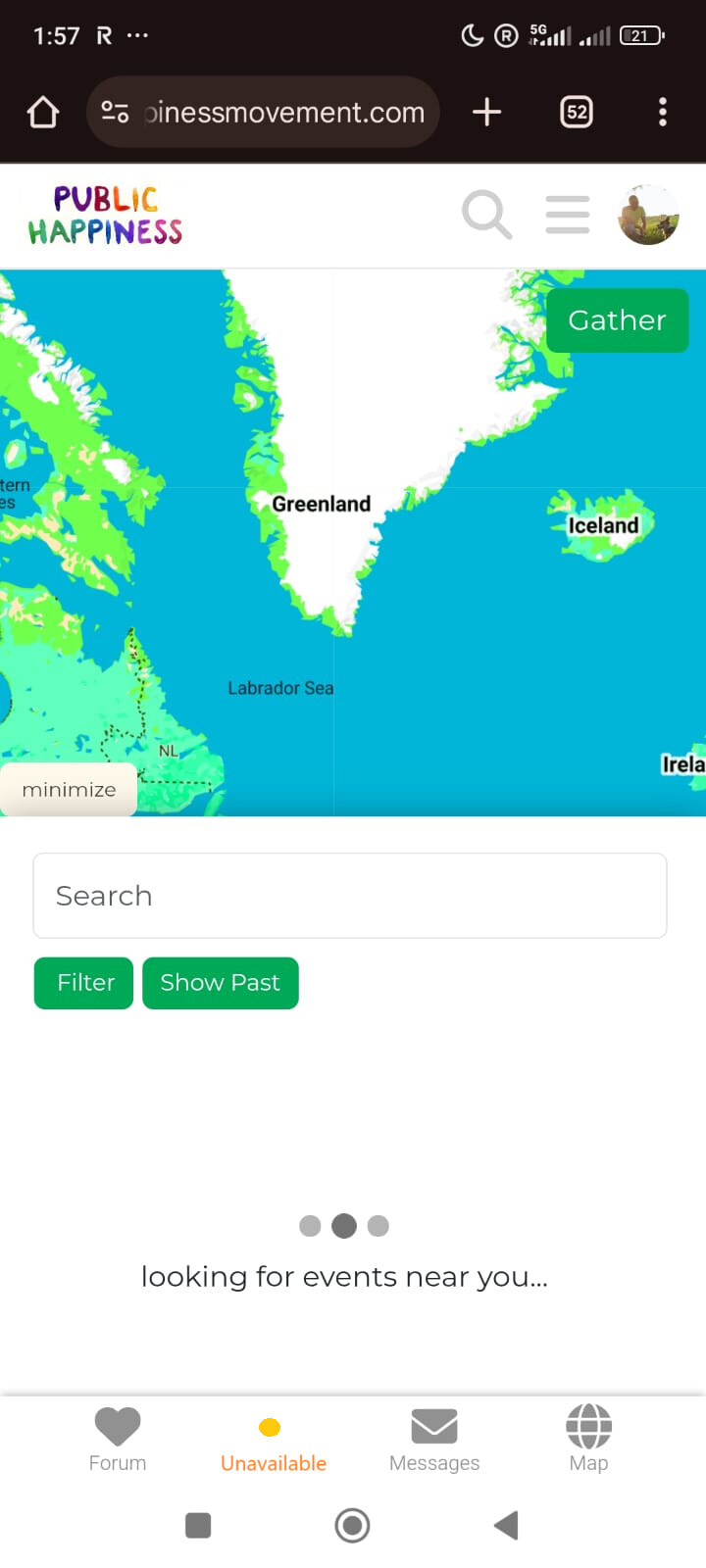
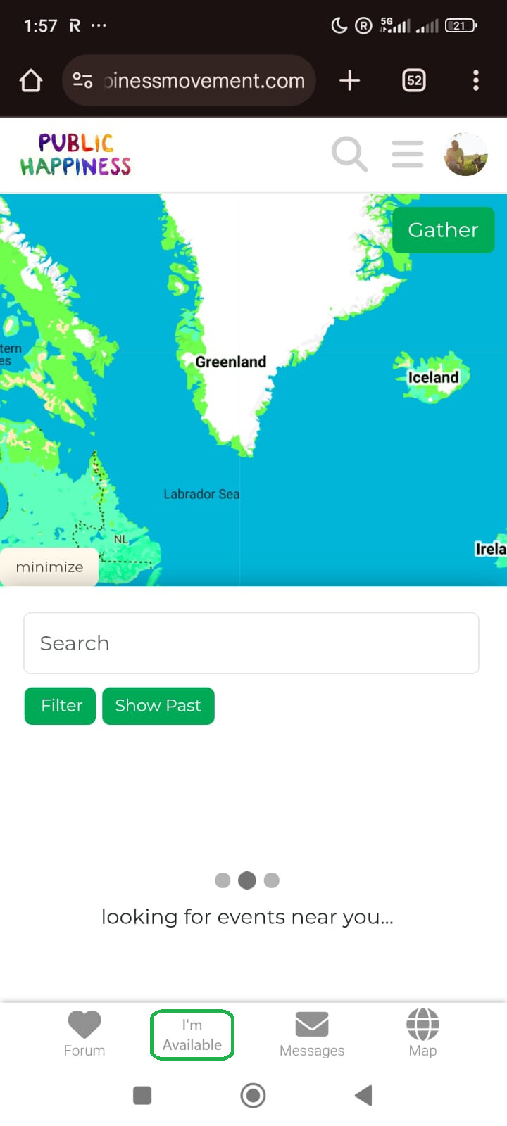
User has filled in current ‘add myself to the map’ part of forms (which will have a different name):
‘available’: User is open to receiving invites to nearby activities from other users. (we may need to explain this somehow).
‘currently unavailable’: User doesn’t receive invites.
these options should be customisable. for example how far away is you limit to receiving activity invites. Most users wont want a notification about something 200km away. I’m not currently sure how we would customise these.
User hasn’t completed the form: Button shows ‘I’m in!’ instead. Opens the ‘add yourself to the map’ form. Colour.. blue i guess. matching the ocean.
I think the ones below look better, but aren’t as clear to the user what they actually mean. On desktop we could deal with that with an ‘on-hover’ explaination, but on mobile we couldn’t explain in that way.
Burger Menu now hides on the homepage and maps side of the platform. It was painfully tricky, but appears to work flawlessly now
The code should work for mobile and desktop. It’s been tested on chrome and firefox for android, chrome and firefox for desktop. To test head to the homepage, then navigate to the forum, then to the maps.
(note: It doesn’t work on all Themes, but atm i think we are all using ‘default’ or ‘dark’ which is does work on)
Feel welcome to try it out on other systems @Marvelxy