Hey, Amazing Focallocal Magicians ![]()
Thank you for all you’re doing.
I wanted to ask your expert feedback.
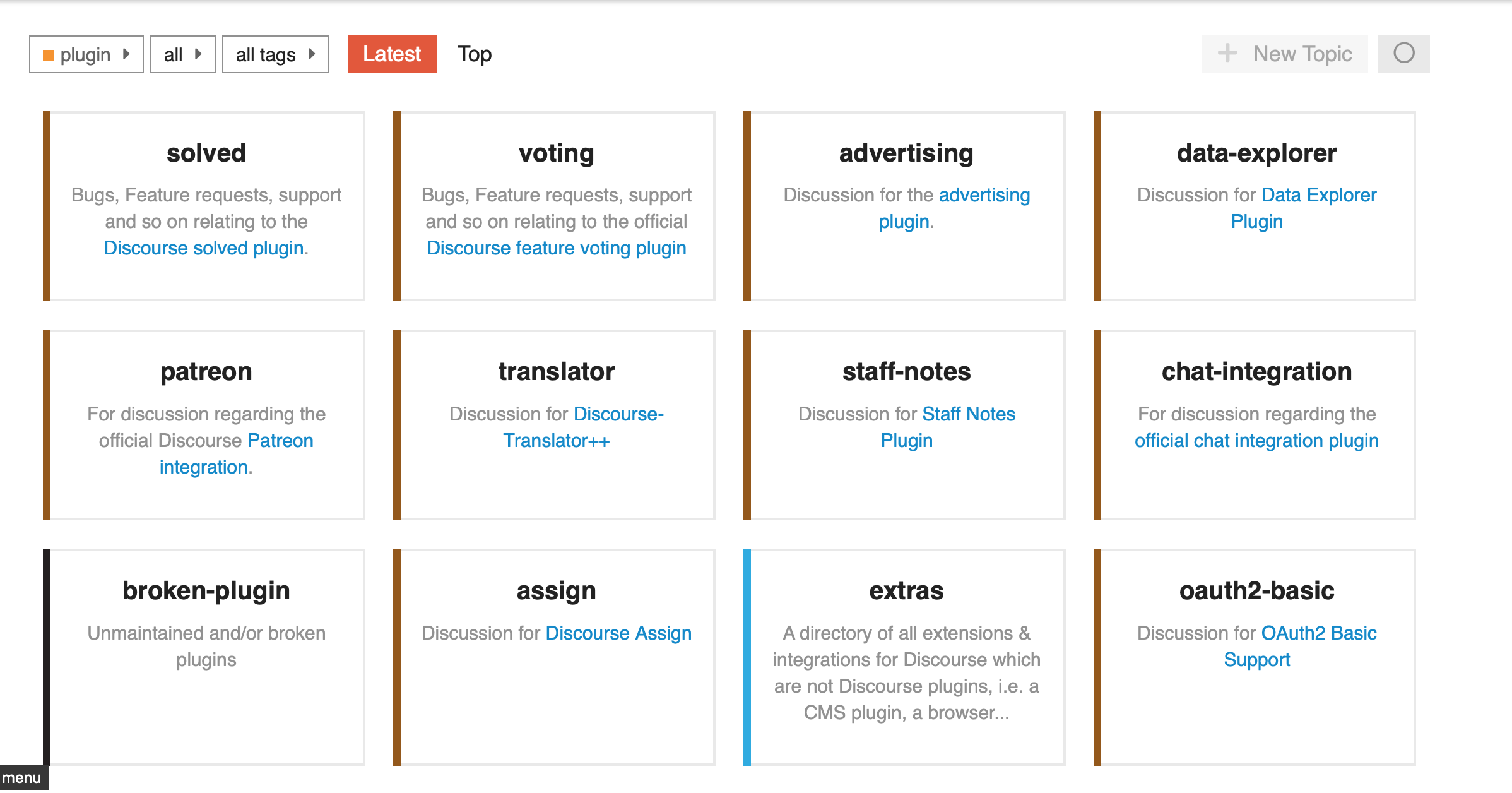
Me as I a user found this points a bit difficult to use a platform:
- Feel a bit clattered with options even at the front page
- Losing myself in different groups
https://publichappinessmovement.com/docuss/build
- Forum itself difficult to read , toooo much , overwhelming feeling, people can lost:
I am not expert at all.I know just that everything really matters for people comprehension: colour, size, text, positions, angel, etc.
-
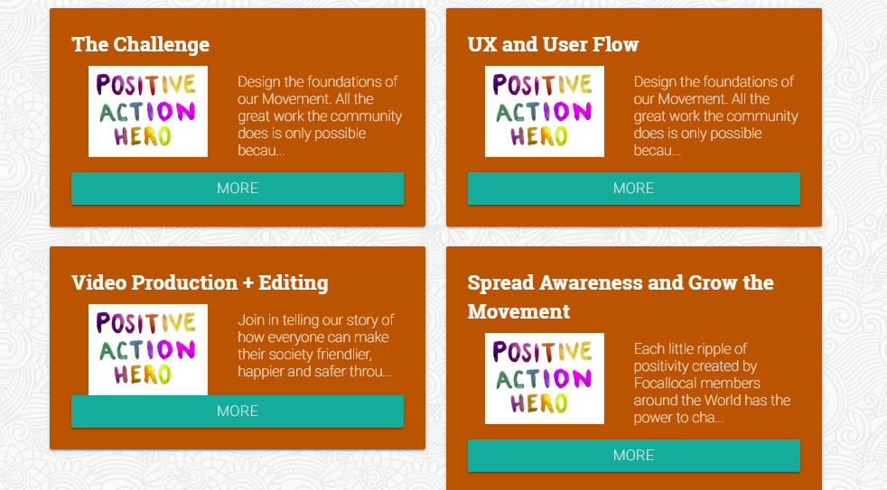
More CLEAR SIMPLE platform looking maybe smth like that:
-
Maybe instead of grouping it by blocks just make a clear page and just ONE thing in a middle where person can type any WORD and can find by this WORD any group, project: UX/UI; Dev; Project management; Activities, Financial, etc.
Maybe some main NAMES of groups too, but it should look different than now, more clear, spacy, you know better
I don’t know how but you might suggest how to make it more:
SIMPLE
CLEAR
INTUITIVE
In a wat that a user wants to be in this platform, wants to spend time here, not run away after 1 min you saw so much things and it’s overwhelming, cluttering his/her mind.
Please, help to make our common dream reality ![]() without your magician hint it would be very difficult
without your magician hint it would be very difficult ![]()
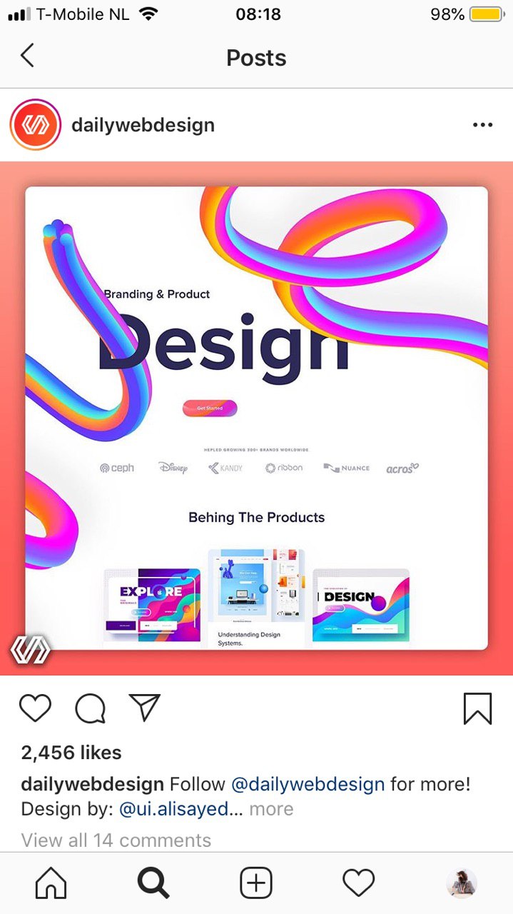
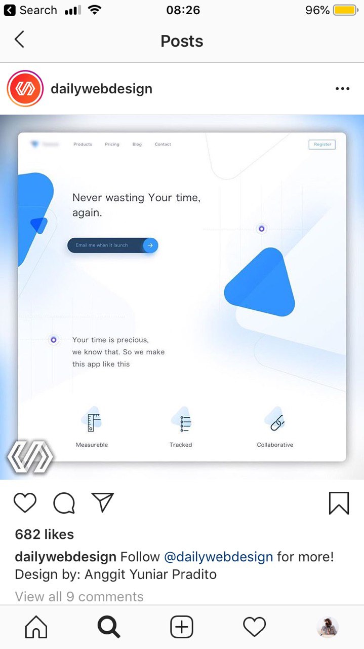
Maybe let’s start putting here examples of websites which inspires you, to have a common imagination how it should look like.
And by small steps start moving towards that.