Just to confirm what you want, you want the colors to be more vibrant with realistically gold-colored land having shading and reflections, and vibrant blue oceans? what do you want the background color to be? any clue what fonts you want? size and color?
I think a plain white background would be the best for colour differentiation and making it stand out.
I’ve no idea about Fonts and Text right now. I guess the best would be if it was something that could be updated during future team discussion. I can imagine someone might think to make a ‘public happiness board game’, and we already have a Public Happiness Documentary coming out. So bring able to update would be useful
I can save it as an image file that includes no background which I imagine would be best.
Would having no country lines be more friendly maybe? Suggesting the world is more united instead of divided.
For fonts would you rather I leave that up to you and it could be separate from the logo? You can adjust fonts as easily as I can. Lots of free fonts exist too, like at websites such as dafont.com and fontspace.com
If you aren’t satisfied with any then I can try to come up with some font options for you.
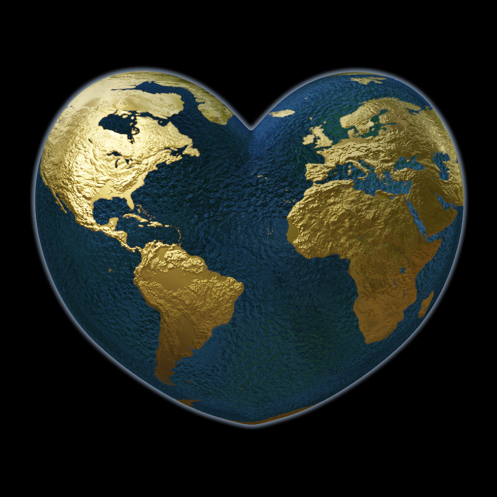
it’s going, but i keep needing to ask forums for help on how to do things. that’s why it’s taking so long. blender is a really complicated program, but i think the logo will look great eventually
I think what Andy was trying to say was that the colour scheme is perfect, while there is a little space for the ocean to ‘pop’ a little more.
Partly that’s because the dark spots in the middle of the ocean, they look interesting but grab the attention a bit too much creating a darker experience. I wouldn’t get rid of it, just lighten the tone of that area.
The other part is a balance, that blue tone is beautiful. It might be possible to pull some extra luminescence from it without losing the tone, which would really make the logo catch the eye.
The gold is absolutely breathtaking! As @AndyatFocallocal mentioned light perhaps slightly expanding the really bright parts would achieve that. I wouldn’t touch it much though as it is brilliant!
I would guess the light within the image and it ‘popping out’ from the background, is going to be key for catching the eye in times when the logo is small
i think that would be pretty odd to have australia in the wrong place. i don’t think any australians would mind being unrepresented china and many countries are missing too so it’s not really unfair to only fit what can fit
@AndyatFocallocal I agree with what Isiah has said about it being odd if Australia were to be added in the middle of the logo. I think some users that will visit the site might also question the placement. If the logo is going to be mounted on a white background, then users will notice the 3D logo. So, not all the countries can fit on the side that is showing. Countries in Central Asia, Southeast Asia, Oceania, and some of the countries in the Southwest Pacific region are not there. There will be other opportunities on the site that will showcase the world map.
Also feedback which @MarinaOhNo and Olga sent to me, rather than posting here
Was that it felt a little too serious and businessy needed a little magic. I think that would be achieved with the lighter blue glow from the water I was talking about before.
Maybe this shade of blue is more what I was thinking though, or even a shade brighter (if it looks good)
@MarinaOhNo and Olga what do you mean by magic? Like do you want the logo to be more welcoming? Changing the shade of blue will definitely change the mood. Light blue can symbolize calmness and some other things.

