@AndyatFocallocal I think @isaiahgirard is waiting for your reply in order to finish up the logo.
yuup, thanks
sorry, i forgot to come back to this. thanks for reminding me Bob
they liked the pedestal idea most. the outer glow i’m not sure about. do you want to try with and witout and we’ll hold a vote here, and on our facebook group?
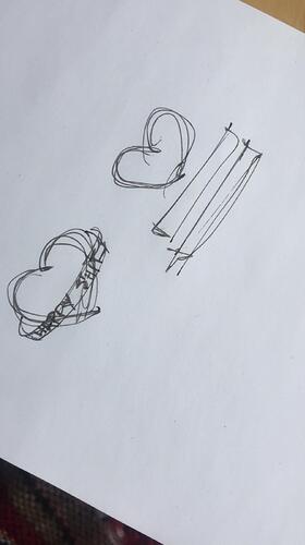
can you give me an example of the pedestal idea? maybe one of your coworkers can sketch it roughly? (no letters, just the area rectangles where the words would go)
i’ll work on the outer glow
Hello!
The logo is great! However, I’m kind of afraid it won’t be readable / recognizable at small sizes as there may be too many details on it. More than 60% of Internet use is made on mobile phones.
Even if 3D design look good, logo design is going flat lately because it is so much easier to see on digital devices. It may look like a trend, bu it has real benefits, and a simpler logo also means less cognitive load to read and understand for the users. The simpler the logo, the easier it is to recognize.
Don’t you think we may try a flatter version? I can’t see the added value of the 3D one at the moment.
We have been discussing having a low detail and high detail version of the same logo
i think the big details make it identifiable, not the little details that might get lost. no similar logos exist that i know of, and with apps the app name is under the icon anyways. i can make a flat simplified version if you test this version at a small scale and aren’t happy with it.
the outerglow looks nice @isaiahgirard. could you post one with a white background too please so we can see what that will look like
you want the heart to be resting on 3d letters? explain all the text details you can like size, color, texture, etc. ill post the white bg version soon
I don’t really know. I guess it should be simple, probably plain white, so the ‘public happiness movement’ text stands out
want it to be
PUBLIC
HAPPINESS
MOVEMENT
centered?
Yes, that sounds good
I agree with Mateo
here’s a sample of it at small sizes. it will look clearer though being that it can be scaled perfectly to any size as a vector graphic. think it would be good as an app icon or should i make a simpler 2d version for that?
(click on the image to view the entire thing. the 3rd / small version got cut off otherwise)
i tried making the text like you wanted, but the problem is that the text doesn’t look 3D from the front. want me to change the viewing angle of it all? if so, from which direction do you want the perspective to come from?
I’m sorry to insist, but it seems that you are not taking into account the critics here…(MarinaOhNo, Eleanor, me)
A logo is something that must be consistent and recognizable without too much cognitive load. Having two versions, one in 3D and one flat is a bad idea, as it goes against consistency. People will have a hard time identifying us.
If there are no similar logo at the moment it means something, as logo designers usually know what they are doing, let’s not reinvent the wheel ![]()
It seems we are adding a lot of effects on it, glow, 3D, shadows, and it could hurt the website by making it feel unprofessional and not serious at all.
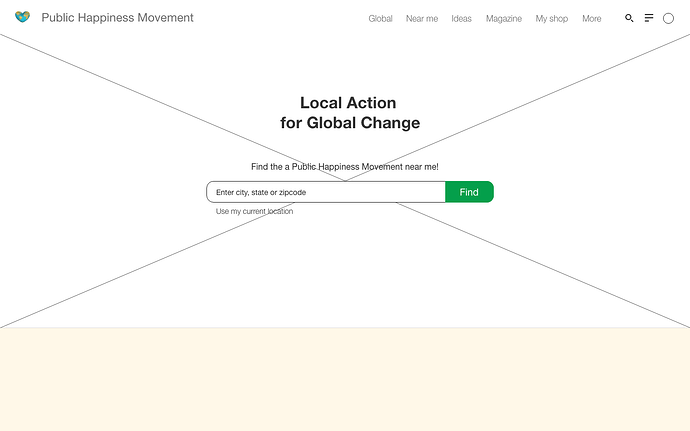
Here’s a quick mock-up on how it would look, if you feel like it’s ok and we can understand what it represents then let’s keep it. If the majority of people like it as it is, I won’t go against it.
Thanks for making that mock up Mateo. I think it works if the user has seen our full size logo, but it isn’t clear what the gold is if they haven’t.
@isaiahgirard has put a lot of work into this and it looks excellent at a large size. We should look to find a creative solution that works for everyone.
It’s a shame we were short on experienced voices earlier in the design process.
For example:
Perhaps this is best as a banner image? Which can include the logo when there is space for a larger image?
Our community has a very distinctive puppy who carries a camera at our events : https://www.inzli.com/tag/wigglesthecameradog
I could imagine a logo of the puppy (like Doge coin) and when it’s a larger image the puppy could be behind the earth resting it’s head between the dips in the heart.
How does that sound?
Another alternative is if the logo is all the cool blue colour at logo size and details appear when it gets bigger.

