If we aren’t able to find a way to make it pop as a logo I was thinking it would be very cool to have a banner with the logo inside that heart globe, showing that we are global and making the world richer (in what really matters).
Or if it were a corgi puppy, resting it’s head on it would be super cool. I also thought it could be the shape of a corgi butt… but the colours we chose would look a bit weird on a corgi butt.
mateo’s sample isn’t accurate, because it wasn’t scaled down using illustrator. the image would be completely clear and not blurry. there’s also no reason that the logo has to be that small on a website. the logo doesn’t have to be the common or standard size to look professional. maybe i’m a little bias from all the hours i’ve spent working on it, but i think it can work, and i don’t believe having a simpler version for a small app icon would be unprofessional.
it isn’t hard to identify us if the name is always next to the logo… and the logo is obviously the same image in 2d and 3d formats. no similar logos existing does matter, because our logo wont be confused for somebody else’s logo.
the glow effect is just to resemble the atmosphere, 3D may not be common, but i think it looks good and is what i was told was wanted originally, and the shadows are just from the mountains being 3D. i doubt anyone would see the effects as unprofessional.
want me to make a 2d version? if not, then i don’t feel like making a completely different logo. i’ve already spent many hours working on this for free
Your efforts are very much appreciated around here Isiah
It’s a shame these voices are here now rather than earlier in there process, but it’s also a great thing as together we will strengthen the idea and come up with an awesome end product.
What you’ve made looks fantastic and will definitely benefit the project, so we’re just discussing a possible change in use cases.
First it would be great to have the version you think would work best as a small logo in the nav bar so we can compare.
If it doesn’t work there then I think we should use it as a fantastic frame to represent the global happier world vision were building here. So the small logo would be in the middle of the earth when it’s larger (like the app/sites loading screen).
We’d still need a small logo for right now and I propose that we use your scaled down one regardless as @bob is waiting on a logo for the app loading page
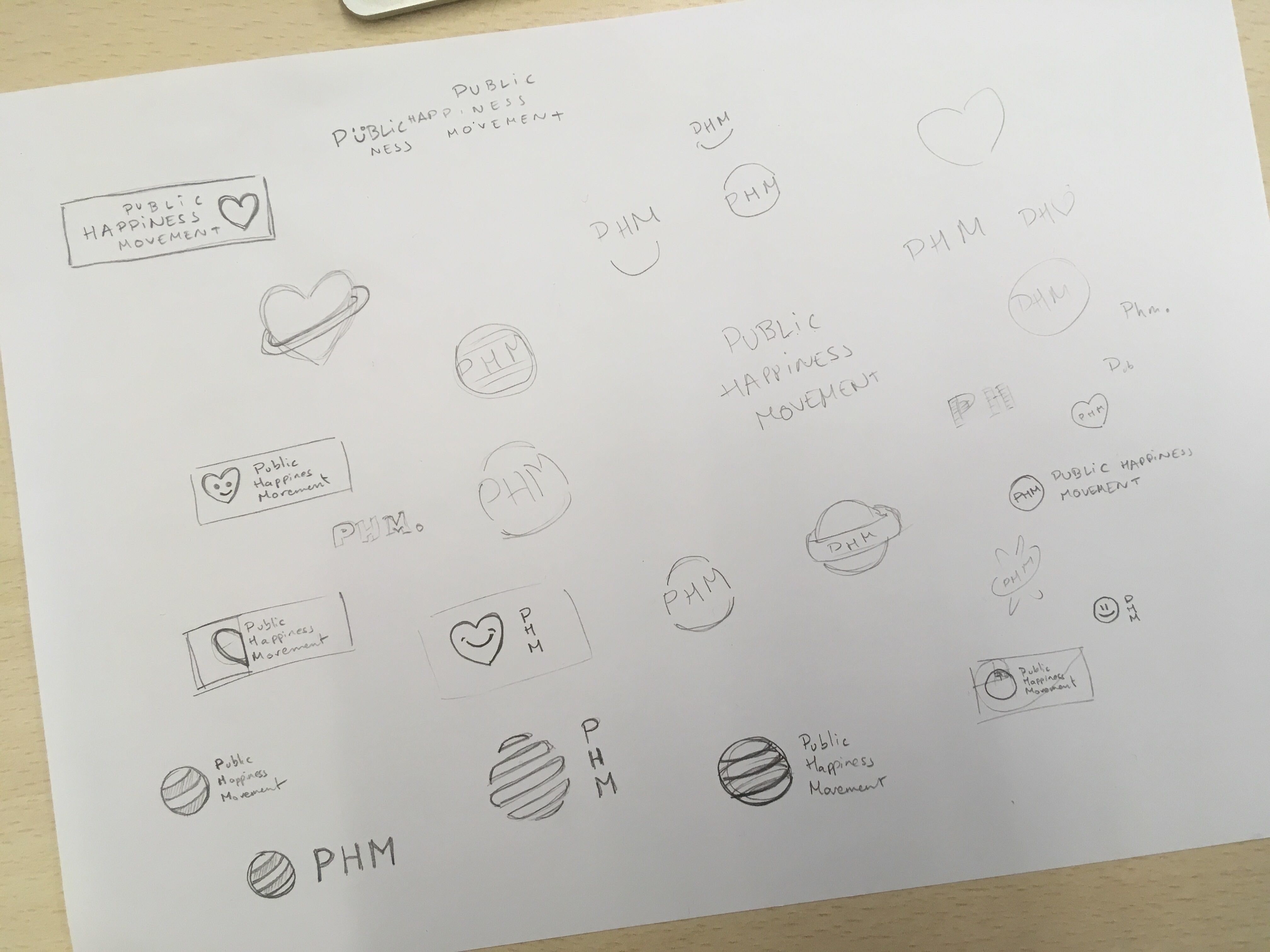
@isaiahgirard I feel bad for my critic because I know you put a lot of work into it, but I’m not saying it against you but for the project and the user experience when looking at the logo. And I feel bad for saying it so late, after all the hard work that has been done. @MarinaOhNo I have created logo for some projects but I’m not specialized in logo design, here are some quick sketches I’ve made that represent some simple and clear ideas that I think could suit the project. I wouldn’t go for something complicated at the moment but for something easily recognizable, usable and scalable.
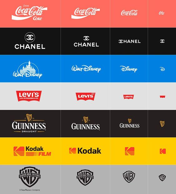
Ok, I may have an idea but it could represent more work for the devs: we could go with adaptive logo design, which can look great, here an example of how some brands use this:
We’ll have to add queries in the CSS so it detects the size of the windows and the device used to enter the website/app.
If we go for that, there are some things we’d still have to do in the logo:
On the actual version, we should only use two colors, it serves no purpose having 3 shades of blue.
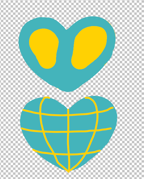
Maybe we could try simplifying the earth - yellow part, so we can recognize it without having to have every coast. For example, on these design, we can clearly recognize it’s the Earth without having so much detail:
Finally, let’s use simple flat type for the text, not only because it is easier to read but also for accessibility issues: people with lower vision or dyslexia problems may have a hard time with this kind of effect.
We’ll also have to design three simplified designs for other devices
Yes, I believe it should work like that!
I’ve got a doubt, do you think we could make it so we can see our Australian friends on it?
Or should we make the earth continents not recognizable at all so we don’t have this issue?
For the size i think we would need, at least:
For the favicon, a 16x16 px logo at 72 ppi (very little detail)
For the website logo, we could use something like 250x150? Or 160x160? at 150 ppi
For print, a 500x500 for small things and a 1024x1024 for large ones at 300 ppi
The hard thing here is to make sure they are all highly similar but easy to read, tell me if I can help in something @isaiahgirard
Good spot. We discussed that before and @isiah didn’t think it was. Getting overly complex, but if we are returning different logos based on resolution, what if we had a code that recognised where they are from and has a northern and southern hemisphere version.
Yes but that may require a lot of work and data, we’ll have to check user IP to know their location and import a list of countries… Maybe too much work for now, but definitely something we could keep as a “nice to have”.
Looking online, the only other form of simplified earth I see is this one:
I like the globe with it expand in stages to Isiah’s full version. What about if we had 2 versions and a randomiser so sometimes users saw the northern and sometimes the southern.
Or we just manually switch each month.
Most ppl won’t notice, but those who do will be happy
i think having it alternate every time showing a version with and without australia would be cool. the continents would be too small if i tried to fit australia in.
want me to make an australia version in every size?
Oh, or we can just casually alternate them on different pages. That’s the low tech solution. So the earth appears to spin as users visit different pages on our site