want me to make an australia version in every size?
Guys, thank you for your hard work here. ![]()
Just curious to ask,
- What do you think to make the heart with few layers like it’s neural networks which is unbreakable, infinite shape - inspiration by relativity of neuro netrowk of human beings brain and universe, somehow showing that we’re the ONE and if we stay TOGETHER we’re unbreakable force.
I don’t remember exactly what is unbreakable physical shape which exist , and I cant find it in internet, I guess guys you might know better than me. Maybe this kind of graphene shape?
- Maybe if with neuro shapes heart is too difficult to make, what about just use deep&complex colours? I’ll attach a link what I mean by deep colour and more sharper shapes. Like here in the first example of 3D gradient. It’s simple and at the same time deep looking.
1 Like
Hello,
Yes I checked yesterday but I was concentrated on the time-picker thing.
I feel like we are going to a lot of complex things, we should keep it simple as much as possible.
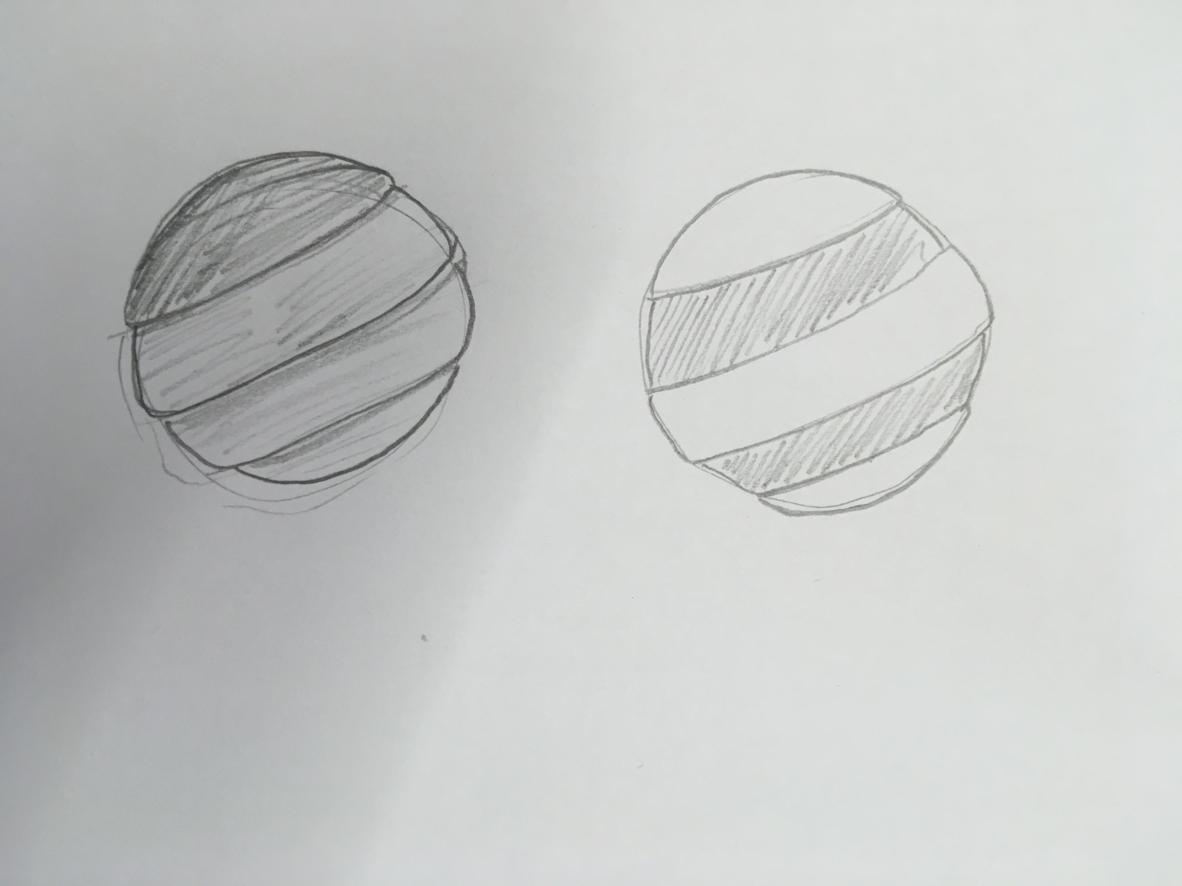
Even if a moving earth, a changing form or any animation could look cool, we should first define what it is that we want to show. I think going for an abstract and minimalist approach is a good idea, like the globe with lines or the graphene thing suggested by @MarinaOhNo . (but we should be careful not to create a football ball thought). Also I did some quick sketches with the layers thing and it could look great:
My process of creating a logo is very similar to the one of this man, and it always begin with a lot of research and ideation: https://www.youtube.com/watch?v=zOPA0NaeTBk
1 Like
Guys,
I just stumble on pretty cool logo.
I’m sorry to kind of coming up with new idea at the last moment , but just for you maybe to get some inspiration.
I really like how they simply played around with lines.
We could do smth similar with 3 letters PHM - public happiness movement.
It looks playful, fun, and can be differently adjusted.
Just have a look.
https://www.behance.net/gallery/33226587/Fluor-Naming-Branding?tracking_source=search|naming
I prefer the ones we’ve been discussing. I think they represent what what want to create more
Sure.
Just sending that for inspiration.
It can be still the heart just a bit different funky shape, lines, and colours.
Maybe some ideas will emerge from that.
@MarinaOhNo how do you imagine them being made into the logo? did you mean to make the heart only out of a hexagon mesh, and to have a light to dark gradient? i could possibly make that, but i’m just following orders, so i’ll need to hear a consensus. i don’t think many would understand the relation between hexagons and us being an unbreakable force together though tbh.
@Mateo the program i’ve been using lets you create animations, so i could make any logo rotate 360 degrees.
@AndyatFocallocal i need you to tell me what to do ![]()
From what I can see, Mateo, you and myself like the idea of having a low detail version like the one you posted above, then the high detail version, and… probably 2? steps in between.
I felt there was also support for having a northern and southern hemisphere version which we can use interchangeably and perhaps automate at a later date.
Those were the only two ideas so far that seemed to gain support so unless more support grows behind Marina’s suggestion it’s probably not needed to pull the three ideas out into a voting thread.
If anyone prefers we create a vote on them just let me know
Well, to be honest I think we are going to all kind of directions because we don’t have a clear idea of what we want. We are going on the wrong path because of not having this clear vision of what we are doing and what is a logo, and I guess that’s why we are not convinced yet.
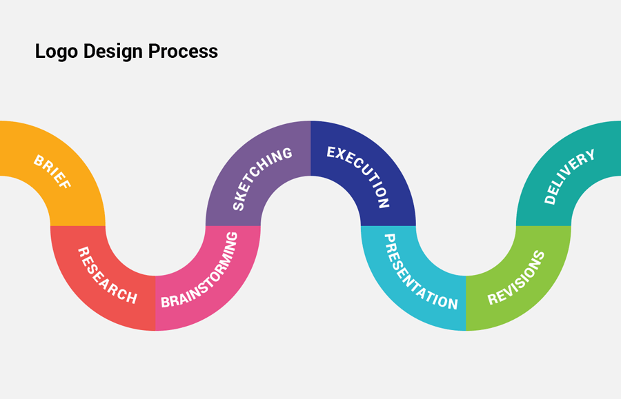
The process here seems to be more like an illustration process than a logo one: something has been asked and we did it following the “client”'s (Andy) request. For a logo, we should begin with a brief and not a defined solution. Here is a example of what the process should be, and I think we jumped right on to the execution part: (you can see it in this link: Logo Design Process From Start To Finish)
There are 5 important rules for a good logo and I feel we are not respecting them:
- Is it simple? (easy recognition, unique but not overdrawn)
- Is it memorable? (if simple easier to memorize)
- Is it timeless? (doesn’t need rebranding because of effect or trends)
- Is it versatile? (functional in different support and colors)
- Is it appropriate? (logical scheme depending on the public=
More info about that here: https://www.chino.k12.ca.us/cms/lib8/CA01902308/Centricity/domain/2246/unit%207%20resources%20and%20pdfs/What%20Makes%20a%20Good%20Logo.pdf
Finally, a logo is an identifier and not an explainer of what the brand is.
I’m sorry but I really think we should start from zero here. And I’ll forget about the animation, 3D, 4 different versions, etc. for now. Let’s use the simple version that @isaiahgirard proposed here, and start working on a another one later but following the process.
I hope I’m not wrongly interpreted here, I really don’t want to be mean or judgemental but I think we should follow tested and proven methods (that’s why I add as much links and sources as possible).
Regards,
Mateo
1 Like
Myself and Isiah went through these stages initially in creating his heart globe design.
More experienced voices joined in and suggested it was too detailed, so we’re in the review stage now discussing how to reduce the complexity.
Marina’s message was a bit of a sidewind as I personally like the ideas and designs we came up with here to have a low detail, mid detail and high detail version.
Hello again,
I have been reading all the thread before, and there is no brief, no research, no brainstorming and no sketching.
A brief is not saying what you want, but what you represent and what you are. @isaiahgirard asked what you wanted and created it but this is not the right process. This means there haven’t been research nor brainstorming. What we have right now could have been bought on a stock image website directly: Google Search. I must insist, it is not a logo but an illustration.
Logo design is one of the most complicated job in graphic design and it shouldn’t be done like that. We are going against all conventions and good practices here. @Eleanor correctly told it at the beginning of the process. There is no source that would validate this kind of design or process, when I showed it to my colleagues or friends no one found it correctly created. And I’m not speaking about beauty, but good practices.
I’ve tried my best here with source, proof and links, so if this is the path you decide to follow I’ll have to step down from this thread as I can’t approve it, and I’ll concentrate on other parts of the website (no bad feelings though!)
Regards
PD: I just found this little gem, have you seen how simple, memorable, timeless, versatile and appropriate it is? (and classy, elegant, modern, beautiful) https://dribbble.com/shots/5442210-Project-Earth

1 Like
You’re correct that we didn’t follow correct protocol for designing a logo, as none of us at the beginning had that experience. The sketch discussed at the top came from sitting with a few UX/UI ppl informally and discussing the movement vision and what we want to communicate to the world.
This thread brings up an interesting question we have to resolve, and so its really good that we’re having it now. With new users who have new ideas coming into the community regularly we’re going to find that long threads where members are discussing an idea or project, get into a groove where progress is happening. That’s going to get disrupted when a new idea is introduced as everyone needs to stop and discuss that idea.
I’ll work on creating documentation to guide users joining in existing discussions so we can protect that flow. I think it should be that members read back to get an understanding of whats going on, and then their comments should contribute to that idea.
If they feel strongly the correct action would be to begin an alternative idea then they should introduce that in it’s own thread as a 2nd option, which the rest of the community can talk about in its own space. build if they like it, and vote between which of the two is best when completed.
At this point this thread has been going for a while and has been about Isiah’s design for a while. so discussions should remain on Isiah’s design. Marina’s idea would be it’s own post. Mateo’s idea to begin the process from the beginning and follow all the steps would also be it’s own thread. when completed the community can vote if they want to keep with the current one, or switch to the new design.
@isaiahgirard @Mateo @MarinaOhNo What do you think about adding that to the user guide?
The difference between my heart shaped earth and stock ones is that i’ve been able to revise it to fit exactly what andy has been asking for. i can also easily add different angles of the earth which would be impossible to find with stock images. i have done logo design work many times before, and what i think works best is for a client to tell me what they want, and for me to make it and revise it until they like it. logos don’t have to follow traditions or trends. maybe you would think the same way if you took art history classes and saw how successful artists can be who stray from traditional methods. i went to college and have a major in art with a graphic design concentration and they never taught the things you posted. i’m sure your method works well, but im just saying it’s not required.
@AndyatFocallocal what do you mean by “adding that to the user guide?” exactly? i’m not sure what a user guide is, or what “that” is referring to.
my vote is for using the simple version of the logo i made (and another version with and without australia) at 3 sizes
for reference:
- For the favicon, a 16x16 px logo at 72 ppi (very little detail)
- For the website logo, we could use something like 250x150? Or 160x160? at 150 ppi
- For print, a 500x500 for small things and a 1024x1024 for large ones at 300 ppi
i kind of rushed the logo, so i can make some final touches to make it look better too. what do you guys think of adding a light-dark gradient like maria recommended?
i can also make an animated version of the logo rotating 360 degrees after all of that is done since it may take a while to learn to do that.
2 Likes
The 3D version would work great on our videos, and be future ready as 3D screens are becoming more popular so I can easily see companies wanting their logo’s to pop out once that tech is more wide spread
I actually took art history classes for three years ![]()
You’re both right, let’s continue with what we have now. I think too that a gradient is a good idea and could add a nice effect on the last one you sent.
Let me know if you need help with the different formats.
2 Likes
do you both agree that i should make the simple version of the logo i made (and another version without australia) at 3 sizes? what size do you want the 3D logo to be? can you tell me the color hex codes you want used?
what do you guys think of this version with a gradient?
https://photos.app.goo.gl/rECy73MJb2wwFgR38
also, do you want me to edit the shapes of the lakes or land any? i personally don’t like some of the shapes but it’s close to how it naturally is.
2 Likes
I like that. Is that the middle detail version?
color hex codes
I’m not sure I’m the right person to ask. The one you posted looks great
i guess so. do you think it’s good enough for the large version, or should the large have more details?
i need a confirmation though if i should make the logo (and another version with australia) at 3 sizes
1 Like
We should create documentation on how contribute to threads to maximise efficiency in our processes. My suggestion is that when joining any thread beyond say… 20 comments, users should read back to understand the flow of the thread, and if they are suggesting something that forks from that they should post it as it’s own thread, then if that idea is better everyone will move over.
That would increase efficiency on delivering ideas
1 Like
I thought that would be the medium version. Your original design is the large one, and that small one you posted earlier would be the small one.
I don’t know if there is a guide for how much detail each should have though.