‘Estimated Reach’ will be a multiplier of the numbers shown above it. I’ll have to do some research on how many people on average are interacted with at our events, or how many people on average see a post on facebook with 100 likes, etc.
For now just put in a basic multiplier like ‘x10’ and i’ll change it later and write a page at a later date with the research to justify that multiplication.
1 Like
When you’re ready for the social media stats let me know and i’ll send links to where you can find them all.
1 Like
I don’t understand this. What is the [platform]?
It would be a relative url, or reading the url from the current site.
so, publichappinessmovement.com or brightertomorrowmovement.com
1 Like
Okay, thank you. I didn’t want to assume 
1 Like
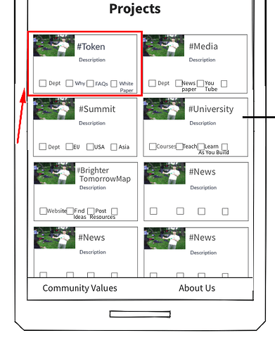
Quick question. Are these really going to look this way?
On a mobile device each box would be full screen. It should aim to mimic this as much as possible: Public Happiness - Local action for global change (there will also be photos in each of these, right now only one category has a profile image)
1 Like
Great, thanks! This is exactly what I wanted to confirm
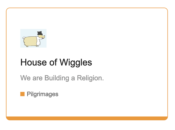
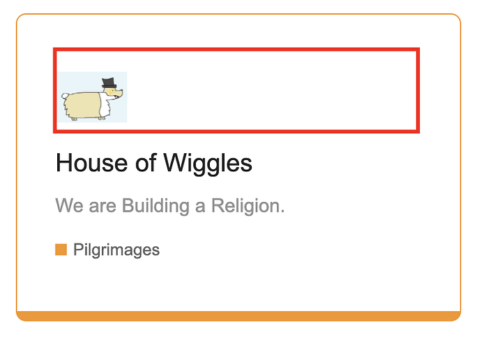
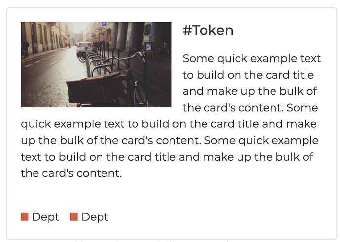
Don’t you think we should have the image stretch to the end? Like this:
Not exactly like the previous screenshot, but display in full instead of sitting at the right hand side of the box.
Let me know your thoughts.
1 Like
The small images looks good though, I will use the smaller images 
1 Like
I think you’re right. A banner image would be great
1 Like
Or move the text across and have the image come lower
1 Like
Can you do a quick rough design of this?
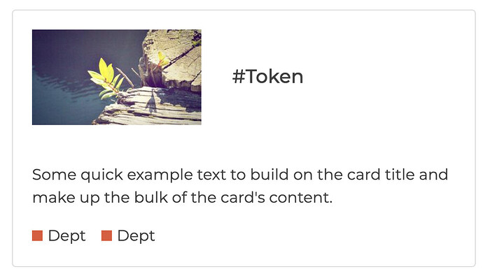
It would be this style image, just with the image about twice the height. In the example the text is all to the right of the image.
Got it. I will send you a screenshot.
1 Like
How’s the homepage coming, anything i can help with?
Coming good. I will finish the project section today.
Meanwhile, what do you think?
1 Like
Looks good 
There’s a couple of small edits i can see, probably some of them are already on your to do list but i’ll mention them in the hope it helps a bit…
- The image would be bigger to make the homepage look more interesting. That would mean the description text wraps around the image, starting below the title.
- The boxes outside line would look cooler if it were coloured. There is a colour scheme in the forum already, you can see it by clicking ‘Global’ in the top menu.
-
#token and ‘dept’ are links and would be the normal link colour so users can see they are clickable
1 Like
what about we make it half the width of the box?
1 Like
I will do that 
This is a rough stuff I did this morning. I will start editing to make it look exactly like what we want it to 
1 Like
This took a while, I can’t believe it. 
1 Like

