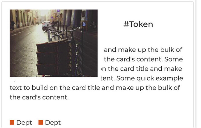
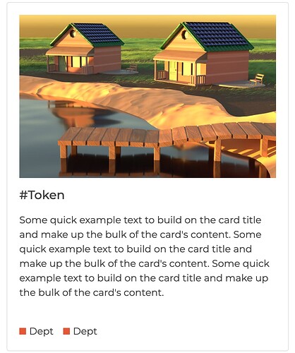
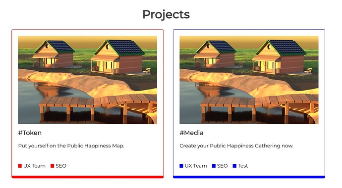
Its not quite popping. What about something like this:
(i missed the bottom by mistake)
The image needs to be big to make the homepage look interesting
I will work on the image next. Going to the saloon now. When I get back, I will work on it.
It seems we don’t have UI/UX guys. Going forward, I would like to do proper UI/UX design before writing codes because it makes things easier.
Cool!
btw, here the images for the center we’re aiming to build here. I’ll make a post about it soon.
It looks like I have to edit them, right? Since they are all together, I have to crop them out.
haha did I mis-read your last message 
Now I understand. Sorry for the misconception 
No worries, i will be adding that as a project that’ll go into the boxes but you won’t need to add that yourself. I’ll add the images, links and text via i18n
Alright, got it. One last thing. Send me the dimension of a sample image that would go in the project section. I need it to test with.
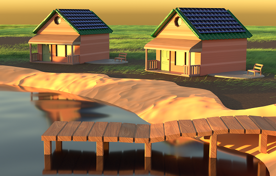
We haven’t decided on a set image size. I guess we should go with the image size suggested in category logo images which looks to be 550px x 350px
Thanks 
Ok, that looks good. Just play around with different screen sizes to check it looks good on them all, and with two columns for desktop and one for mobile it should be perfect 
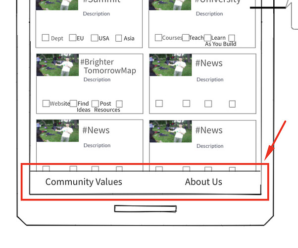
It looks like a floating footer though 
Ohh!!! That’s the floating footer I’ve been working on, correct me if I’m wrong @AndyatFocallocal ?
