Discussion carried on from here: Designing the Home Page for Non-logged in users - #118 by AndyatFocallocal
Linked to Text for a new Homepage for non-logged in users:
Logged out users should land on a landing page which encourages users to join in by delivering the feeling of what the world, their local community, and their life will feel like if they support us in making this community a global movement.
This involves delivering our messages in quickly and effectively, giving a sense of community and action towards humanitarian goals to benefit people, communities and the planet. Also demonstrating specific issues being tackled at a local level through our community.
Sequential Goals:
- Users create an account
- Users are directed down one of the two main paths Build or Gather
- Build is where they will build projects to transform the world with other community members, and also this platform
- Gather is where they can post themselves onto the map and invite other users nearby to meet and create positive public actions which benefit their local community
- Gather can also be considered ‘local community’, whilst Build is ‘global community’
- Users are introduced briefly to the concept of our token as a concept for a new economic system which can transform the entire world by rewarding people fairly for taking positive actions which benefit their local community.
Note: As a main part of our marketing strategy, non-logged in users should be able to see Gatherings (events, but we don’t use that term) and Project Overviews, if they have a direct link to it, but not be able to explore the platform without logging in.
@aeglobal @LuisR @ZaraAlyssa @krunal-tony @tiron_le @josie @AlenHuang @mateo @c_nine @kris @Abdeladim @doncolio @lmda @Zurika @animalworldng @MarinaOhNo @danyalamriben @NJUX @AlecAaron
You are always welcome to grab any task from the Sprint, or Backlog list (click the UX tag).
This task would be an excellent task to begin with, and one we could all work on together. Alexia has already begun putting together a design for it. Also DM me if you have other specific skills you’d like to contribute and i’ll help match you up with a 1st task to get active on at this exciting stage of our build
Lets discuss on this thread the design, and create another one here for the text, images, videos which should appear on it.
Hey everyone,
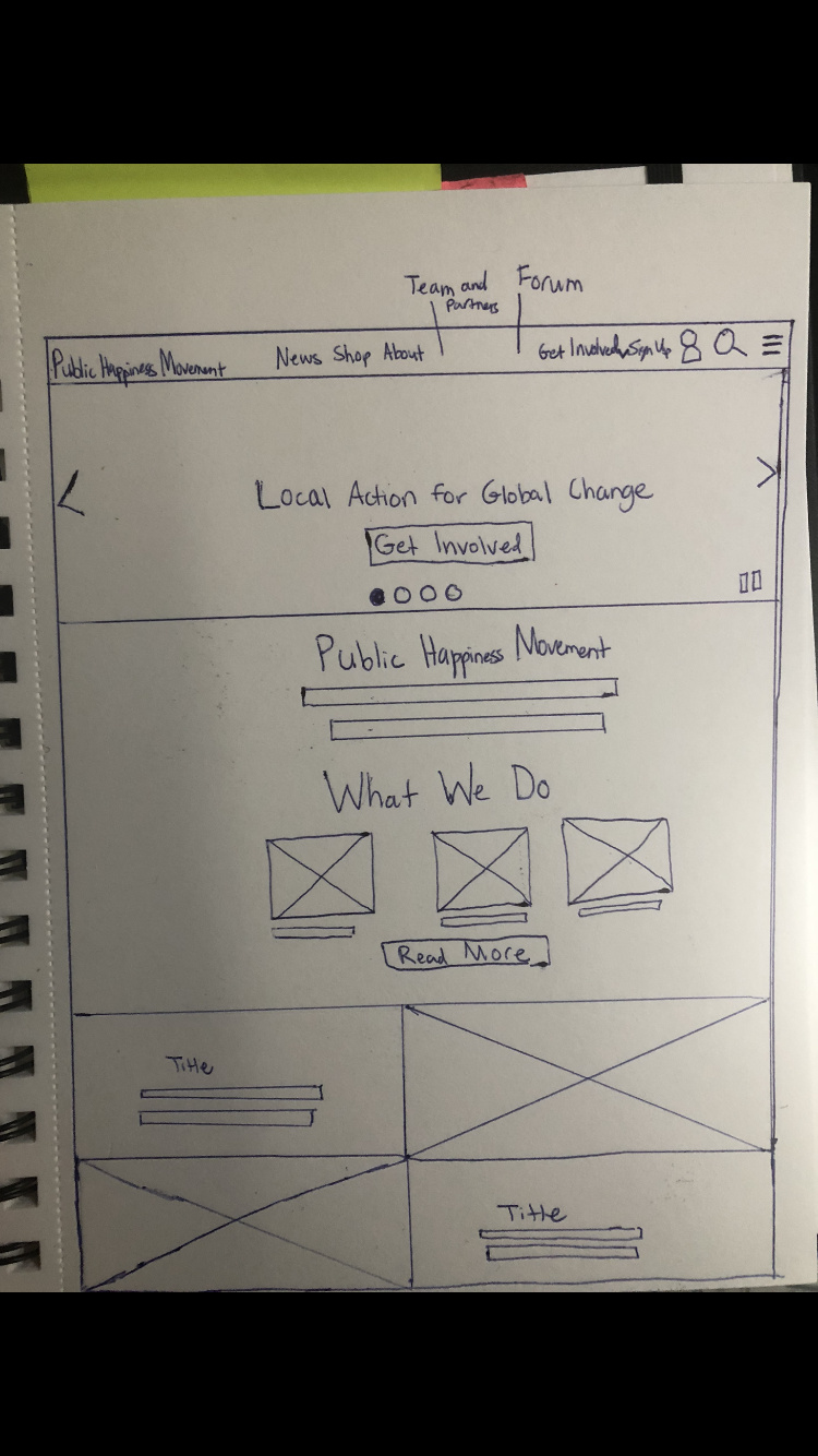
Here’s a rough draft of a wireframe that I drew. This wireframe only shows the first few sections. The other wireframe I’m planning to draw will include the rest of the sections and a footer.
1 Like
Just adding in my reply to your message this morning:
Thats a good start 
The main thing missing is that we need to direct users down two paths, Build and Gather as equally weighted routes. Right now the existing homepage only directs users into the Gather side.
Search for city, state and zip code would only work for the Gather side. It’s also an issue that we want users to create an account before going deeper into the site, so they would end up in a create account page rather than seeing their local area. Perhaps that find bar should be a ‘create account’ button?
One suggestion we discussed is to have two side by side splash pages which visitors can swipe between for each route. Giving more space to explain each side
Ah, also, right now there are few users and gatherings on the map, so allowing users to visit before creating an account will lead to them likely not joining
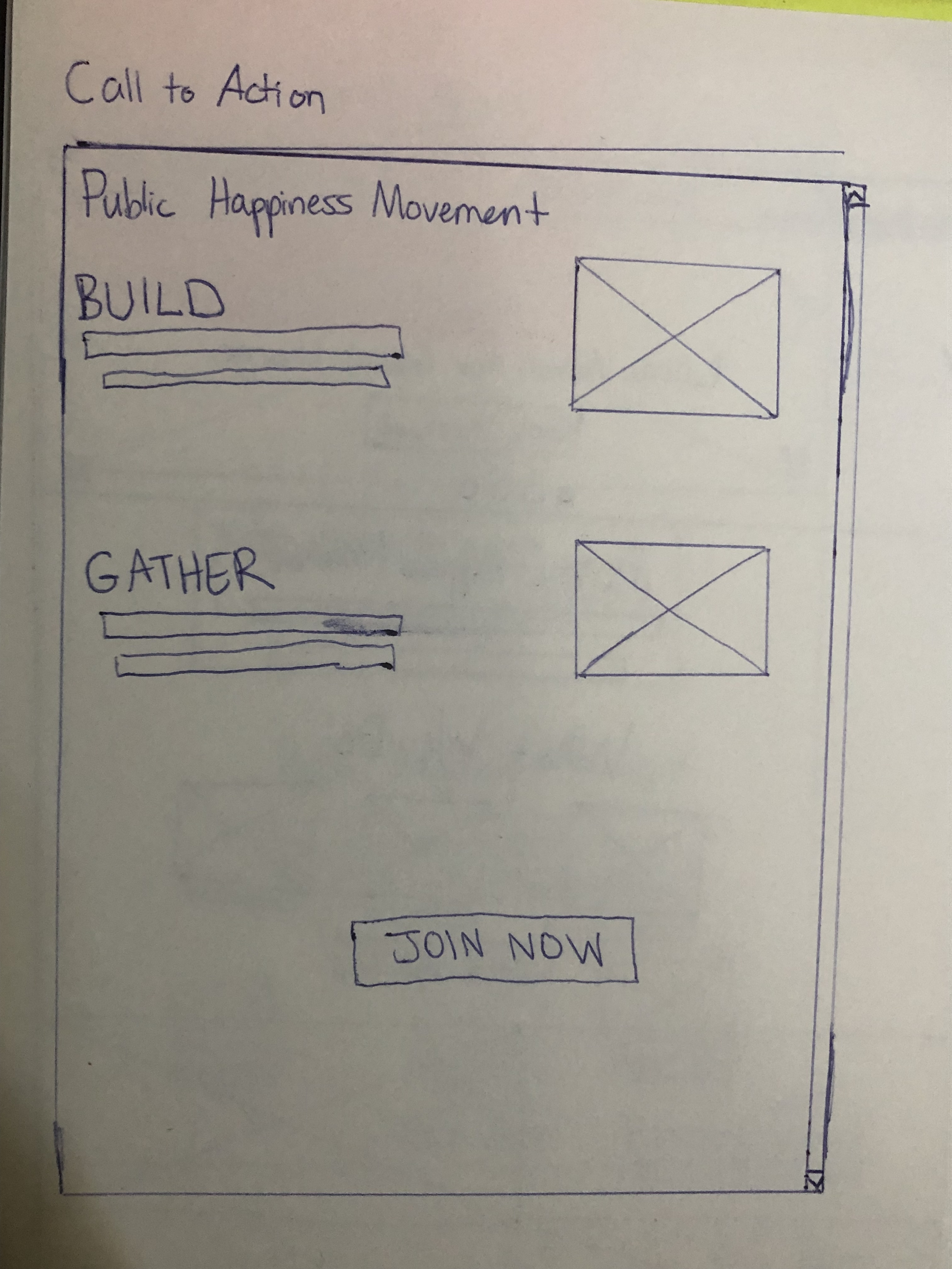
I was thinking of adding a “Get Involved” section that will have two clickable images, which will then take the user to the different respective pages that will go more into detail about either the “Build” or “Gather” section. There will be a small summary at the bottom of each image.
Interesting idea. That makes two clicks before a user lands on the ‘sign up’ page.
I’ve not seen that before, are there others using it effectively?
It’s also possible that the search bar invites them to search for locations, causes, or skills they want to contribute. That could then dynamically pull an overview of each underneath, and when a user clicks on anything for more info they have to sign up. That would be cool as the homepage would always be up to date.
The main issue with that approach is that we’d need two search buttons (or one really smart one), as ‘locations’ are built in a different language, and part of the site (gather).
I’ve seen a few volunteer websites where people click to find more information before deciding if they want to participate. I think there should only be one search button. Two search buttons can make it confusing for potential users. Also, most websites only have one search button. The search bar that you guys have should be able to search for the listed things.
I added a call to action page that focuses on Build and Gather. The call to action page would be the first thing that would be shown. Then, the user will scroll, and see the landing page. I got rid of Build and Gather in the menu bar. Both would be in the get involved drop-down menu. The slideshow images can relate to Build and Gather. The two sections at the bottom can be used for the splash pages.
The designs look good
I don’t think we can remove Build and Gather from the menu easily, as they are the two main sections and users need to be able to navigate to them easily from everywhere in the platform.
The search bar is a problem. We will need a search bar for each side of the site (they use different code and operate differently), so we if users go down the Build route we would then have a new search bar on the next page which operates differently confusing them
Perhaps the search bars shouldnt be on the splash page, and only appear after a user chooses a route
A lot of users couldn’t find the ‘Tasks’ tab as there’s a weird bug where some users see it as ‘Board’. If you couldn’t find it just jump into here and comment on a task you’d like to contribute to: https://publichappinessmovement.com/c/web-developers/delivering-our-message-mission-and-user-flow/l/latest?board=default
I will change it back to the original menu. I will also work on two different working prototypes. The first one is when the search bar would appear after the route. The other one is where the search bar is on the splash page. We should probably test this with users to see which one they would prefer.
Sounds good… although on the splash page the search bar would need to be split (if we have one). The reason is that for technical reasons, it won’t show users what they expect to see.
For example,
Scenario one: if I type London into it we can have it show users what’s going in London on our map. If I type homelessness into it, it’ll find and show nothing.
Scenario two: if I type homelessness into it, it’ll show all the great projects being built in our project management suite to help reduce homelessness around the world. If I type London it’ll take the user to a load of random threads with no real theme, as the build section is for global collaborations.
From a technical point of view we need two search bars, or none on the splash page, as they are searching different databases with very different organisational structures.
It’s why I suggested a splash page for each side, and users directed to swipe between one or the other (or a footer to click either ‘local’ or "global’ depending which side they are in). That way you can have just one visible search bar, while allowing both databases to be searched
I see your point. I’ll put more time in for the search bar after the route. Is the layout for the splash fine? Or should I get rid of the middle section in order to make more room for the specific sides?
Yes, I think the layout is good
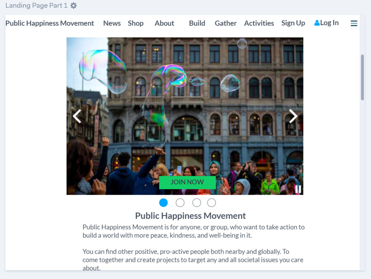
Link is to the prototype that I just recently finished. Marvel 3. Only clickable names on the menu are Sign Up, Build, Gather, and Log In. The Join Now button only works for the Call to Action page and the landing page. You can select the close icon on Sign Up and Log In to go back to the landing page. The Build and Gather titles on the splash page of landing page part 4 are clickable. There are scrolls bars on each page except for the Call to Action page. The scroll bars are where the page ended on the screens that I was working on. The website makes it larger once it is in preview mode. You might want to zoom out when you use the link. There are three options to go through all the pages.
-
Use the left and right side arrows provided by the link.
-
Interactions that I created for the different pages. Down arrow leads to the landing page.Then, after that all the other pages you just need to click on the scroll bar to move to the next page. Build and Gather don’t have any interactions for the scroll bar. Scroll bars take you through landing page part 1- 4 in order.
-
Menu button at the far left corner at the bottom. This will show you all 10 screens.
The landing page’s first image would obviously fill the left and right side of the page. However, for this prototype I used an image that was not wide enough.
1 Like
It looks really good. I like having less info on there, as my natural inclination is to put everything that could possibly be there, on there.
I’m a little confused where this page sits in the order of things:
Is this the page users are taken to after logging in, so they can be directed to the correct side on the platform? I like the idea of leading users with a question on this page, for example:
I want to:
Build positive social impact projects online with other members around the world.
Projects are focused on empowering local people to transform life where they live
Gather with other kind and proactive people near me
The space to find (and create) impactful and fun activities and groups taking positive action on the streets to benefit society.
The Call to Action page can be the first thing after logging in. Or it can be before the landing page. In the prototype, it was the second option to give people the idea of the options before seeing the official landing page. However, it makes sense that the Call to Action page would be after logging in. I’ll change the order. Can I use the example you have and put it in the prototype? I like how it has more information for that section. So, people can decide on which path.
1 Like
Sure you can. @ArtyS is building a minimal prototype of the Action Center this weekend, so don’t worry too much about that section, or the Map section for now.
That’ll give us the navigation structure to build upon and should make it easier for us all to collaborate and for the community to grow. I’m finding that the ‘less is more’ approach to a project as broad as our seems to get a better reaction as there is too much to digest and it puts people off.
So the introduction to each would be just a line or two about the change each section aims to make in the world. With an opportunity to read more on another page if they want.
I agree that the login page should be before users travel deeper into the site - although they need to be able to access direct links, where they’ll be asked to login before interacting with the page
1 Like
@aeglobal the text doens’t have to be perfect as we can work on it together once the idea is up.
I’m pulling concepts from your plan for the Action Center redesign. Half yours, and half the wre frame i made before. Plus a few other conversations with UX devs who seem to prefer to talk to me rahter than join the community (…which is a little annoying)